Let's draw some medieval helmets! If you guys know me on Twitter, you'd probably already know that I love game's like Dark Souls and Elden Ring, especially the armor designs. I'd love to teach how to medieval armor entirely but I can't do that in one tutorial so for now we'll start with some helmets. It's good to know some terminology if you want to be able to search them up so there's the close helmet, beak helmet, barbute, great helm, frog helm, kettle hat, and the Viking helmet. There are a plenty more kinds of medieval helmets out there but these ones are the ones most iconic to me. So from left to right, I sketched them in order. Each of these sketches are no more than 32px.

We're going to do draw each helmet one by one.
1. Close Helmet
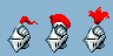
So with the close helmet sketch, right now it's just a round head with pointy visor in front. The visor is the mobile piece that can pivot in front of the face. Next thing I'd sketch out are the comb, visor pores, and the trough pattern along the scalp.
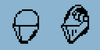
Now we can color and shade it. Since the visor has flat "cheeks", try to make sure that there is a clear distinct line down the middle that separates that brightness between one face and the other.
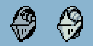
This isn't done though, realistic lighting is pretty dynamic. For example, even though the cheeks are flat surfaces, they don't appear as a single shade all the way across across. They'd resemble surfaces more like this...
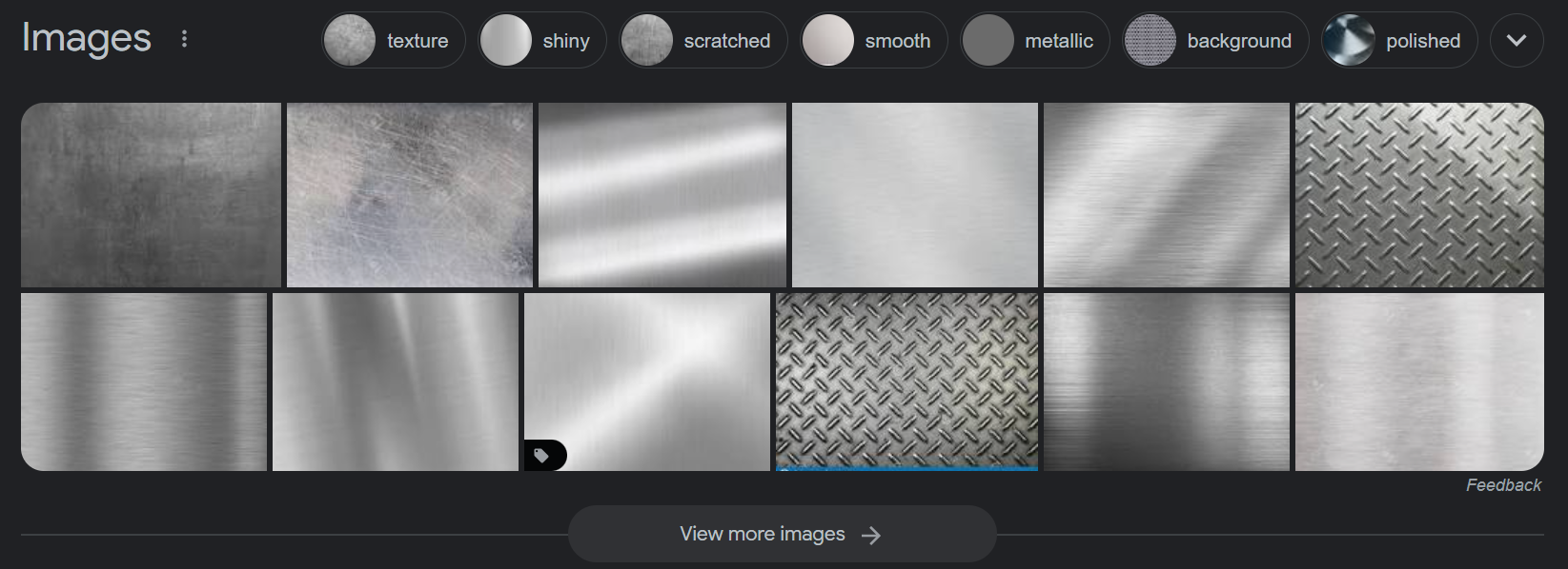
Even though these are flat textures, the reflections are pretty dynamic. So we can apply that to our helmet and end up with something like this. Also a little quick mention, the neck armor piece that knights wear is called the bevor. Generally speaking, it should curve out towards the bottom.
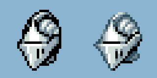
If you want you can add a plume. Plumes are decorative feathers, commonly worn above medieval helmets (but are not restricted to medieval helmets).
2. Beak Helmet
Moving on we're drawing the beak helmet which is similar enough to the close helmet however the visor has a rounded cone shape instead, not flat-sided. So in order to make the beak appear round, I'm going to take the original sketch but shade it as if it were a cone.

If you search up beak helmets you might notice that the top is also pointy and cone-shaped, often angled back. From what I've gathered, it seems that the beak helmet lacks the many of the top features that close helmets have such as the comb, plumes, etc. but if you want, you can always experiment. On the bright side, that's less work for us. If you were to shade it, you might end up with something like this.
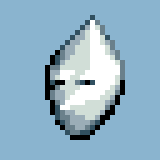
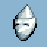
Right now the way it's drawn, the visor is embedded but it's not how I want it. It could be viable, but I want to keep it separate for this tutorial. First and foremost, as far as I know, the visor actually includes the eye holes. There should be a noticeable edge of the visor above the eyes so we could get something like this.
Lastly we want to draw the dotted pores within the visor and you could draw a riveted bevor if you want to add a little extra detail for practice.
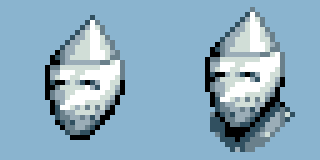
That's it for the beak helmet, moving on.
3. Barbute Helmet
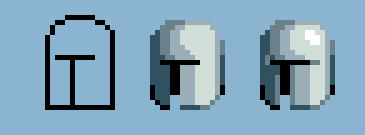
Next we draw the barbute helmet. This one has really simple shapes so it shouldn't take too long. Its silhouette appears as a cylinder with a rounded top, resembling something like a stubby round bullet. The other key thing about them is that they commonly have a T-shaped gap in the face (but not always). So we can take our original sketch and shade it.
If you're struggling with the shading, just remember that it's a cylinder with a rounding top, we can combine sphere and cylinder shading techniques to shade the helmet more or less, just don't forget to add the T.
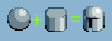
If you want, you can give it a comb and some rims with the "T" but otherwise I'm going to move on to the .

4. Crusader helm
Next off, we're drawing the great helm (also known as Crusader helm). This helmet also does not have a visor and a tall shape, but this onetypically has a cross gold cross ingrained into the face, a flat top, two small eye slits, and porous breathing holes. So we have this sketch.

It's a good start but the shape is too square and the angle is to mundane. I'm going to narrow the top slightly and adjust the viewing angle to be more interesting.
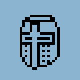
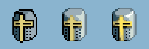
Now we have this which is better, but still needs the color. Now we can shade it similar to the previous helmet but the top is slightly beveled. When shading keep in mind that to top is flat, and use a thin curved highlight for the bevel. For the cross, we will use gold colors.
5. Frog Helm
The frog helmet was primarily used for jousting. It got its name due to it's appearance resembling a frog's mouth. The "chin" of these helmets appeared very long, the main reason being it covered most of the throat. The top is often kind of flat but not entirely, it's still a bit round. Here's the sketch we currently have.
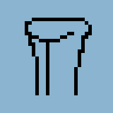
It shows the "frog mouth" which is the single large eye slit, and a line down the center to make it easier to distinguish the two sides of the helmet. Now if you're able to draw the other helmets, you should have some idea how to shade this one as well. First I'd set the base lighting then apply highlights where necessary, in this case it's pretty similar to the last one.
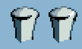
From here I'd start applying extra detail such as jousting scratches, combed scalp, rivets, etc. Rivets are always attached to the sides.
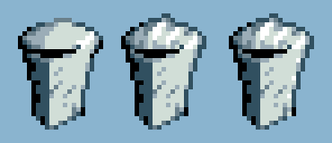
The interesting thing about frog helms is that the bevor is built in to the design. Here are a few ways you could go about it.
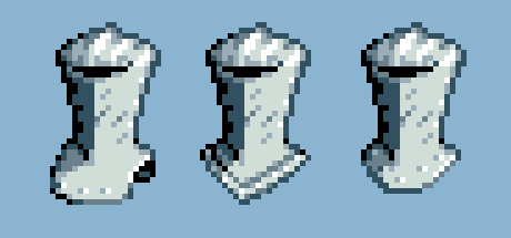
(To be continued, I will continue the last two helmets later. Thanks for reading!)


