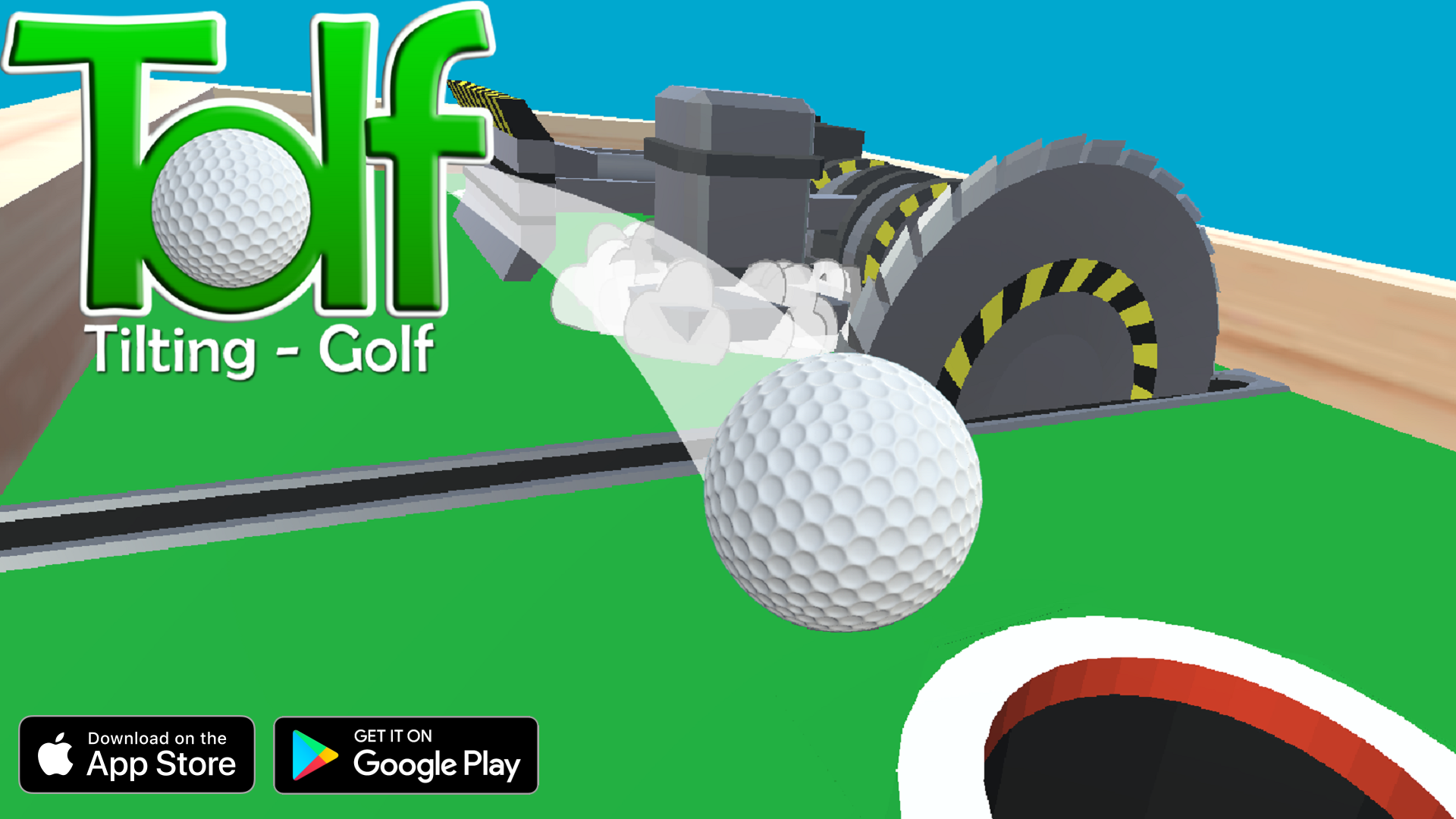
Hi i am searching for feedback for my new mobile marble tiltig-golf game named "Tolf".
https://trashpanda-games.itch.io/tolf
I would be very happy to receive feedback from you.
Kind regards
Hi i am searching for feedback for my new mobile marble tiltig-golf game named "Tolf".
https://trashpanda-games.itch.io/tolf
I would be very happy to receive feedback from you.
Kind regards
Hey Trashpanda Games,
I tried your game on an Android tablet. Looks interesting. Here is my feedback:
The intro screen that has the Trashpanda logo, appears within a frame, and fades out slowly. I assume it was meant to fade in slowly as well? Also it doesn’t show long enough to view the logo.
On the main menu, it looks like an image is set as the background, but configured to keep it’s aspect ratio, with black borders feeling the rest of the space. The game’s logo and the text “tap to start…” seem to touch the black border, which looks a bit like an “accident”.
The background image looks fun! It conveys the message of what the game is about, and shows some excitement.
The text “tap to start…” is roughly the same color as the text below the game’s title “Tilting - Golf”. That makes it get lost in the background a bit. I think it would be better if more attention was brought to the text that asks the user to tap, maybe by giving it some blinking animation, or some other kind of movement?
On the level select screen, I can scroll down even after scrolling beyond all visible stages.
At first glance, I wasn’t very sure what all buttons do at the top of the level select screen, apart from the sound/mute one.
On the ball select screen, the buttons to exit that menu seem to appear after some delay.
On the ball select screen, the “buy a new ball” button seemed a little unclear at first. I couldn’t tell what would happen if I clicked it.
I think the default ball would really benefit if it had some different color/texture that would show while the ball is rolling.
I like how the levels are trying to teach how the game works without a tutorial, but I think they are doing it really slow. I played the first 10 level, and the game kept teaching me how to do simple turns. It would be more fun if the game introduced a few more elements earlier.
The ads seem to cause a bit of a “not-smooth” experience when they appear. When time runs out, the UI buttons disappear for a couple of seconds before an ad appears.
The Android’s back button seem to be ignored.
In general, colors seem to be all over the place, and not be very consistent.
Hope this helps. Everything I’ve mentioned on this post is my personal opinion, it’s up to you to decide if you like any of these ideas.