Thanks for playing. I think I might remove contact damage entirely for enemies that already use weapons, that makes sense actually. Combat and difficulty needs tuning in general. The bow is a bit op right now simply due to unlimited arrows, which will probably not be a thing eventually. Maybe with a special quiver. I will speed up the death animation or make it skipable, it's indeed a bit on the long side. I'm glad you noticed that the enemies try to eliminate the rolypoly if they get hit by it, there's iirc a 50/50 chance that they either go for the rolypoly or for the player.
Wackytoaster
Creator of
Recent community posts
Thanks for playing. I prefer W for jumping but I know some prefer Space. I think this is just a matter of adding adjustable keybinds. And yeah no pausing is implemented as of now. You can let go of a vertical rope without a jump by pressing down+left/right. The block should stay lowered, but it's possible that the lever got randomly hit by an enemy arrow when you passed by the area. It's not a one-time lever so the block just cycles up and down whenever the lever is activated.
As for the difficulty, I was curious how people would fare. The enemies can currently really go to town on your healthbar because there is no general invulnerability, so you can take contact damage (with a very brief window where it can re-hit you) and the damage from the attacks by two or more at the same time. And there's no way to heal yet, other than the crystal and the acorn which doesn't heal that much (did you find the acorn?). But there's a lot of finetuning that I can do in terms of how fast enemies can attack, right now they are quite fast, especially the knife goblins.
I'll try to play your game too but I'm soon leaving for a thing and I'm not sure yet how much time I'll have in the coming days.
Thanks for playing. In the springy level you should be able to gain enough height just by using the springs. They work like trampolines, where you can jump right when they recoil to gain more and more height (up to a point). And yeah there's plenty missing in terms of explaining, I will add better introductory levels for new mechanics. And probably some kind of UI for what type of paint/how many lines etc.
Ah I did not read that. Yeah I have a controller plugged in, that explains it. Don't remember the sensitivity, it played around with it for a bit till it felt ok, iirc around 20. But that will also vary with dpi settings and whatnot which I never bother with. Now that you mention it I'd guess the game probably feels better with a controller. Because if I aim with a mouse I just expect perfect mouse aim like in any given FPS, allowing for flicks and such.
I love all the 2D art. Can't go wrong with some waifus. As for the game, there's a lot of controls and tons of information I can't really make use of (severe case of small brain in that regard) but aimlessly moving about and shooting some dudes worked fine. One thing I'd change is the UI for each unit constantly showing, it's just massively cluttered. There's probably a button to show/hide it (not that I'd read tutorials or something) but even then, what information can I actually gather from this?
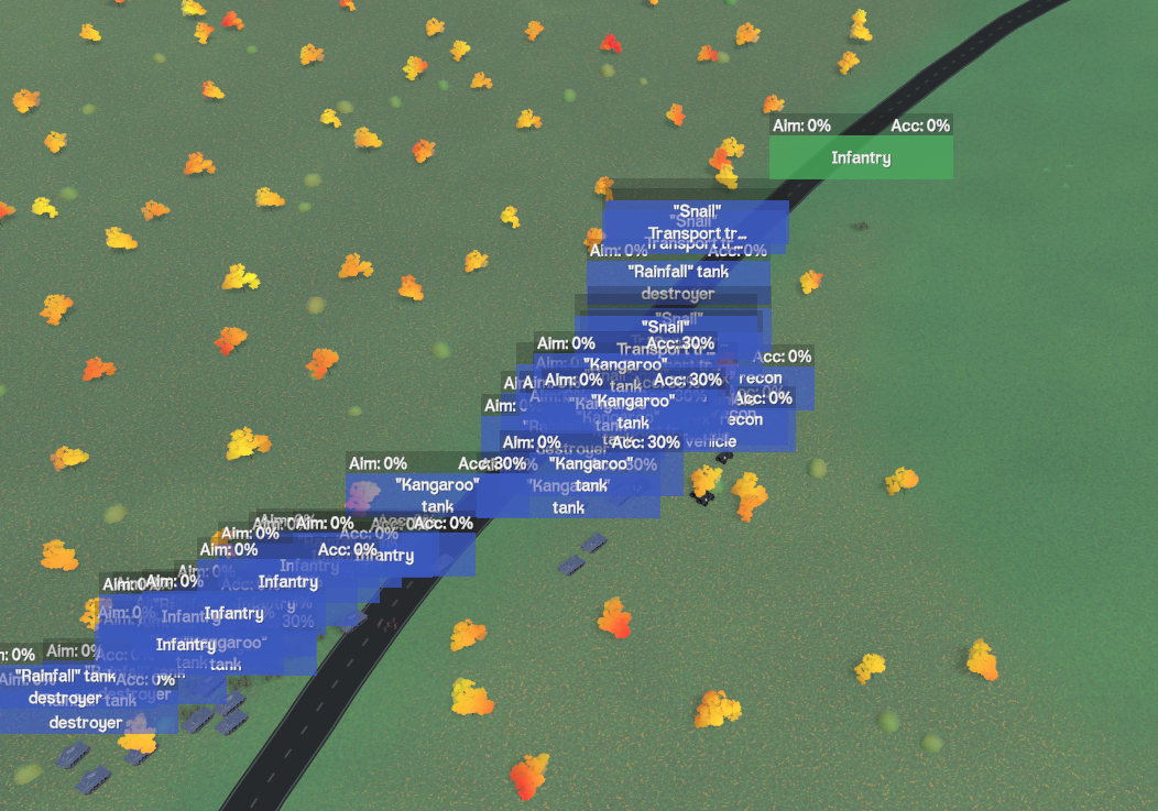
It's overall fun to play, what I don't like is how the aiming feels... it's kinda floaty instead of snappy like I'm used to from shooters, but it's also a "mech" game so I assume that's why it's made this way. I fused my fire stone and got an upgrade, but I had no clue what it does. It seems to swap something when I activate it (holding ALT) but I couldn't tell what. There were also a bunch of button promts that straight up didn't work. Game said press Y, but it was some different button. Game said press B but that was also some different button. The main controls were fine though, I'm assuming that's a case of german keyboard layout. But again the biggest meh factor for me was how the aiming didn't feel good.
Thanks for playing. Yeah I've noticed that across a bunch of games this jam they all get false positives from windows defender. I will add a line counter of some sorts. As for the cheese, yeah that's a thing that's just possible to do, I think I'll add some kind of zone to the game that destroys drawings to help a bit with that but I'm not entirely opposed to the idea of that just existing in the game to some degree. I pondered if I could make it required for some kind of end-game meta-puzzle but obviously I don't want the players to be able to cheese half the levels by making flying machines (those also exist) and jumpcheese. The game actually runs fine on mobile and controls pretty well, but I'm not 100% certain on what publishing route I wanna go with this game. I kinda dislike mobile to a degree.
Wasn't that quite a different game (warioware-like) a few months ago? Anyway... way too much reading for my personal taste, worst part is that you make me mash through all of it again whenever I fail one of the minigames. They are also overall weirdly hard for the wrong reasons, like the physics in the platformer are questionable, the fishing game requires carpal tunnel level mashing (the shark variant is also weird), the tower defense game feels like the goblins have twice the amount of health they should have... You've got a good amount of variety I guess but it's also clear that you've spread the amount of polishing very thin across all of them. I'd just focus on maybe 3 minigames (or really, just do one at a time) at first and make those 3 really good, you can always add more later.
Thanks for playing. I will probably add key rebinding further down the road so everyone gets their favorite control scheme. I'm kinda curious though what level you think you're cheesing. The only actual cheese are "flying machines" and "infinite jumps" and I'm not 100% certain if I can prevent either without also neutering some intended mechanics. (Will play your game in return tomorrow)
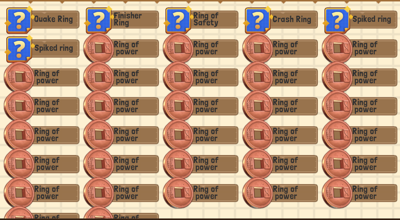
I beat windows defender into submission. Anyway, cute game. The UI looks like it wants to be drag & dropped but it won't let me and gives me the sad. Removing and adding rings is kinda janky and appears to not work on some characters? Also I can remove empty ring slots to gain Ring of power. I feel like I don't employ much of a strategy when playing regardless of what kinds of enemies are there or if they attack, or slow or poison. I just kinda don't care and it's working. Not sure if that's good, depends a little on the target audience. It took me way too long to figure out I can actually move the cannon left/right (that level where the middle position is blocked off) Knight seems OP for dps while everyone else just kinda sucks. I had fun tho.
Not a civ fan so I usually don't play these kind of games. I think the basics work, nothing is really flashy yet. I generally had no idea what I'm supposed to do but I build a city and a temple and explored a bit. I think you can maybe put some menus on a rightclick maybe instead of having it just the deselect button.
Thanks for playing. All ways are intended... sort of. It's hard to really get rid of the cheese with the physics stuff and I think I'm ok with it mostly. I'll add something to indicate the number of drawings available and maybe also what kind of physics. Switching physics is something I have planned for future levels.
Thx for playing. Yeah the floaty thing has something silly going on that I'm not 100% certain on how I'll actually fix it. I can adjust some values to make it impact performance less, right now it's cranked up all the way, but realistically I'd wanna change something more fundamental and I'm not sure if I can make that work. Maybe I can shove it into a different thread to save the performance cost...
Imo idle games live and die by how complex/interesting the upgrades are, right now they seem just extremely default but I also haven't played that far. The space station idea is good, maybe you can even do some custom build style where you can attach rooms to each other, maybe get adjacancy bonuses etc. Idk. You could also juice things up a little with some animations on the ship, some wiggling or tweening or anything really.
It's very cute, although I'm personally not a fan of the super low res pixel graphics. Maybe also because mixels look very jarring at that resolution. I think the effects you used mixels on could be very easily made using proper pixel sizes. I agree with the deer mount feeling too floaty and due to the small levels I never had the urge to hop on it to cover a larger distance + I can't fight on it either. Needs some extra polishing on the sounds. It gives me some animal well vibes overall. The boss was alright in terms of difficulty but since the rest of the game was so easy it felt a bit jarring to suddenly be challenged. Be careful with binding X/Z because german keyboard layout sucks, but at least you had alternate controls that were fine. Also I kinda hate not being able to jump with W, is shooting up really important for the game?
Seems like a charming game. Is the jump really that powerful that it needs a 10 second cooldown? I also got confused at the shadow guy outright killing you if you get too close, it happened on the second run and I thought it was bugged at first. Also getting stuck between the piggus is nasty they just sort of stunlock you hard, if only my jump didn't have a 10 second cooldown. Some text for the abilities would be great, what do I get, what does it mean, what will I get if I pick an upgrade over a new ability?
This one feels juicy. The asteroids shattering is awesome, but I'm not the biggest fan of the spaceship controls. The gravity shield is super annoying, I'd expect that to be more in the later levels.
It has this pixeljitter effect with the camera movement, maybe you can find anything that helps here https://github.com/godotengine/godot-proposals/discussions/9256 I don't use godot so I cannot tell. Rest assured, the issue also exists in other engines, it's usually tied to smooth (sub-pixel) camera movement and pixel-perfect rendering iirc. It's also part of the reason why I don't use pixel-perfect rendering in my game.
When I saw the turns passing I initially thought of DOTage, but it is obvously different. What I can say is that I'm usually not a fan of what I'd call empty turns, where I just click the pass turn button repeatedly to pass more time until I have X wood or whatever. Imo in turn-based games every turn should encompass an impactful decision that is made. Waiting can be one of these decisions, but in most cases it isn't. Plain waiting for enough resources to be gathered is not interesting, so there should be some other decisions I can make while also waiting for the resources on the side.
I did indeed shove a puck. Controls were not explained so I kinda had to figure out how I actually do shove the puck. Once I managed to shove the puck properly it was alright. I did think the power bar as the classic automatic one where you time it would be more fun. I'm also sad that I cannot do wall bounces, but I think that's intended.
I only played the prologue but I had fun. The idea of the bullets filling up the room is interesting, is there a limit to this or could I fill a room so full that I softlock? I tried for a bit but it seems like you've taken that into account. It seems that especially when aiming up I'm not actually shooting at the crosshair but rather slightly left/right of it, which is kinda odd. I also quite quickly figured out I can kick projectiles in air before the tutorial told me, which is a plus. The bossfight was ok, although for the most part jumpkicking the guy seemed like the best strategy, but I still felt kinda like I'm just randomly flailing about without much intend or thought behind it.
I'm not sure where I could start with feedback since it is indeed very barebones. A map would be nice and also do I ever have a reason to specifically attack with the sclera of my left eye or something? I think this could be cool in some way if certain enemies are specifically vulnerable to that but at the same time maybe it's a bit too much detail?
Game plays like a not evil version of Flappy Bird.
Heh, that's exactly what I had in mind.
a button to "lock" the big flower (temporarily prevent interaction)?
I've been thinking on how I could achive this in a good way but I'm not 100% certain. I don't exactly want to add a button. Maybe I could make it timed so the player has to sit on the flower for a second or so before it triggers the goal but that also has it's downsides. It's less about the difficulty and more about making it as simple as possible. No extra UI, no waiting, just touch flower. I might keep it this way but make it so that it's a bit more out of the way and easier to avoid dropping in on accident.
- show the stage number when a level starts? It has to be an intentional part of the aesthetic that there are no numbers on-screen except on the stage select menu, eh?
Yeah the idea is to keep it as minimal as possible. Showing a level number somewhere would be fine though, I'll put it on the list. I also thought about naming levels and such but I'd prefer to avoid text as much as possible just for the sake of not having to translate anything.
100%. ~1 hour (about 45 minutes spent on stages 1-24; like 15 minutes to clear stage 25 alone).
Damn stage 25 got hands. It's actually intended to be stage 35 or something, I just shifted it back for the demo, but reading this I might have to put near the very end.
Thanks for the detailed feedback :)


