Was a interesting visual spin in terms of clicking a clicker game within the clicker game which did leave a striking UI. I didn't find it obvious that the start button was the TV button not the text. But apart from that simple working mechanics and a UI with a twist.
UP2023255
Creator of
Recent community posts
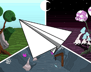
Simple concept of a screen runner game with hints of meta story telling which I liked. However past the bodies of your friends in arms the visuals start getting weird seemingly for the sake of being weird. Took away from that first well chosen visual before to tell a story.
Parts of the game felt the same despite the obstacles being different as well but i think that comes down to the one button limitation. Overall the game does look great and play well i think some more chooses to make it meta in telling a story and making the gameplay different would have really linked everything together and given a really new take on a screen runner.
Love the direction.
Love the way the game looks but when choosing that style and perspective i feel you really need to take the time to get the scaling right, the road not being centred left me feeling a bit disconnected and dizzy because i couldn't visually put it together.
However the chicken jumping the cars and the trucks all look and scale believably well and with a few sound affects for the coins mainly to make getting them more gratifying you have yourself an amazing game.
The music and having a frog fall from the sky really sets the tone for this one i feel. Really reminded me of counting sheep in terms of how relaxing it really was.
From a gameplay side of things however with no goal and literally no forward movement or progression does leave a lot to be desired regarding Jerries future. I want to know where the boi is going and if he will succeed.
That cut scene was simple at the start but really does so much to drive and motivate a player which I think I stand out considering it could have easily just been game with a score and nothing else to entice the gameplay.
The fact that as you went higher and higher new objects were being added also gave a really clear promt to the player that they were progressing without telling them or using UI, while i never made it too the top because the RNG gods hate me and everything i do in life i will say because of all the effort you put into this game i wanted to kick that alien in the face.
Some life drop also would have been nice since the game can be quite tough at times.
Overall a amazing story was conveyed to the player with such few assets which i think is incredible.
Lovely concept and in the world of AFK or super simple mobile apps you can see this concept working wonders; with an expanded shop that gives interactable items you can sink so many 5 minute sessions into this. Wish it had some sort of sound though or even blushes when you pat him to amp the cute factor!
I would say adding some sort of interaction to seeing the items fuels a player to get there; see Blobby actually eat those cookies? I would click 10,000 times over if I need to. But without the items giving any reward to the player nor Blobby i find the game lacking in areas that aren't him being cute as a button.
My forearm is twice the size now and its all thanks to you.
But the animations were amazing! Unsure of how you caused the sprite to change animation; as in if it was random or done at certain times, scores etc.. but it came across as very believable the way she moved. Overall the art style as well kept the screen clear and lacking anything to distract the player from doing the only thing they needed to do which is mash.
For what it is i got 96 on my first go and don't care to hurt myself again to see if I can beat it xD but considering what the game is meant to do I have little bad to say.
Having the space bar slow the character down really threw me off which admittedly because its not something I've seen before which is a good thing! Such a simple concept but kept me coming back for more; the grey blocks were too tough for me wee mind so unsure what else was lying it wait.
My design mind already sees other thing this game could add such as blocks that speed up or slow down alongside Billy himself slowing down to throw the player off; love the fact that your way to use the one button leaves so many options for exploration open.
Will say that at the beginning of the game the scene jolts as from what I can see Billy is started at too high a Y position? May be wrong but is noticeable when the rest of the game runs smooth. Plus some sort of progress gauge is nice, I would have likely kept playing if I knew there was more waiting.
I feel like my life's worries have just flew away; honestly the hand drawn cat and well imagined background really gave it a sense of style and its the kinda thing you can imagine being shown as a cartoon or simple children's game. Amazing to see so many elements from text choice to music all come together to make a gameplay experience that was enjoyable and put a smile on my face.
With the ability to spam space however did make the game have no challenge plus the spamming my space bar ruined the beautiful music you choose! Would suggest maybe putting in some sort of internal cool down to the shotting (could even have the cat get angry if you tried to spam, would be totally cute!)


