Thanks a bunch for the info 🙏
A member registered Jan 30, 2021 · View creator page →
Creator of
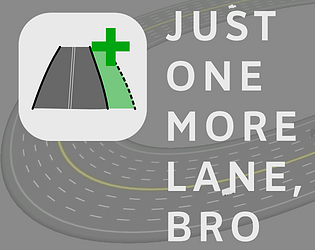
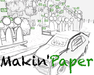
Tower defense crossed with highway expansion planning
Simulation
Play in browser
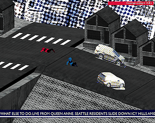
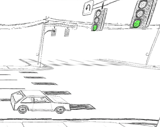
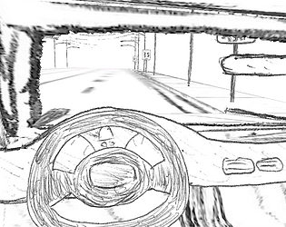
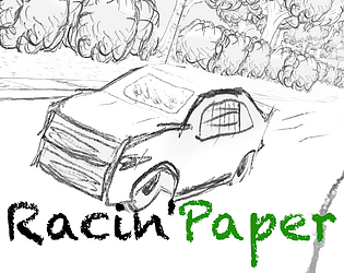
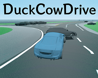
Race downhill while avoiding sliding cars
Racing
Play in browser
Modern transit rendition of the classic Track and Field arcade game
Sports
Play in browser


Extends the Godot UI to make it easy to edit points of 3D paths
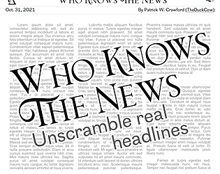
Unscramble real news headlines! Daily and topic-driven puzzles for web (desktop + mobile). También jugable en español.
Puzzle
Play in browser
Recent community posts


Had to rate a fellow blob-entry of course. Definitely does well for all the categories, and the squishing is satisfying. Got a little hard to remove some items, placing them back in the menu led to them being floating and sometimes the mouths were hard to grab / repositioning items was slightly awkward? But overall, nice work - and definitely lots of permutations!