Indie game storeFree gamesFun gamesHorror games
Game developmentAssetsComics
SalesBundles
Jobs
TagsGame Engines

SeriousBug

44
Posts
2
Topics
2
Followers
5
Following
A member registered Mar 13, 2016 · View creator page →

Creator of

Recent community posts

 I came across this discussion which looks like a great starting point: https://forum.unity.com/threads/where-to-start-if-i-want-create-ps1-style-game-a...


First of all, looks like lights are out all together.  Instead, I'll need to use unlit shaders instead. The discussion above also links to 2 shaders which help with the PS1 look.


For textures, I found one source that said they used 128x128 textures for the vehicles in Twisted Metal, so something around that range is likely good.

For the polycount, the people in the discussion mentioned keeping the the polycount on screen below 3000.

Please leave a message if this is helpful for you, or if you have any other suggestions.

(1 edit)

Hi folks! Excited for the jam to begin!

While waiting for the jam to begin, I'm thinking that I want to make something 3D, and I want to make sure I keep my models and textures in the range of something you would actually find in a PS1 game.

Excuse my ignorance,  but does anyone know what resolution of textures and what kind of polygon/tri counts would be realistic for the era? And would multiple light sources be realistic? How about normal maps?

Thank you!

Thank you very much :)

Thanks for playing! I had trouble with balancing, I think I would have to rethink the mechanics to make something balanced. Thanks for the feedback.

I absolutely love the music and visuals, this is a synthwave treat!

Just played it, great work :)

Really liked the game, and thanks for releasing a Linux version too, it works great.

Loved the mechanic of deciding which lamp to leave for last. Cute art and music, great work!

I love the art and music, and everything comes together beatifully! I really like the mechanic with the ramps, it makes the jumps very dynamic.

Just finished the game, great job!

I love what you did with the music in different worlds! Great work!

(1 edit)

Okay, I didn't update for the last few days, but finished the game in time! Yay!

All cards are implemented, a few of them don't have any visual effects but that's fine. I added the buldings and trees as well, and the game looks much more cohesive now.

Please try it! I have Windows, Linux and Mac versions available:

https://itch.io/jam/my-first-game-jam-summer-2020/rate/711488

Day 12!

Still missing the implementation of a few cards, but I added music, sound effects and a title screen.

Turn on the sound on the gfycat to hear the music and sound effects!

Day 11!

Implemented most of the cards now, I'm only missing Soothsayer, Logging camp (lumberyard), and the Precious Metals effect. There might be a few more things missing, but I should be able to add them in time for the deadline. I also put together a simple game-over screen. Here's how all of it looks together:

The art is absolutely adorable! I love that you have a language option set up.

Thanks!

Just played the game, and I love the art! And oof, that ending, great job with that.

I love that menu, great work. The new tileset is also pretty amazing.

Day 10:

Wow, so there's 4 days left?

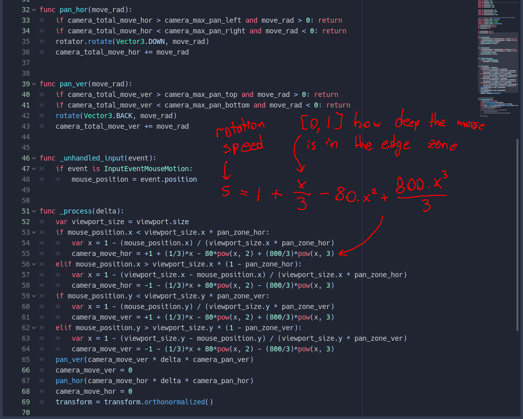
Since the last day, I fixed the camera movement. Instead of the complicated method I did with raycasts, I instead opted for manually calculating rotations on the camera based on the mouse position. Here's how the code looks like:

You might be wondering what the weird formula is. This calculates a smooth rotation speed so that closer the mouse is to the edge of the screen, the faster the camera rotates. I got the formula by going on some online curve-fitting calculator and inserting points to match the curve I wanted.

I also fixed the ships. Here's how they look now:


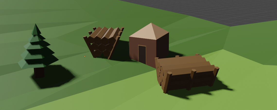
Finally, I came up with a simple design for a logging camp:


I already have 2 types of trees designed, so I need to just insert all of them into the game.

So far, I'm still missing about 5 cards! I might have to put them in with minimal visuals to meet the deadline. Otherwise, the game is coming together pretty well.

I love the effects you have on the screen, looks amazing!

Thank you!

I like the weapons, they are pretty minimalist and cool! Good luck!

Thanks for that!

Day 9:

I tried to add some camera movement, making the camera follow the mouse. I think it really brings the game together, especially the cards!

I added the docks and the ships to the game, and added an animation on the ships to make them look a little more active, you can see it at the end. I'm having some trouble with reusing the animation on the other ships, but I think I figured out how to do it, just need to redo the animation.

The bigger problem is limiting the camera movement. I'm having trouble clamping the camera to the play-area. I tried a few options, but all of them either do nothing or cause the camera to start convulsing and shaking. Does anyone have any ideas how to limit the rotation of the camera for Godot? Right now, I raycast to the mouse position from the camera. I have collision set up on the land. I have a dummy spatial node next to the camera, on which I use look_at to make it look at the raycast collision point. Then, I use a tween to modify the transform.basis of the camera to match the dummy node. However, I'm not sure how to limit the rotation. The basis values, or even Quat of the basis does not make much sense to me. I would very much appreciate any help.

I think I might modify the code for the camera movement later to manually do rotations based on the mouse location (e.g. if on the left side of the screen, rotate 1 degree to the left every frame until 5 degrees). I'll have to try that later.

Thank you very much!

Looks really cool! I like her design, great job with that!

Days 7 & 8:

Mostly missed day 7, but I did some important refactoring for Day 8. I initially coded up a horrible implementation for the cards, but it was extremely buggy and not very scalable. So I went back and refactored it.

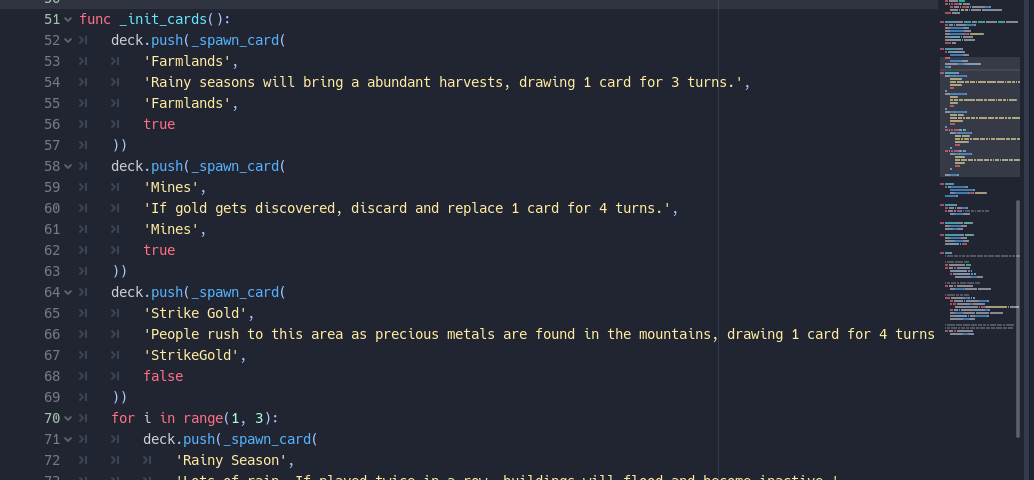
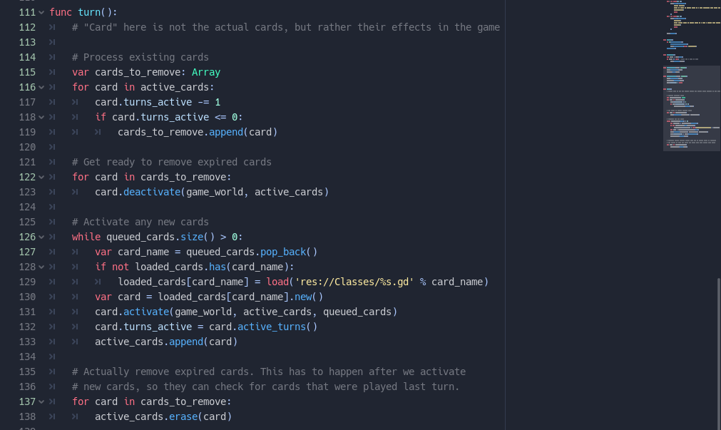
With the new design, there's a CardBase class, and a class for each card in the game. The classes get loaded dynamically as the cards are played, and there are some data structures to keep track of the cards. Here's how the card classes look like:

And the code that loads up all the cards to the deck:

Finally, the code that manages the game's card state:


I'm pretty happy with the code now. I wish GDScript had a few more features, like first-class functions (e.g. function references, lambdas, closures) and a little better typing, but it works well enough.

Next, I modeled the docks, and a few ships to go by the docks:

The box looks pretty ugly, but I'm feeling pretty out of ideas about the ships, so I'll have to keep it.

I added the mines to the game, and the refactors I made also fixed the bugs with the Drought cards. Here's how it looks like now:

Day 6:

Got a lot of other work to do, so stopping early today. I modeled the mines, and the model for the "Strike Gold" card. Here are the mines:

That's when the mines have been built, and with the Strike Gold effect active. I love how sparkly the gold looks, here it is without the mines being built:

Day 5!

Did a few things today. One thing I forgot to show yesterday was the corn plant I designed. Today I used Godot's MultiMeshInstance to place thousands of corn plants all over the farmlands, but it causes a massive dip in framerate (going from 200+ to about 20)! I guess that's just way too many meshes. I guess I need to figure out a way to simplify the plants somehow. Perhaps I could render them into flat textures, then add them as 2D sprites.

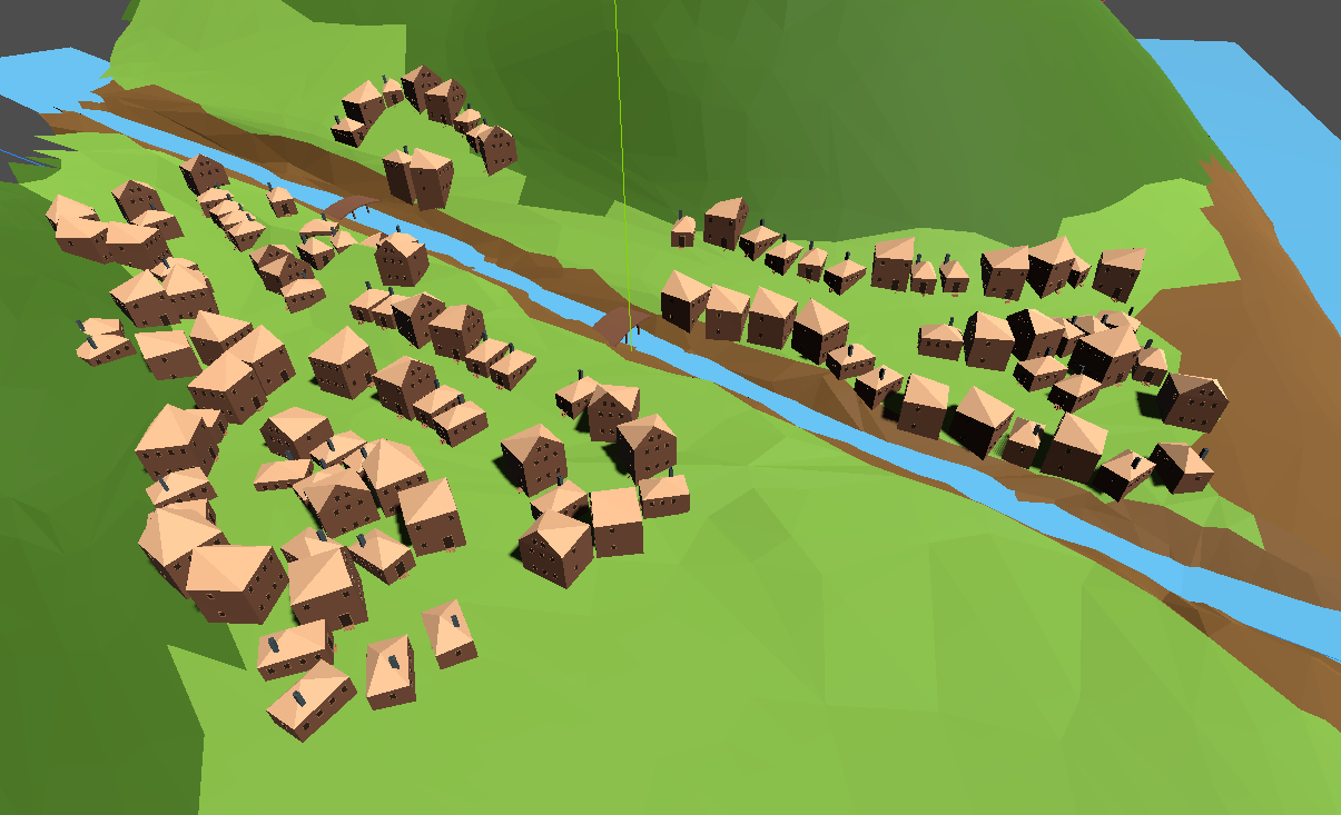
Another thing I did was to place buildings around the land. I played around with light and shadows to get something pretty cool.

I also implemented some code for playing cards, and their effects. The code is quite messy right now, I need to work on simplifying and fixing up things 

I implemented the Farmlands and Rainy Season. Also added Drought, but it's buggy right now. I added a font from Kenney's assets too. Here's how the whole thing looks now:

Great job with the wall jumping, it looks great. Good luck with the rest of the project!

Day 4:

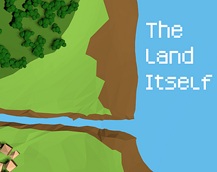
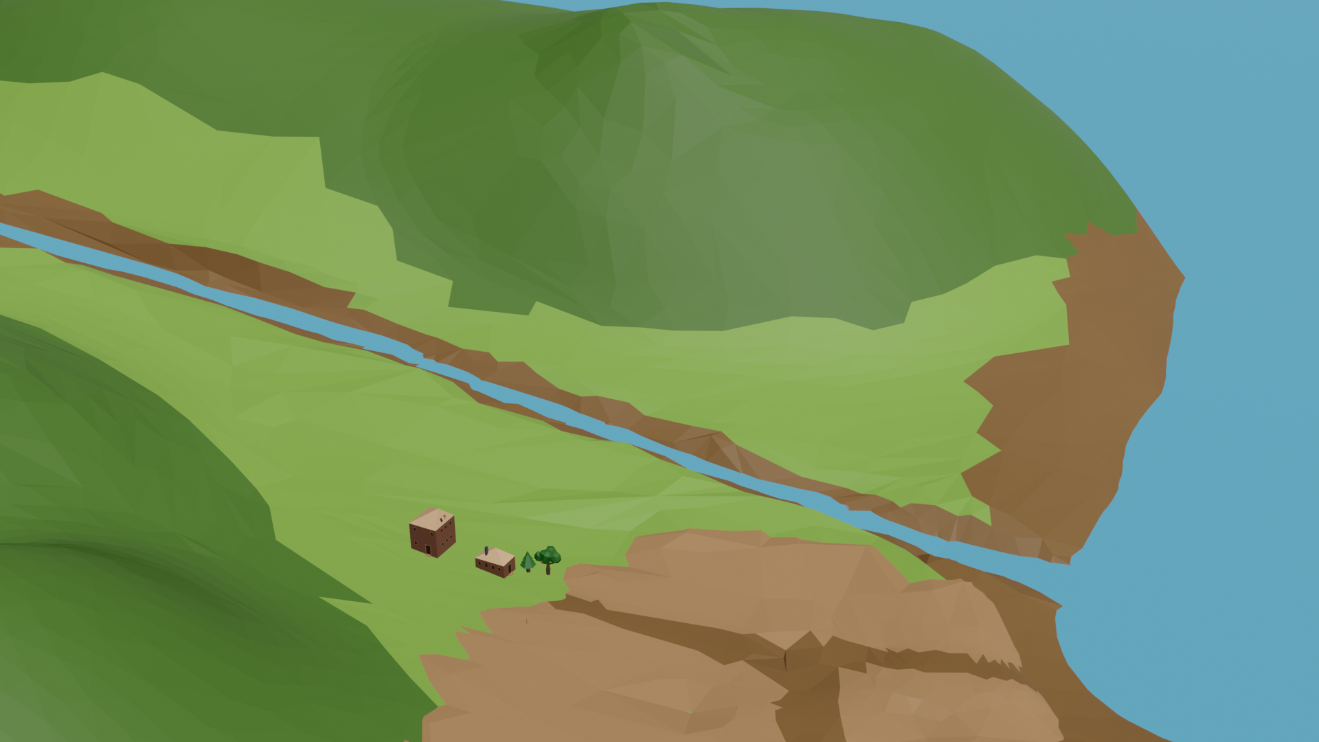
Got some models designed for cards today. I'm on track with my plan so far, yay! So, first of all, I added a river to the land:

On the bottom right corner is the farmlands with a single maize plant on it, which you can't really see! Hopefully it'll look better when there's a lot of them covering the whole thing. I also added some design for when the area is flooded:


The flooding raises the levels of the river, and also puts the farms under water. I think that's a good visual representation of why the flooding effect disables buildings. I'll continue to add more areas for flooding as I design more buildings.

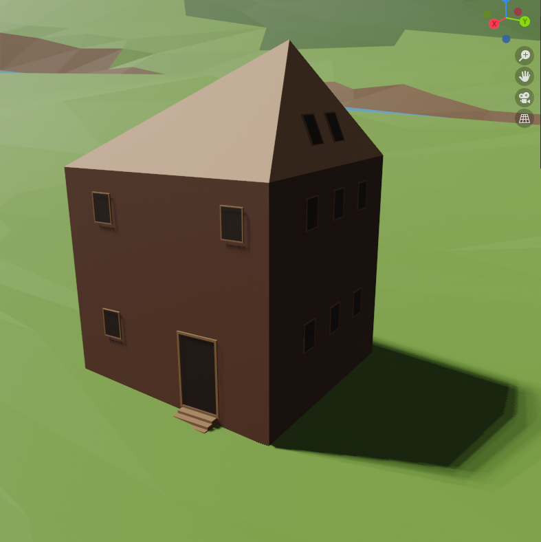
Here's some closeups of the trees and the houses:

I'm planning to have a hidden population counter that goes up or down based on the cards played, and depending on the population houses will get built or abandoned. Similar for the trees, I'm planning to have several sections of a forest, and have them get chopped down when the lumberyard card is used. That way, at the end of the game, you'll be able to see the effects of the lumberyard in the environment.

(1 edit)

Looks really fun! Movement sounds like an interesting twist, although it looks like it's hard to incorporate it into the game. I don't see any HP on the cards themselves, can the cards attack each other?

Thank you! :)

The particle effects look amazing, great job!

Day 3!

I coded the deck, the player's hand, and the discard pile today. I don't have any animations on the cards, but I might add them if I have time before the end of the jam.

That cupcake looks very much like something I'd bake :) The main menu looks great!

Day 2:

Figured out how to get text on the cards!

I don't know if this is the ideal way, but I'll explain how I did it in case anyone is trying to do something similar in Godot: Create a Viewport, with a Label as it's child. Then create a MeshInstance, and add a quad as the mesh. Next, create a SpatialMaterial for the mesh, pick "Local to Scene" and "Transparent" for the mesh, then create a Viewport texture for it. Enable "Transparent" and "V Flip" on the viewport. Mind that if you click on the Label, Godot goes into 2D mode, but you can't actually see the label in 2D. You have to switch back to 3D to see what you are doing with the label.

I also created a scene for the deck. I decided to use Godot's scene tree to keep track of things instead of an array, so I'm going to put all the cards in the deck as children of the deck.

Thanks for the jam!

Thank you!