
Thanks for playing it 👍
A member registered Feb 14, 2025 · View creator page →
Creator of
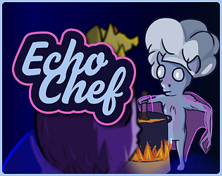
A young bat must master echolocation to gather ingredients for the Bat King before Martian bats arrive.
Adventure
Play in browser
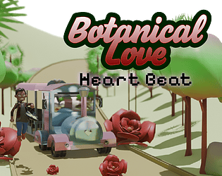
Juego realizado con amor para mi pareja y para la Jam "Heart Beat"

Juego realizado con amor para mi pareja y para la Jam "Heart Beat"
Adventure
Play in browser