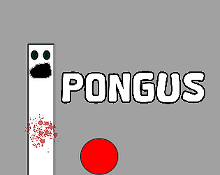
The lababo thing is clever way to spin the miniature theme haha. dig it. Also -- top tier tag line for the game.
A member registered Sep 11, 2021 · View creator page →
Creator of
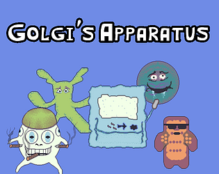
Prevent your cell's death against hordes of bacteria and a gambling-addicted Nucleus.
Survival
Play in browser
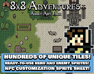
Game Boy-style adventure game assets for GBStudio or any engine out there!
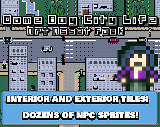
All in one convenient asset pack for making a Game Boy city based RPG!
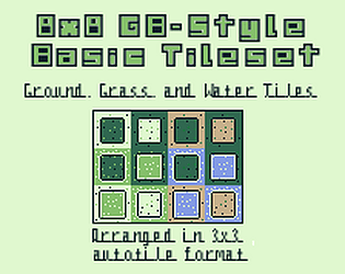
3 basic 8x8 tilesets for a top-down adventure /rpg in GB-studio or other game engines.
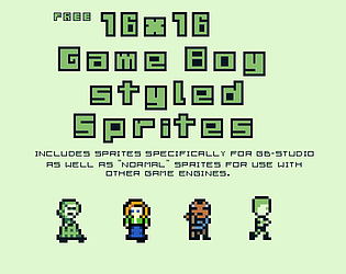
Free 16x16 Game Boy -styled sprites.

5 pixel fonts with extended Latin alphabet characters!
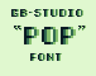
This is a free variable width font that adds depth and character to your GB studio project!
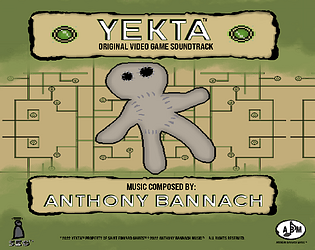
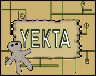
The official music for the video game Yekta!
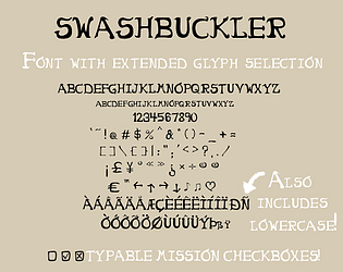
A custom font that adds an air of adventure!

Custom Font that is perfect for evoking unease!
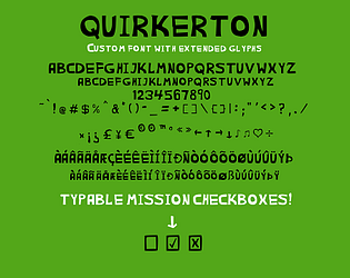
Quirky custom font evoking a offbeat yet fun-loving spirit!
free pixel-font

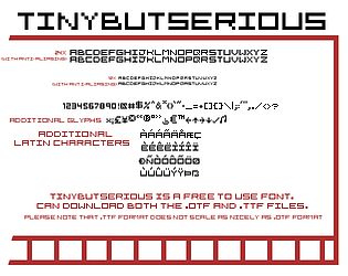
Free basic pixel font with additional Latin characters and symbols.