Did you just play the demo that's available here or the Early Access version from Steam/Patreon? That one has so much more content already. Either way, glad to hear you liked it! Thanks for letting me know!
A member registered May 22, 2016 · View creator page →
Creator of
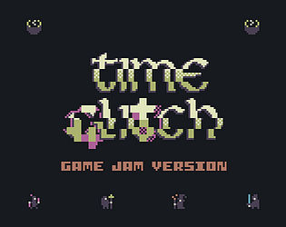
Embark on an epic bite-sized tabletop RPG journey in Time Glitch, where your knowledge of the past shapes the future.
Adventure
Play in browser