
Indie game storeFree gamesFun gamesHorror games
Game developmentAssetsComics
SalesBundles
Jobs
TagsGame Engines

ratschofield

3
Posts
1
Followers
A member registered Aug 31, 2021 · View creator page →

Creator of

Recent community posts

Home Page

The use of colours for the background image was appealing and the  images gave me a visual cue of what I could expect in the game.  The politician with his intense eyes drew me to the centre of the page so the game title was not immediately obvious against the smoke/clouds in the sky and could be hard to see in people with low vision.  The Play game button did not provide any user feedback and the Help buttons rollover colour could have been more contrasting.  The buttons could have been given more emphasis to stand out against the background.

Game Page

As soon as the Play Game button was pressed the game launched and it was not obvious how to move the character in the game.  Based on previous user experience I immediately tried the spacebar and arrow keys and was confused when these did not work.  As the game did not use keyboard controls it could be better to offer the user a quick hint explaining the moral compass and how to use it to give the user a better experience when first using the game.  The click area could also have been larger on the north and south so that you didn’t have to be so precise to manipulate the character (ie could have also incorporated the words jump or slide as my natural reaction was to try clicking the word and not the arrowhead).

The score faded into the background and could have been more highlighted.

Help Page

I felt there were too many instructions and story on one page which was overwhelming.

The Home button from the help page did not work and the Play game button was not aligned correctly and appeared to be smaller than the home button.
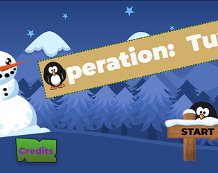
Credits Page

I loved the illustrations and animation on the page but would have liked the text to scroll a bit slower to read the inspiration message in the credits without having to go back to the game a couple of times to read.  Would have been good to leave that message on the screen. 

I really liked the originality of your theme and the illustrations.  Great work Jack!  

James’ Home screen

The use of visual hierarchy principles in the design worked well with the larger title naturally attracting the user’s immediate attention.  The negative space around the buttons improved readability however the white particles moving across the buttons detracted from the buttons visual impact.   

The use of colours on the home screen was visually appealing and delivered the space theme to the user when the page loaded.  The bright colours contrasted well against the black background.  The speed of the floating particles and the planet rotation may cause the user cognitive overload with too much visual stimulation at once.

When hovering over the buttons as they increased in width I felt a conflict in expectations that the button text remained static.  A visually impaired person using a screen reader may not see the entire menu at one time and this could cause confusion on whether a button is highlighted.

James’ spaceman

The spaceman was an awesome design but could have been given more impact against a solid background rather than the default skybox.

The use of proximity when placing the controls looking visually pleasing but would have worked better to group together the move buttons and the rotate buttons together as related functions.

The experience of controlling the spaceman could have been improved by ensuring the original position of the character was reset each time and not retaining previous positioning information.

Well done James, the project was well designed and your spaceman was awesome!

The interface was well set out with clear easy to understand  navigation however it would have been a better experience for the user if the game started at the home page to provide the user with the name of the game, a clear sense of where they were in the game and it's purpose.  

Jack's Rocket screen

The proximity of the control buttons on the rocket screen helped to effectively draw the user's eye to them  and the button text gave the user a clear understanding of what each button would do.  The Up and Down buttons only moved the rocket very minutely so there was little visual feedback that the rocket was actually moving which could lead to confusion that the buttons did not work if they were pressed first.  

When the rocket was sent to orbit it completely moved off the screen so could be confusing to the user wondering where it went or how to get it back.

The button text alignment and font were easy to read and the contrast of dark grey against the red button was effective on idle, however the button colours when highlighted or pressed became very dark making the text hard to read causing accessibility issues for users with poor vision.  The use of the red buttons complemented the red rocket and was visually pleasing.

Jack's Home screen

The visual design of the home page immedicately gave the user the space theme and the bright yellow contrasted very well against the dark background.

The use of both text and images on the menu buttons was great design allowing for users with low reading skiills to understand  what they might expect when they pressed a button.

The use of the square font for the button text fitted with the space theme.  Once again the use of a darker text colour for the highlighted button was hard to read. 

Overall, a great design Jack!