

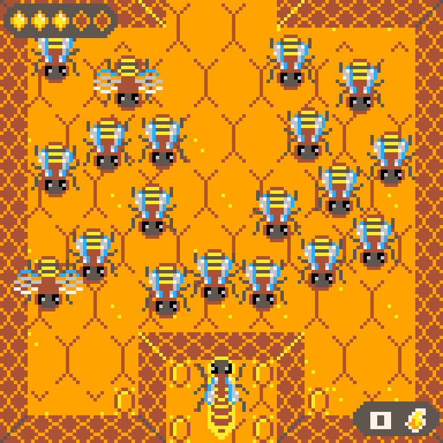
Of Honey & Bees is a PICO-8 project that takes inspiration from the classic Game Boy adventure games to tell a short and sweet story about harvesting honey and protecting your hive from danger.
There’s exploration, boss fights and a story about heroism and sacrifice.
https://random-state-machine.itch.io/of-honey-and-bees
I originally created the game for the Narrative Design Awards jam back in May where it was nominated as one of the best games of the jam. I never got around to posting it here, however.
It focuses much more on the story and characters than combat and bosses with the focus of the jam clearly being on narrative design.
I’ve continuously updated the game during the past two months and got to a stage where updating it further would require mayor reworks to expand the limited resources PICO-8 provides. I’m calling this version of the game finished and thought I’d show it off.
Have fun buzzing about!