On Sale: GamesAssetsToolsTabletopComics
Indie game storeFree gamesFun gamesHorror games
Game developmentAssetsComics
SalesBundles
Jobs
TagsGame Engines

PixelPinion

38
Posts
2
Followers
A member registered Sep 05, 2024 · View creator page →

Creator of

Recent community posts

Sorry it took so long to get back to this again. Work keeps me busy, but I'm sure you know how it is. Okay so I think I can finally point out where the "blob" tileset fell short for me.
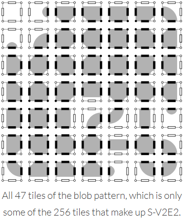

Image credit (this is a great page talking about tilesets btw): https://www.boristhebrave.com/2021/11/14/classification-of-tilesets/

As you can see, none of the tiles in this particular set are corner-only tiles. 

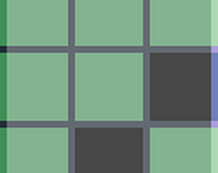
So for example, say that my auto tiler rendered a map, and I take a snapshot of this square pattern of 9 tiles, wherein X represents a forest tile and 0 represents some other terrain:

XX0
0X0
00X

If rendered using only the blob tileset, it comes out like this:
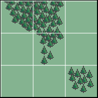

But using a 256-tile set where I can specify that corner connection, then it comes out like this:
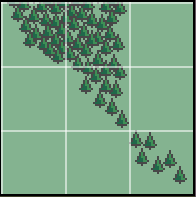

This use case comes up constantly in my map gen and it comes up a lot more natural with the 256-tile set.

Hope this finally cleared things up!

You flatter me! I was so afraid of reaching the tile limit that I just repeated the 64-wide mountains. After I realized I was very under count I didn't go back and change it because I came to like the pattern of it. All in all a fun experience!

Aw, thank you so much! At one point I almost decided to make an image similar to yours, but I'm glad I didn't because I don't think I would have made a picture as nice as yours

Thank you so much! My son thinks that if you turn it on it's side it kinda looks like a spine. I almost like it more when I think of it that way

That's awesome 😁

Such kind words, thank you!

You could sail this ship through my picture! Love it

The dripping is the best part

I didn't understand until I saw the word Fibonacci. Then it immediately made sense. I can even see how you used the Fibonacci spiral!

This is creepy in a good way. I like it

that Anubis is super rad

this is rad

lol amazing

this is so gorgeous I could just die

that is the coolest Anubis

A dichotomy of an individual, so cool

I love the opposites at work here. Every object has its counterpart, not just in light vs dark, but also in principle. I like the life and death theme.

This is so clean. Everything is well defined. I like it

That legwear is impressive

I feel this to my core. I code AND I make art, and still find that I must put aside one to work on the other. It drives me nuts. I think you did well on this, though. I particularly like that you made the gameboy at an angle instead of straight on, adding a bit of extra difficulty

You warped the reflection and everything! This is so cool

aw, thanks!

I am so jealous of this!

Looks like you spent so much time on this. I wish I could have this in sticker form. I'd put it right on the front of my notebook

Ooh, I think we had similar inspiration! It's like you could sail right from your pic into mine. Your lines are much cleaner, though. Love it

Oh my gosh I want this on a blanket right now

Oh, wow, those prints really are neat. I can see the influence, too!

Turtles all the way down! I love it

The heavy dithering actually works with this piece. I love the inclusion of the gameboy pictures. Awesome pic

This is the same look that my own little void kitty makes when she wants to play. Absolutely charming, well done!

It looks like a frame out of a beautiful manga. Art to aspire to, for sure.

I love this so much. It's so pretty and has a lot of illusion of soft lines and curvature in it. I showed it to my own little midnight cat. She did a mew without sound -- her way of asking for a treat. Guess I better oblige!

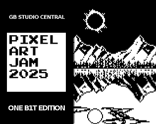
You are so kind!  On the top half there is an eclipse in the sky. In the bottom half it is supposed to be the moon coming out during the daytime (but not an eclipse). It is intentionally not a direct reflection of what is happening in the sky above, partially breaking the symmetry. The stuff in the sky and water was all my son's idea, and I think they turned out great.

I still consider myself a beginner, but I have a few small pieces that I am proud of.  Originally, I tried to make something new, a sceptre and sword meant to represent the balance between decisions. However, I just didn't enjoy working on it. I went looking through my old pictures for inspiration and found myself staring at my favourite: a colourful image of a mountain on a lake. As I looked at it, I thought that balance for me in that moment meant reflecting on the slow, incremental improvement of my art over time and my commitment to continue. So I took that picture and used it as my reference. As I built it, pixel by pixel, I found myself discovering new challenges and overcoming them. I also consulted with my art manager (my son who got me into pixel art in the first place) and he suggested a couple more additions to the scene.

In the end I'm happy with it, even if it has plenty of amateur mistakes. I'm just happy to contribute and be a part of the community. Most importantly, my art manager is thrilled with it.

Not sure if I did mention it, but they are 32x32. I believe they should scale without much issue, though I could always whip up a smaller version if anyone ever inquired. I've been a bit busy, but I have some time off soon. This conversation has been interesting to me, too. I'd like to see if I can pick through my work and find the spot where l had to convert up to the bigger tileset. If I do, I'll come back to this thread with the specific example that broke the blob tileset for me, and demonstrate how. 

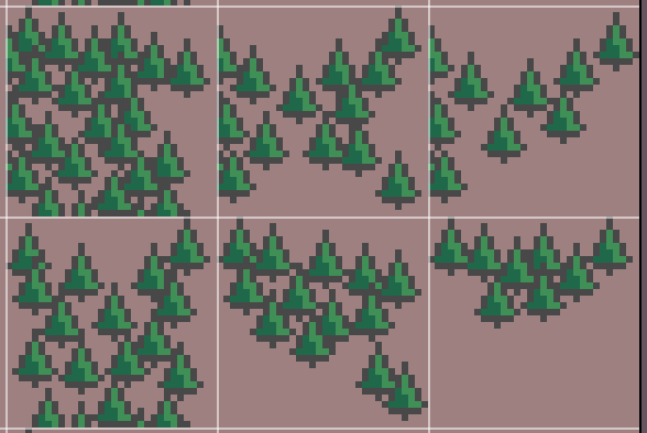
Sure, and I'm glad you asked. The 47-piece tileset is for terrains that have a lot of symmetry, allowing for someone to rotate and flip the tiles, saving artist time and file size in the process.  The 256-piece tileset allows me to create asymmetrical designs, and even designs that overlap tiles. Here's an example of a few of the forest tiles I use. Notice how certain connecting edges have trees that are intended to overlap into the next tile:

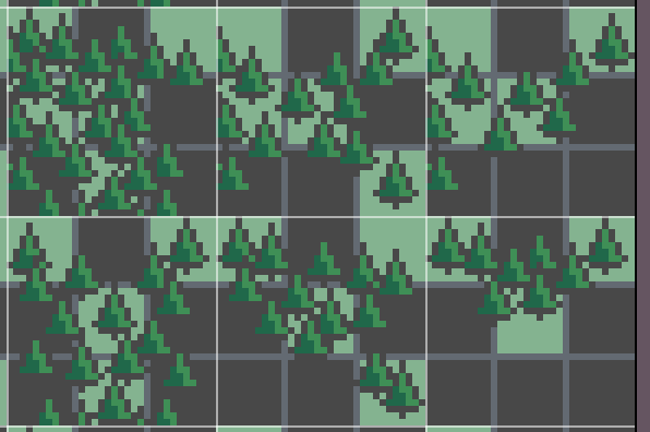
Now let me show you the template beneath it so you can see why I made the artistic choices I made:

As you can see, I wanted the trees to trail off a certain way depending on the surrounding tiles. Here's a bit of my tileset being used on my current WIP:

As you can see, it flows relatively smoothly and doesn't look overly tiled.

Hopefully this clears up my choices a bit more! If not, I could break it down even more, if that would help.

Oops, didn't see this until now. While it's true that the smaller tileset is enough for most projects, I personally ran into issues that required the full set for some textures. For example, I had a forest and river tileset I was using for large map generation. It was important in this case to address some of the more niche adjacencies in order to make the resulting landscape look more natural. In any case, I often duplicate tiles that fit multiple adjacencies (usually by just using a reference in code), but I've definitely found that having the full set as a baseline makes random map generation go much more smoothly. 


Thanks for the comment, and I definitely recommend using a smaller tileset, especially if you plan to place them by hand instead of using proc gen. This template is also free to use if anybody comes across a use case for it like I did.