Heya thank you for the feedback, I'm glad you liked it! It shouldn't be too hard to add that tutorial change, I change made it that way in case people skipped the tutorial accidentally before they had a chance to read it
Icelamp
Creator of
Recent community posts
Just watched Zackavelli's stream on this and here are my thoughts:
- I can't remember if the stream muted your game, but SFX (just a simple shoot, hit and death sfx) would be huge
- While the art looked good, definitely spend more time testing (e.g. what happens if I place no gnomes). A super easy one that could've come from this is 'restart game automatically if any zombies get through'
- Too much text for the tutorial - have a quick look at how Plants Vs Zombies does it - it's just one sentence at a time in between letting the player take actions. Generally, the more text you have; the faster they'll skip through it!
- Overall, pretty godo game for your first ever finished project! Well done
Thanks for the feedback Okayh!
I did try with bigger rooms, but it made the game too easy (I could've then put more obstacles in the way, but I decided that would've been too annoying).
I also had the tutorial only play once initially, but when I showed it to people, quite a few of them accidentally skipped it and then didn't end up understanding how to play!
Damn this game rocks! From the music to the artwork, animation, economy of upgrades, very well done! Only major thing I would've wanted was a prestige mechanic, maybe new characters that interact with existing systems (e.g. maybe someone that rides on the back of the horse auto-firing at fliers, increased horse speed, passive candy income, etc).
And only minor things are some of the gravestones were backwards, and since they have the light angles reverse on them it looks a bit out of place. That and it would be cool to see a little more interesting details in the background behind the trees. Some (very few) of the voice lines were a little cringey; I didn't mind the ones with puns, but others just didn't seem to have a punchline e.g. "neigh, neigh neigh neigh, horse". And lastly make the candy a liiiitle bit bigger as it's tough to click on the ground. Also ghosts seemed to completely stop spawning later in the game?
Anyways, congrats on the great game (and great hand-drawn thumbnail too)!
Nice creepy vibes in this one. I do think that there could be some extra audio added when getting close to a monster, but I like the oddness of the mechanics and you explained them very well without slowing the player down.
I couldn't kill the first monster in the 3rd level because the gun wouldn't load the gunpowder at all, but I liked how the mosnter actually requires some skill rather than just blindly shooting it.
Something else that could be improved (which there might be in later levels) is a sense of urgency to reload & shoot while moving. The first couple of levels was just move, stop, shoot, move, collect ammo, stop, shoot, and you could stop for as long as you wanted with no risks.
I'm not sure where the reference for "skull island" came from, and it's not explained why you lost your arm, but I'm guessing you made another game in this universe that this is a sequel to? If so, cool tie-in but as a first time player it is a little jarring (why are we on the island? if we survived the island in the first game, why are we back? why are we only going out in a boat with one arm at night rather than daytime where it's probably safer? what's the story behind the monsters?)
But good job in setting a creepy mood :D
This was nice, I liked the puzzle solving elements and the stories told by each grave!
A few things could be improved though, like giving players an extremely basic one-sentence tutorial at the start e.g. "click your inventory and select an item to equip it." and "click an equipped item next to the inventory button, then click an object to interact with it using that item".
I also got confused for a long time at the very right-end of the map - I spam clicked it with every item I equipped thus far because I thought I was supposed to solve a puzzle in order to cross it.
Awesome game! I really liked how it made me feel - helpless at the start, then starting to manage things, then looking for things to do while I was acing all the maintenance. Took me a while to figure out how the energy and sanity worked as it wasn't very intuitive (usually you sleep to restore energy and maybe sanity as well). This could've been solved by calling Energy simply Hunger, and calling Sanity Energy (though my Sanity never got low enough to find out what it did).
I also was really impressed by how well written most of the lore was. The fonts weren't very consistent however, and some of the special characters like [ and ] didn't display correctly (I'm guessing you took your screenshots from in-engine).
Only thing I would say is that it's a little easy to skim past the tutorial - ideally it's not just a block of text (I admit, I did this too lol) but rather you show the player why something is happening and what to do about it, when introducing mechanics that are not intuitive just by looking at it (i.e. how would I know the you refill fuel from the back if I didn't read the text). Something like flashing the back of the light red when fuel runs low might help. I also think that if you want to make it even more immersive, take as many UI bars out of the HUD as possible and teach the player how to hear and/or see when those resources are running low through sound, VFX, etc.
Overall, very immersive and isolating, perfect for a horror jam. And great work on the pixel art thumbnail too!
Appreciate the feedback!!
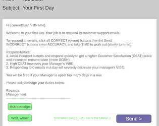
Yeah I think I'll take Zackavelli's advice and change the start colours to green, and try to highlight the part of the tutorial that says "buttons change colour".
And yes!! Part of my dream if this game had more time spent on it would be that you're eventually automating so much that you basically don't do anything and just get paid, then you can start making things optionally harder for yourself, or take on multiple jobs, or start building relationships with coworkers, or start hacking. Aim was to build the MVP in the 7 days I had haha
Heya, yeah I pinpointed that bug today actually - if you're on the Emails or the Job panel when you start a new job (either by quitting or getting fired) the non-permanent upgrades won't reset. I've got it fixed on my local, just pushing a couple of other things as well before the next build.
Thanks for the feedback, it is indeed hard to make an engaging idle/clicker game! I'll take a look into balancing the upgrades as well (I did always plan on the crypto upgrade being the most lucrative and upgrading to the max as part of the endgame)
This game definitely stood out the most for me in the bunch. I got nostalgic about my time doing a game design degree in uni and our lecturer took us to a small indie art museum where people were presenting really out-there stuff that challenged a lot of design norms and played with the idea of what is an experience and are games art.
This game has the most 'art' both literally and figuratively out of all of these, and I really loved experiencing this and I could tell that everyone's experience of it would be quite different.
I think you can lean even more into telling the player that this is not a typical game, and when things are confusing or don't make sense, what matters is that the player relaxes; there's no timers, no danger, nothing to oppose them except their own need for answers. But yeah maybe explain hope and inspiration a little more (i.e. hope can be thought of as 'money' to purchase creatures or 'upgrades', etc.)
I agree a little with the comment about art style not matching, but I personally think the textures are fine and it was just the colour that maybe needed to be aligned a little more so it didn't look like an alien island ;) (unless that's what you were going for)
Well done pivoting in 2 days on this!! I don't think I would've been able to do that much in that little time.
A few things that could probably be implemented easily is putting holes in your islands (to put water there), that way players would have to adapt to their environment to plan things out.
Another cool thing would be a task for each island e.g. "make at least two tracks that are at least 20 tiles long" or something along those lines.
Lastly, anything else to use money on! Maybe it changes the road look to be like a dirt rally, or lots of puddles everywhere, and these might simply increase the amount of money you earn from each track per second :)
Anyways looking forward to future updates!
In addition to what everyone else wrote below, this is super polished for only one month! Especially the pixel art for the butterflies, they look incredible.
I think the main things for me are:
a basic tutorial popup showing what wilting flowers look like, why you should get rid of them and how to do so (wasn't totally obvious to me to begin with, I forgot a lot of the email text soon after closing it).
So cool how you have basically 4 games in one though: gardening, bug catching, quizes and filling out the dex!
Damn dude this game rocks (boulders included)!
I love the core game loop, slicing stuff needs to make a comeback ;) I do agree that later in the game though you are generally just sitting there waiting for a spawn of the colour you want, so maybe adding upgrades to manipulate the spawn rates would give players slightly more control over the rng.
While the building was a little buggy with the overlapping text, I adore how you can not care about the bonuses at all and just build a cute aesthetic little village (plus the reflective water was a nice simple touch).
I would've loved more of a taste of the story that you set up at the start, maybe little bits of popup text while you're building or something like that.
Anyways, incredible job and hopefully you do update this in the future!
Amazing art on this one! Really keen to see where the story was headed (seemed like the machine/system was some kind of sentient being) and loved the number facts down the bottom (though would be nice if there was a minimum time they were on screen so that I could read each one.
I really like the look and feel of the numbers going up, coming out the sides and changing colour, as well as the graph (even though I didn't really understand it).
I think the cap of 1M to prestige is a little too high considering how long it takes to get there. There are some idle games out there that have a soft prestige that starts low but doesn't give you significant rewards until you get really high numbers, so maybe that could be an inspiration. Right now it feels like the longest 'cycle' of the game is the first one, and every one after that just gets faster, whereas you usually have it the other way around (difficulty is exponential, reward is logarithmic).
You hit the nail on the head!
Fun fact, I joined this game jam 3 weeks late so I only had 1 week to do this, hence the lack of sound, UI styling, feedback and content for emails and upgrades. There's still a lot I want to add so I may continue working on this in the future! I did have plans for upgrades to increase email spawn rates, rare emails that are harder but reward more, auto-solving emails (not always 100% correct), etc.
Thanks for the detailed feedback, and for playing!!
So many ideas, thank you for the awesome feedback!!
I had a lot of fun designing and decorating a bunch of the levels, though I can't take credit for the music. It actually is one track that adds more layers & instruments the more you make mess/build the mess meter at the top of the screen, it's just that there's a very small amount of mess you have to make in the earlier levels that you don't notice it until later. But it's technically there from the beginning!
We did think of a few cool things that the catnip could actually do like zoomies, make the controls wobbly/reversed momentarily etc, but just didn't spend time on the right things in the end. Would love to continue working on this in the future though to tighten the loop and add more features like the ones you suggested 😁
Thanks for the feeback and glad your daughter loved it, she was actually part of our target audience after all!
And you're right that's something most people struggled with; including us! We wanted to have a way to hide from the dog even after it starts chasing after you, but we also wanted to avoid too many explicit tutorials. I think what may have been better would be to have a level with the hide spot and the dog in the same level, with no way to progress BUT using the hiding spot, in order to make it a little more obvious. Another thing Zackavelli said on the stream was to perhaps make it a different button to reinforce that it doesn't have anything to do with making a mess.
Amazing game, well done!! Loved the humour, theme and pixel art. Also liked that it was quick to start. Couple of things that would've been nice:
- More sounds, i.e. when the egg grenade goes off, when you eat bread, when you get hit. And the starting gun was maybe a little too loud
- Couldn't buy a gun for a loooong time, and the first one kind sucked, but then after buying the first shotgun, it was so strong that clearing rooms took barely any time, and I steamrolled everything, including the boss, since you could shoot its bullets. You could maybe reduce the cost of the early guns, and make it so that your bullets and the bosses don't interact? I also feel like buying the most expensive gun is bad for the boss because your one bullet gets countered by their bullet storm
Love the theme! Music and the hook on the rail also makes sense thematically. Great tutorial and great idea, the only thing holding this back is are two things: the ability to move the arm forward and backward (could just use W and S so that mouse controls up/down/left/right), as well as having some core items be accidentally tossed into a completely inaccessible spot. I think you already have some invisible walls set up so probably just need a bit of refining there.
Oh and I got my hand stuck in the pot multiple times haha. But I had a great time nonetheless! I could only beat the first level - as soon as it got to the second and I had to cut ingredients and the knife flew off the table I gave up
Although my fingers were tired at the end, once I understand that you had to build one type of factory to generate resources and another one to turn the resources into slimes, it all started clicking.
Loved the energy of it though, well done! Could probably use a better tutorial, and there's also a bug where you can open two of the upgrade menus at once, but nothing game breaking. Also didn't understand why I lost the game :P
Nice game though it took me a while to realise why I couldn't use the new guns after buying them (had to press 1-3 to change guns). I liked that all the guns felt pretty balanced, but definitely needs the option to be able to just hold down the mouse button - my finger got sore from clicking so much!
Thanks heaps for the feedback! I spent so long on the game itself that I didn't leave enough for a proper tutorial, so that's what I'm working on now (as well as fine-tuning the audio, UI polish and aiming system), but great point about the slo-mo. I might try a build that uses that kind of alternate control, and let the player pick how they want to play after trying both out for a bit during the tutorial :D
Oh and the respawning will be fixed shortly!
Awesome game, incredible art, just the little bits of polish here and there that would really make this a 5/5 game! Things like make the jump a bit faster, feedback on hitting enemies (screenshake, change the swing sound effect as it currently sounds like it missed the enemy, and maybe some hit-stop too).
Overall, awesome work and well done for only a month!!


