I don't have any friends to play with. BUT would be a fun game if I did. Good work on all the assets in the game. It looks really well made and from some talented people :>
NoTwo
Creator of
Recent community posts
KNOWN BUGS:
The upgrade for the WSB and Twitter powerups make the Twitter powerup WORSE, instead of better. The WSB powerup still gets better, to my knowledge.
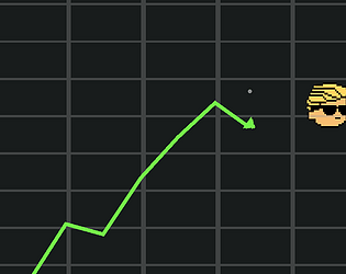
The arrowhead for the line on the graph is a bit off, and gets worse at higher rates of change.
Pausing and unpausing during the beginning speech when Bogdanoff takes control of your crypto will skip the speech.
Selling only part of your holdings in crypto will make the graph turn red, depending on how much you sold. The graph will turn green if you buy more, having already invested. The graph color should remain unchanged by these transactions.
You are unable to interact with the pause menu if you open it up in the shop.
 Regarding the hitboxes, the line itself won't collide with the hitboxes of the items on the graph, it's the faint little circle in the middle of the screen that will hit them. Though making the hitboxes bigger should make the game a lot easier, since I often find it's hard to time when to hit the Pump/Crash button.
I totally get the square aspect ratio thing. Or maybe even just having a circle as your field of vision, instead of fullscreen or a square. I had big ideas for this game, but I slacked a lot on this game jam, and by the time I was at a point where I wanted to implement all those ideas, the time crunch was too great, I had to make my levels (without playtesting them very much) and then ship the game before the deadline ran out. I'm really happy you played it and thought it was fun, though. Maybe I'll work on it more over the summer?
I think, for now at least, the hardest part about the game for me is timing my movements to get the sword to hit the opponents. This wasn't really an issue until the first boss. But its a cool idea nonetheless. I just need practice. Otherwise, this game is really amazing overall! <3
Maybe, start the player off with more manageable enemies? So that they can more easily get used to the timing skill that is involved with dealing damage, without having to worry about dodging bullets so much. Keep in mind, I'm not good at video games at all, I was failing from the very get-go lol.
For sure! I was trying out a different way to control the character than from my last game (bypassing input manager axes and just take the inputs in directly, so I don't have to mess with the values in input manager), and I got lazy and didn't add in the arrow keys for movement. Thanks for the nice words! I'm glad you enjoyed my game!
Game play is definitley something I need to focus more on in the future. I did intend for this to be a trial and error-y game, though. I didn't give this much playtesting as I was mostly focused on making prefabs and assets, and gameplay kind of fell as a result. I hope you were still able to enjoy it for what it is!
Thanks a lot! The key thing is kind of brutal, and I got that from a lot of people who played my game, but by the time I had to start actually making levels and gameplay, I didn't have enough time to rethink or re-code the assets I already made (Took until Sunday just making assets, prefabs and general code for the game, with a healthy amount of procrastination sprinkled in there). The spike hit box thing was a purposeful thing that I did, even though I didn't want to do it. If I made the hit box smaller than the tile size, the player could hang off the edge of the tile to walk around it, and I didn't know how to code it differently to fix this. Lots of general laziness on my part with this game, but it was my first time making a game with Unity and I only had a week to do it. I really surprised myself with how nice this looks and I'm glad you feel the same. Gameplay is definitely something I'll focus on in the future though!
Thank you for the criticisms and the compliments! <3


