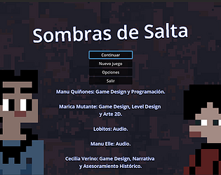
Holi, lamentablemente arrancamos el proyecto con artefactos que no nos permiten compatibilidad con web :(
lueegue
Creator of
Recent community posts
Heeeey I took the liberty to submit Material Maker to Itch as a tool to add in the metadata of games. We have used it in our pre-alpha version of Qhipan (https://messy-bytes.itch.io/qhipan)
It would be awesome if you also submit it (goint into analytics, metadata of a project you'll see the tool options and can suggest with the link bellow the field)
Material Maker is awesome, it was my introduction into authoring materials and I will keep using it as long as I have brain.
(And as soon as I get a job again donate!!)
Thanks for your work.
Heeeey! Glad to see more of this game starting to come out.
I got some feedback and it might be a bit too much but it's free!
1. Game Feel:
- Most game queues and hints feel very shy, the graphic style could definetly go ESPECTACULAR, go all for it. Metroidvanias don't need to be coy with the player.
- One aspect of this is enemy pattern signaling, making obvious decisions here won't hurt the game difficulty, and this ties directly to the animation principles: Anticipation, Action, Reaction. And this three weaved with Exageration.
- This applies, tho condensed in order to feel responsive, to the player actions. Right now Dashes feel like an interrupt while parrying feels like a slow block. This makes the parry action confusing.
- Tieing this last two bullet-points is where I think there is still a search for that sweet spot for player agency at the moment to decide the parry, making sure player can tell between parry-able and unblockable attacks. (Remember most game keep unblockable attacks in few minion enemies to highlight this as a Boss Trait)
- IMPACT! both enemy and player attacks do not feel impactfull enough, there is a ton of feedback lacking, and honestly the dmg bonus from no hit combos is confusing, figured it out while thinking about it after the playthrough (this is another place to go ESPECTACULAR)
- Enviroment queues are also a bit lacking, closer tho, but here is where this game make use of obvious signaling to player, cracks, weak appeareances, not just old looking.
- I like my metroidvania with secret walls, chests laying around like they are right now feel like an afterthought (for a resource I can't even use) and substract from the current demo experience.
- Hide those chests, or put em in a route where you tease the player first to make em explore in the direction they can't penetrate directly.
2. Setting and Storytelling:
- Where am I? Who are this people? Why are they so helpless? Why the boss lays eggs?
- The look is COOL and thank the dev-spirits you are not dealing with banding on your paralax environments, but everything feels disconected, roaming around without really belonging.
- Enemies are mutants? Monsters? There is no clarity if this creatures are coming from the capsules I see laying around or if they are demons like the first boss
The game has excelent bones, I see the vision but I don't get inspired by it, if you guys work more on that I can assure this can be a very succesful metroidvania!
Finding the ghost band playing the soundtrack was the cherry on top!
The game idea is very fun, it gets repetitive but I understand the jam contrain to start complicating the necromancer stage a bit more. I like that you don't die to ghosts, but some more spice on how, where and WHY the parts to fix our poor test subject appear and are obtained would benefit this game if y'all decided to do some more with this.
The art is very much in my lane! Would adoooooore some animations (nothing fancy, New Grounds level)
WELL DONE!!! First of all the puzzles are good, light fun. The art is OUTSTANDING and makes the lightness of the puzzles absolutely justified. It's an enjoyable piece all around.
One good fix would be to make sure the UI is adaptative even in web, and maybe take it in the same direction aesthetically.
Omg I was able to tie my laces in the 2nd attempt!!
I will give some feedback just cause I can: THE TUTORIAL SCREEN. Dawgs think of readability, I know the game is suposed to put you in a place of "your body is a mech and you will pilot it" but soome more semblance of order there could help.
Aside from that, excelenteeeee
I enjoyed it! Got some incredible tin machine vibe.
Got some feedback:
- The chromatic distortion shader is nice and all but makes reading text very very dificult, always tune for usability first.
- I don't know if this game needs to be so "paused", building and efect can happen real time and would add some more rythm
- Left click to place, Right click to remove pweeeeese.