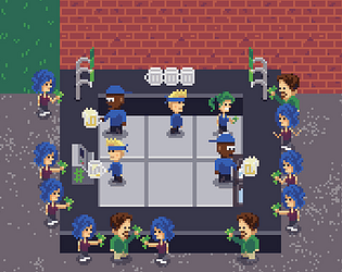
Thank you!
Lou Bagel
Creator of
Recent community posts
oh, and if you didn't know, Dave has a lot of screentime already: https://loubagel.itch.io/daves-coffee

Thank you for leaving a comment!
The boss guy sitting at his desk, he was going to go adjust the thermostat if you made it hotter and the female working in the office below was going to adjust the thermostat if you made it colder. But I thought I would "simplify" that area at first to see what players do, as well as not having to build a thermostat UI, haha. So right now, that guy's purpose is only to block off that path to your lunch. I thought I would pack the bottom room so player's first instinct is to try the top but see it is blocked. So maybe it isn't the best level design - which was what I was hoping to learn here!
I believe the windows version 1.0.4 is working now! I created a few videos on my old PC with it and didn't find any errors, but anyone let me know if you find any!
I should have tested more on my PC before, I honestly just got kind of excited and forgot, haha! Once I got focused on updating the page and making the banner art and such I was just ready to hit release!
Thanks for trying it and leaving feedback!
For the chance/random, were you thinking of the room that has three characters walking? That one was random - not in the mathematical sense but in the game design of it, as each of their routes were independent of each other and had different durations. I'll take the feedback as to be more intentional with the design.
The last room, I was intending to have different ways to solve it. As I worked on it I thought maybe it could be an "easy" way of using all the distractions (there are 3 in there) and a "hard" way of not using any and just do timing. I think the "hard" way ended up being too easy. I might play around with that room more and also be more intentional with routes kind of "syncing" there as well.
Thanks again, this really helped!
Hey, a couple things I thought of for feedback while playing:
- The main player sprite blends a bit with the background; would be good to update colors to player stands out more
- The items, whether power-ups or obstacles etc, on the platforms are a pretty small and not obvious what they are or do. They could probably be made a bit more intuitive.
No bugs or anything and works well, so good job overall
Thanks! I love that you refer to MGS when talking about this! Its some of what I was going for and love the series as well so such a honor!
I was actually thinking while watching your play through that I feel like the range of her vision should be reduced. I believe her cone is currently a 45 range of vision but I might try out something like 30 and see how that feels.
Pretty cool game!
Only played one time part way through. It is pretty rough not being able to change the order of units once you place them, but can see how that makes it a big part of the strategy once you know what kind of units will be available.
At certain times it seems a bit unclear on what to click on or what you can click on. Took a bit to realize that you could upgrade units. Also, never really understood the freeze and the interactions when clicking on the units to buy.
Cool concept!
Couple of feedback:
- I was lazy and didn't read the instructions at first since they looked long. Went back and read them after a couple games and they were good - but you might be able to make things a bit more intuitive in-game
- Even just putting the word "Power-ups" or something over the bar of available special items
- Having tooltips or a text bubble when selecting a power-up would be good even if it is a short description
- It seems like the power-ups came in pretty fast. It could be a bit more strategic if you get less of them, but with more it is kind of more fun ha


