
Haha, yep! You can also (rot13) punatr gur fbat naq nqwhfg ibyhzr as well. Glad you enjoyed that!
A member registered Jul 15, 2024 · View creator page →
Creator of
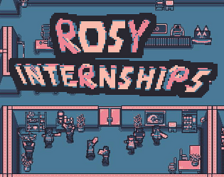
Combo interns to defeat the corporate overlords (or join them?)
Strategy
Play in browser
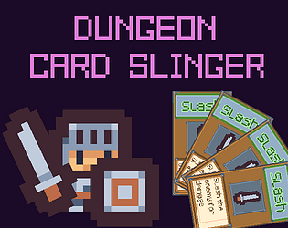
Chaos Unleashed in this Card Game + Autobattler ... inside another broken game!
Card Game
Play in browser
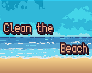
A simple runner game about collecting trashes and treasures at the beach
Play in browser

Risk your life and limbs (not literally) in this action stealth game to save your dog from the shelter!
Action
Play in browser
Platformer Pathfinding Tool in GDScript 4.4.1
Run in browser
Use your mutated Hungry Sword to get to the bottom of the nature going berserk mystery!
Platformer
Play in browser
Recent community posts
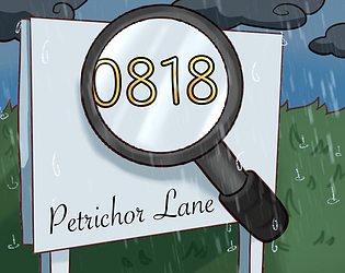
itch.io Community » General » Release Announcements · Created a new topic 0818 Petrchor Lane - Easter Egg Update. More exciting news coming soon 😉
Hello everyone!
Ever since our launch of this small jam game for the GameDev.tv 2026 game jam, we have received greatly positive feedback from players from both the jam and the general itch audience. Our passionate team are beyond grateful to have been able to share this game with you and read your kind comments.
A cozy detective experience
For those who hasn’t played the game yet, here’s a quick overview: As the new building manager of the 0818 Petrichor Lane apartments, you need to get to know your residents well. Learn about their lives from the clues in the scene and fill in their info sheet. A different kind of detective game, where no grim murders took place, but just a cozy, low-stress deduction experience, perfect for reminiscing a chill rainy afternoon on a hot summer day. Play now on your browser!
Long overdue feature
A suuuper important update for the game is that it now comes with a small Easter Egg for you find and interact. It was originally planned to be included in the jam build, but better late than never and we are pleased to have finally implemented now ☺️
Here’s a tiny hint:
Even more news coming at ya
Another piece of news (if you can even call it that🤣) is that there is some very exciting announcements for the game we want to let everyone know of very soon. But right now we cannot say more than that. If you enjoy 0818 Petrichor Lane, consider adding it to your collection or follow us on itch so you can be notified when we drop the news 😉
Until then! Much love from our team to you ❤️
Thank you very much for the well wishes!
Yeah I think the idea of having unique marbles are really cool. There are all kinds of abilities/effects you can have like bounciness, unmoving wall, or maybe a ticking time bomb that explode after a number of hits XD? Haha, just some off the top of my head. These kinds of games definitely have a lot of room to experiment with, but you don’t always get all the time you need for implementation in a jam. I think you could find a lot of inspirations from the modern block breaker genre (games like Ball x Pit).
I think having slightly different controls based on abilities/characteristics of each marble is also not a bad idea, as long as the core control scheme is the same. I wouldn’t make one marble controlled by the keyboard and the other one by pressing the Spacebar for example. But I think an even better solution may be to be additive, rather than subtractive. Discovering new things to play with rather than having new restrictions always feel more fun for players (although some players definitely enjoy a challenge as well).
What I meant by perspective is that in this screenshot for example, you can see the top and the bottom of the lamp post and the shading follow horizontal lines, but the rest of the ground are diagonal lines, so to me it looks off. But maybe other players don’t mind it as much (seeing it’s a jam game and all). I may sound nitpicky sometimes haha, but often I just want to point things out as stuffs that could be improved post-jam, not necessarily things I take points off for the jam rating.