Is Torulf getting a new sprite?
Korikali
Recent community posts
Personally, I thought the reason he tought so much about these specific characters (Lake/Rune/Mikko) was because they're the only ones he actually talks to/knows/considers friends as opposed to the rest of the characters. Also, Lake/Mikko were the last people he talked to before he started thinking about them.
Spoilers for all routes below.
Think Ollie becomes unsettling in every route tbh, like you said he seems to take on a manipulative persona in Trev's route.
In Don's route he looks like he's about to become aggressive with everyone except Don.
In Sam's route, he becomes incredibly submissive and let's Sam dictate his choices and do whatever he wants with him.
Spoilers below, please dont read if you haven't played the game.
So a bit of feedback,
It would be better if you blur the background images that aren't drawn, similar to other VNs, the humans in the images tend to interrupt immersion.
Artstyle is really cute, though Ed and Cypress's heads might be a tad small compared to their bodies. Also from what I feel and see, every characters necks seem too thin, try and thicken them a bit.
In terms of dialogue, I would say place the MC's thoughts into italics or something to indicate that they aren't being said out loud, can be confusing even if there are quotes on vocal dialogue and none on thoughts. Like :
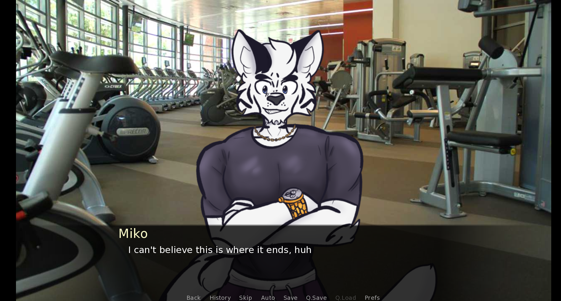
Also for certain sections of dialogue, it gets rather close to the menu, I think limiting each section to 4 lines would be better. For instance :
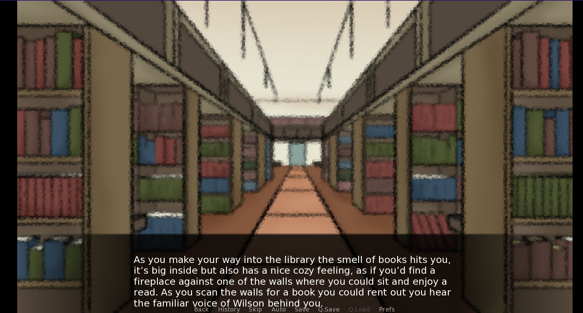
In terms of grammatical fixes :-
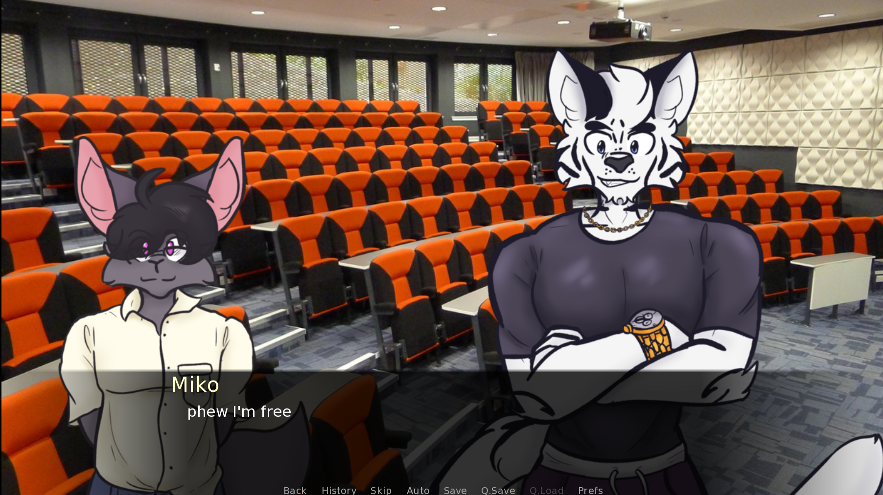
I believe the "phew" in the sentence should be capitalized.
There are few more sentences that aren't capitalized, after the gym section.
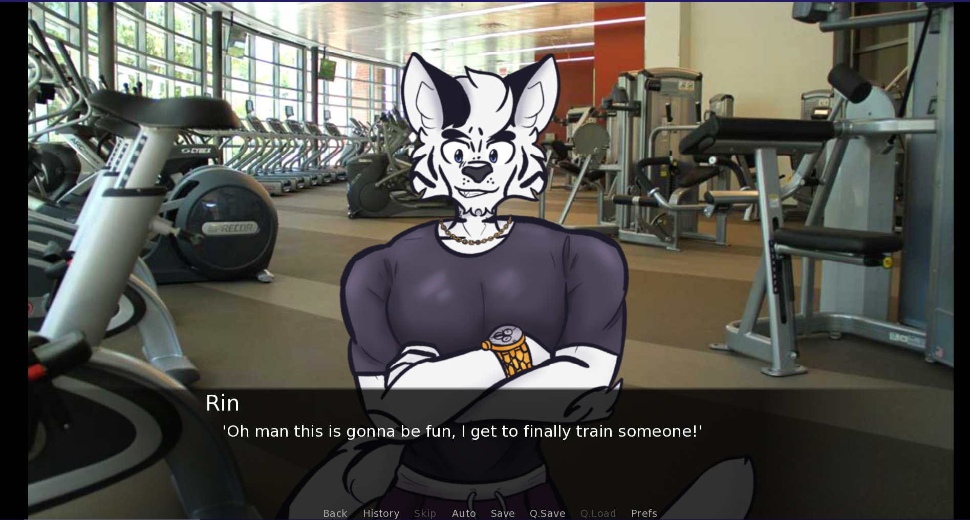
It should be "I finally get to train someone!"
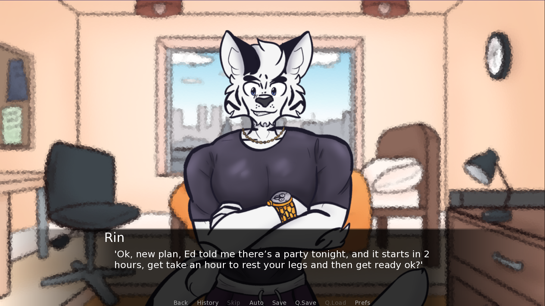
The "get" before "take an hour" shouldn't be there.
There are a few more, but they all happen after the choice of destination after the orientation.
So far that's all I've picked up, I'll update you if I find anything else, assuming you would like it.
Take care!
Hey Harmonious,
I know I mentioned a few oddities with Sam's angry sprite, but after the last update I decided to take a closer look at the sprites of the characters that we've seen and I've noticed a few more odd areas.
So in general I think there could be a few more details added here and there, like shadows and folds in clothing (for example, in Sam's angry sprite, there would be folds where his belly is as he's bending forward and the clothing would bunch up a little) the sprites kind of look flat as they are now (it isn't a major issue though, just thought i'd mention it)
So going back to Sam, in his neutral sprite his left arm looks like it's behind his back as the dominant line isn't from the arm itself, it looks a lot better in his plaid shirt sprite. The same goes for his shocked sprite, his left arm should be infront of his torso, so the dominant line should belong to his arm, also his left elbow is too low or too big (could be either). This is due to the angle of his body, where his left side is slightly more forward than his right.
For Trevor, the one that stood out to me the most would be that his knees are too high. Also I think his torso might be a bit small (this is with his shirt, I'm not sure what his sprite looks like shirtless so it could just be my eyes playing tricks on me). In his sad sprite, his right elbow is too low, as it should end just where his waistline is.
I've already mentioned Vee in the feedback survey (this was before I started looking extensively at the character art)
In terms of CG, the only thing I noticed was in the image where the MC is standing infront of the beach, he looks like he's missing his right shoulder.
That's as far as I've noticed. I probably sound very nitpicky, and I'm sorry for that, I hope I haven't stepped on any toes with this comment. Please tell me if I've gone too far and I'll stop.
Take care!
Hey there,
I have to say, Socially Awkward is an interesting take on the back and forth personality of someone with insecurities ( I imagine that's what you were going for? Please correct me if I'm wrong ). Jayce is a genuinely fun character to play, I like how spontaneous he can be, both for good and bad. Also, it's great that you gave us lithe, ripped and muscular romance options, thank you for that.
Character design wise, I have to admit that they all look great, especially after the redesigns, Rask looks like a completely new character (face wise) and honestly he is really cute, though John's pose looks awkward to me (looks strenuous to hold it). Their personalities are all really unique as well, Tom was very surprising to me, while John felt like an amazing best friend.
It's a bit short storywise to get a proper idea of it other than it's focused around insecurities of school/real life, and how each character helps ease them for you (at least that's what I thought from the description and playing it) but it's intriguing regardless and I'm very much looking forward to whatever is planned for future updates.
Overall it's a really good game from the little that's available, I haven't noticed any bugs or mistakes, though I see some have, but that's tied to loading old saves. So, great job with it and I cant wait to see more!
So, I gotta say I really like this VN, the artstyle is really quirky and cute, the characters (while we dont see much of them) look and sound really interesting in their own rights, and the story seems like it could be interesting, but not much to go on in that department.
As far as I've played, my only gripe would be Sam's sprite for when he's angry? He looks oddly like a toddler when his head is enlarged and his arms are drastically shrunk. It's a minor gripe really, though I thought I should mention it.
Overall I have to say I'm quite interested to see where it goes from here.
On the topic of redesigns. This is more due to curiousity than anything else, but why is it some characters have hair and others don't? Provided, Soutarou is a lion so it makes sense, however the others aren't, so I'm wondering if this topic was ever brought up in the redesign or not. I imagine it could be that the characters are "bald"(if you can even call it that?) but I was still curious what your answer would've been. If it leads to spoilers then I understand completely if you dont want to answer.
On the topic of human or anthro, the difference between Nekojishi and Morenatsu is that the anthromorphs in Nekojishi were spirits/gods that could only be seen by the protagonist (other than Shu-Chi who possessed a human but even then other humans only ever saw him as a human as well) so lorewise it isn't completely awkward for humans and anthros to "coexist". Kingsguard does the whole human and anthro (beastmen in the story) situation rather well too, with them being two completely different races that warred with eachother due to racial prejudice, however currently there is a fragile cease-fire between them, but that prejudice still persists, which makes the protagonist falling for beastman somewhat taboo, there are also moments when the differences between them are actually shown, like whether it's physical, emotional, etc. Morenatsu doesn't really delve into why humans and anthromorphs exist together other than they just do, which can be fine dont get be wrong, however in my honest opinion that is rather awkward to me, like why do humans and genetically superior anthros exist together with there being no discrimination in the slightest? Considering that "humans dont like what they dont understand", why wouldn't they question the disparity? Also Hiroyuki seemed to be the only human(?) I mean other than his family, correct me if i'm wrong. Truth be told human Hiroyuki felt incredibly out of place in the story, but that's just my opinion.
As for the topic on being able to imagine oneself better with a human protagonist, I dont think everyone feels that way, I specifically dont. When I play visual novels, I play it for the story regardless of who's the protagonist. I personally don't enjoy imagining myself in each novel, as I would feel incredibly out of place and out of character if I did. I do like foxes more than other species, but that doesn't stop me from enjoying tons of other novels with protagonists of different species, for instance, Echo you play as an otter, In Identity you play as a scale(i forgot the exact type), a cat in Great Troubles/I Promise, etc etc. I think you're projecting your thoughts and feelings through other people as well, not everyone who plays this game feels the same way.
Stating that people will drop the game purely because there isn't a human protagonist is a pretty big assumption, you're honestly going a bit too far with that statement. They have specified as to why they changed Hiroyuki into a snow fox, it wasn't just because of the "fursona" reasons you mentioned (assuming that's even the case) they changed it because it was a play on his name as "Yuki" can mean "snow", and another reason is because Hiroyuki can't handle the summer heat as well as the rest of them. Either way an option to play either human or fox could be possible and appease everyone, but that'll add even more confusion as there would need to be more human characters for the situation to even make sense.
The whole point of a visual novel is to tell a story, if the plot has holes, then it isn't a very good story is it? why exactly is a human protagonist compatible in the morenatsu universe? where does Hiroyuki fit in society? if there are humans and anthros coexisting, what is the society gonna be like? having humans and anthros together adds a different layer to the story, which in itself could be annoying to fill. Comparing Morenatsu and Nekojishi would never be fair because the anthros in Nekojishi aren't a part of society, they're gods/spirits that only the protagonist can see, which already answers the question as to why the story involves a human and anthro getting together.
I saw the Leo CG as well, however I imagine that's just an outdated piece as Leo got an appearance rework. The reason I pointed out Koshiro's is because his CG is using the reworked appearance. (I stress that I dont think the image as a whole is bad or wrong at all, just that single part felt out of place or incomplete)
I hope I dont come off as insensitive nor entitled, I just thought that I should point out something that I felt was inconsistent with the other very detailed pieces (that isn't considered placeholders)
Firstly, I have to say, Kingsguard is one of the few if not the only visual novel that I know where I'm as heavily engrossed with its story and characters, Koshiro is my favorite personally. His backstory is really interesting to me, I feel I can relate to him, emotionally and mentally speaking even with differing circumstances. I genuinely just want all the good things for this poor boy.
Secondly, I just thought you should know, in Koshiro's(shocker) route the CG art is a little off, the style is amazing, however his manhood looks fake or unfinished(assuming that's the actualy case). It's not major, but it stood out to me amongst the rest of the incredibly detailed art.

