<3
Kirijo
Creator of
Recent community posts
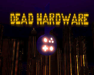
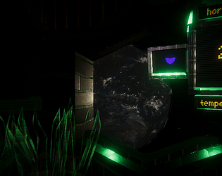
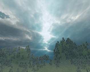
Wow, this is an amazing sensory experience. In terms of "non human perspective," I found myself stumped in realizing the legitimate perspective of the thing I whose perspective I was representing through visual signals instead of mechanical inputs. This recognizes the visual signals I think perfectly. You have a very strong taste and even more important, you have the ability to realize the taste in reality.
Critique: This seems more like an audio-visual experience that would be a part of a Bjork or Arca music video or something, so it seems like the player input is almost secondary to the experience. There is the feeling of confusion and trapped ness that I am experiencing from the suffocating darkness of the world, and I can tell this is purposeful and does interact with player input, but in reality I struggle a bit to understand what I am doing and if it makes any impact on the "game state." I guess, you need to reflect and think, "is there a game state in this work?" "Do I want ludology to impact user experience?"
I love this game! The concept is so funny and really hits that point in reality where people are like, "ugh, the clock is messing with me!" It's a great exploration of such a feeling, and I feel like a feisty time snatcher when I engage with this game.
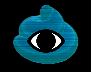
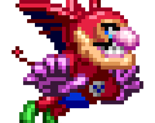
This game sort of reminds me of WarioWare in the best way. I could legit see it in one of the renditions. The eyes just need a spiky mustache underneath them and you're good to go.
Critique: I think the art is really good all around, but the eyes seem a little stylistically inconsistent with the rest of the work. Maybe a way to fix this would be to go back into them and give them a drop shadow, so they look cartoony 3D? Like cell-shaded contemporary Mickey Mouse energy or something.
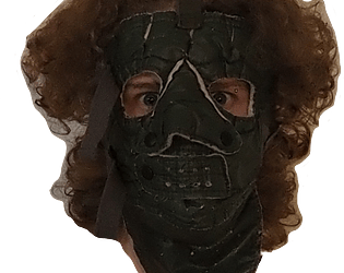
This game definitely does the whole "bloodthirsty killer" energy incredibly effectively. The ambience was so intense it was a little stressful. This was good, though, you very effectively caputred the creepy, intense thing you were trying to portray, from the killing sound to the background music to the post processing you used. I especially loved the framing on the User Interface that gave the player experience a deeper cat iconography.
Critique: This is really small but I think the cutting sound, although very effective, its quality didn't quite match the audio profile of the music? This is obviously a critique that's reaching for SOMETHING to critique, so it's a super small detail that I personally don't know how to fix. I feel like everything else fits together so well that's the one loose end.
This game.... is enjoyable. Very much so. I was conditioned to press the button over and over. I was the rat. I got the concept. I have grokked this.
Critique: I would decrease the mouselook sensitivity a bit. I would also like some more "I am a rat" iconography in the box, maybe Dr. Skinner peering in from above or something. A little bit more "AHH" to the whole situation I think would be a benefit.
This is great. You really turned such a strange prompt into such an amazing critique of games. Love memes of Doom. Who doesn't? I'm sure you'll be itch famous from this or something. Music fits perfectly.
Critique: wish it was easier to tell if I was hitting enemies or not. I also wish the walls had textures.
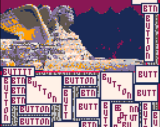
Love this. Its like super different I feel like from what I've usually seen of ur stuff but also super strong. It reminds me of the stuff u post on IG in the best way, like a physical pictorial manifestation of such things. The word jumbles are very good and super expressive. I like the music but I wish it looped a bit more smoothly (although this roughness may be intentional, unknown).
aksjhdfgkjahdgj I love this so much tbh. When you described it to me irl I was like "eh yeah" but playing it now im like "EY YEAH." This is like the epitome of mocking and celebrating found objects in the best way. i guess all of our games are, but this is almost a direct interaction with the concept in a great way. I love the voice modulation in the beginning. I think there should be more beatboxing in this game with my voice. Otherwise it's great. Oh there should also be raycasts.
There... was something addicting about this game. I really wanted to see all the skins. I couldn't stop playing. The noises were so good. It all felt very good to play. Good job. Also I loved the art of the street and the fire hydrant and its various skins. They were exciting to unlock and looked genuinely interesting for fire hydrant skins. Like you do a better skin design job than a lot of games, it felt so good. Wow.
Critiques: I want the wrench to be in a different space in relation to the mouse. Like I want the mouse to be "holding" the wrench part that would be held by a human hand. I also think the UI buttons could look better and be more consistent with the rest of the art style (for example the line width used with UI vs the art of the street was absolutely different).
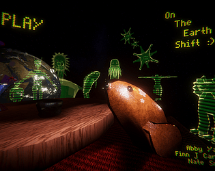
This game is really potent. I like the glub glub weird sounds and the like tinkle tinkle weird sounds. I have no idea what they're for but I like them. I also love the textures you use on the television and smaller television. Also I really love how the introductory menu looks, I think it's very easy to rush past such a thing and be like "oh this isn't part of the game let's just dev it and get it over with" but this one looks visually thought out and purposefully put together in a very nice way.
In terms of critique, I think I wish the camera controls were a bit easier to understand. It felt like I was pressing all of the buttons all the time and nothing was happening or too much was happening. Maybe just having the A and D keys rotate the camera on a pivot would be more effective. Yeah I think generally there are some weird things going on with raycasts in this.
I love this so much, it's so soothing to have open and just watch. I love this... crab? I think it's a crab, it's like a cyborg crab I believe. I love all the little emotes it has. Also beachball and the water textures are... tres bien. Lol. I could see this being a great screensaver or desktop background. I love this little crab so much. I love its little emotes. The way you have it as a pet game but we aren't directly interacting with the crab is also very good, feels Fresh.
My only critique is I wish that there were sounds when spawning/despawning the sound and water.
Drew this is... potent. It definitely effectively mirrors the feeling of having a pet rock. I love the tone of the words you use in this game for the UI, "feed" and "play" are great because of the quotes around them.
My biggest critique: I would prefer if the UI were more consistent between the buttons and the cycled through strings that appear when you press the buttons. But this may have been purposeful! Like the fuzziness of the button text may have been to sort of have this very specific sarcastic feeling, so idk. Anyway I still think a little more consistency would feel better, like all of the text having the same outline or being the same size. Another thing I would like is if there were more string to be cycled through so it would feel a bit more fleshed out.
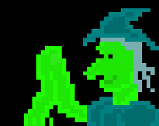
Aww I love this so much! Its like one of those quizzes from online or like from Pokemon Mystery Dungeon but it seems really well done, almost a sorting hat energy (which every player loves, the key to any introductory fantasy or class system or whatever). I think this is super enjoyable and really showcases your tastes in a great way. I also love the music (I think it's like the shop music or Beetle's music?), it definitely soothes. I think the only input I have is that when I press the right or left arrow keys I'd like a small sound effect, sort of similar to the intent that you have when the player chooses one of the options a sound effect plays. I'd also love if the little wizard had an animation of some kind but that might be a bit too out of scope for a jam like this.
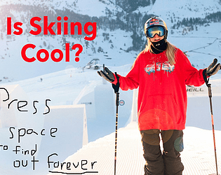
I love this game. It's so funny, it's so contemporary, it's so "on trend." :P Yeah honestly your sense of humor really comes through here and it's potent and good. I love being the gorilla, I love the animalistic feeling of spamming the spacebar only to get an awesome middle finger at the end. "Perfectly captured."
I guess the only critique I have would be to add sound effects or something? I don't know if these would necessarily add or detract, because they'd be sort of forcing the player, through their implementation, to continue to think about the game in a specific way, whereas I think a big strength of this game is the fact that it's so blase and raw with just the crazy tapping of the spacebar. But that could be something to think about. I think all the other things utilized in this game (art, player input, writing), are very effective and do what they're meant to. Aka, good job!
Hey Nate, this is so peaceful and enjoyable to play, I really am having a good time with it. I love the water shader you're using, especially with the little pink neon edge on it that adds a little bit more visual stimuli. I also love how it feels to skip the rock, the bounce on the water is exactly what I want when I press space and it goes back up in the way I expect as a player.
In terms of critique, I think I would spend a bit more time modeling the rock, or adding something into the game to pass by the rock as it goes forward, in order to continue to keep the player's attention while they're playing. I don't think such a thing would even have to impact score, maybe just a buoy or a seagull or something.


