
Thanks for your quick reply. I guess it's time to hook up my Joy Cons :D
A member registered Apr 22, 2018 · View creator page →
Recent community posts
itch.io Community » Game Development » Get Feedback · Posted in I test your game and give you feedback.
Hi,
I've just released a new version of my demo and would be delighted to hear your feedback.
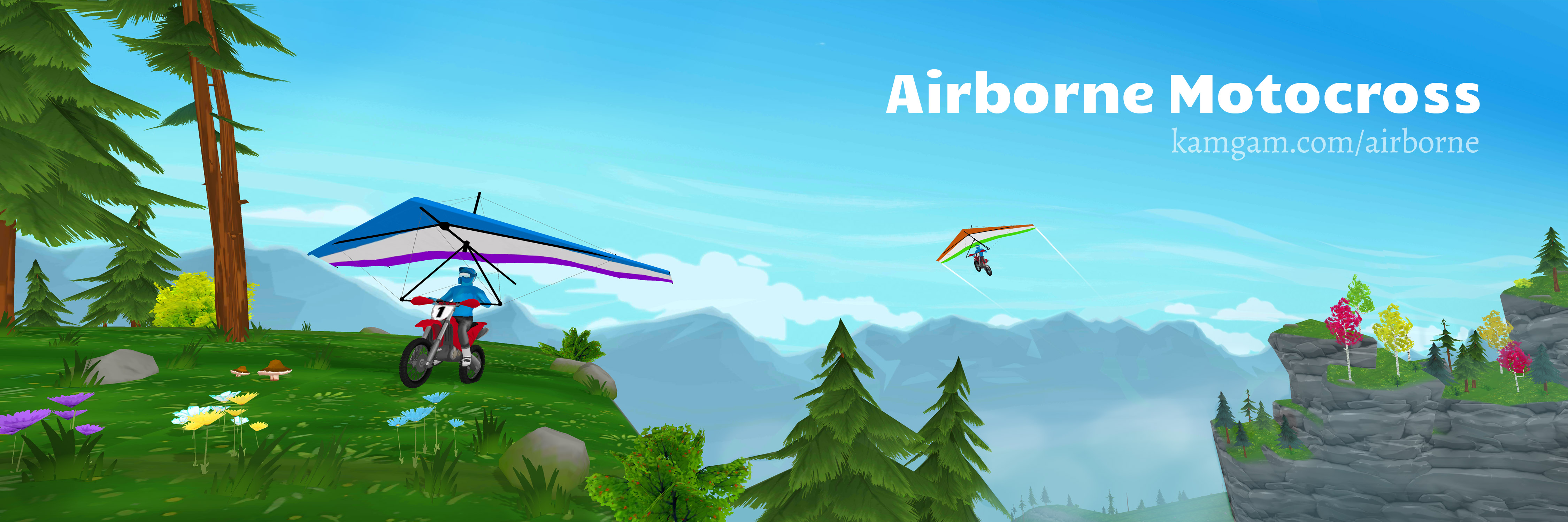
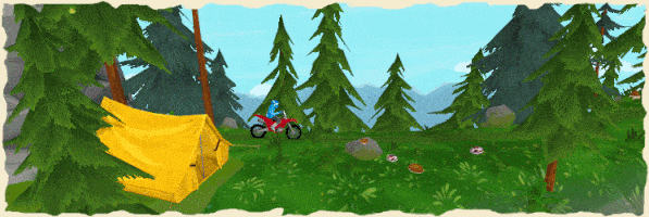
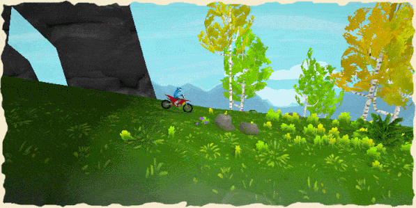
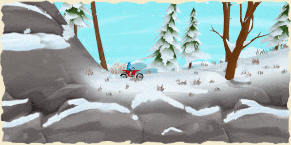
It's a motocross game with exploration, loot and puzzles.
https://kamgam.itch.io/airborne

Have a nice weekend everyone!
itch.io Community » Game Development » Get Feedback · Replied to Leander in Dark Jump - Jump and run in the dark
itch.io Community » Game Development » Get Feedback · Replied to Leander in Dark Jump - Jump and run in the dark
Hi, thanks for making this :-)
Here is an early version of my game. It's a motcross racing game with exploration and (optional) physics puzzles.
There is a tutorial level and a demo level. Playtime should be around 5-20 minutes. I am looking for feedback (especially on the controls).
You can find it here on Itch:
https://kamgam.itch.io/airborne
Or here on the website:
https://airborne.kamgam.com/
Direct Download Links:
Windows (zip with .exe): https://airborne.kamgam.com/build-files/AirborneMotocross-0ca5962.zip
Android (.apk): https://airborne.kamgam.com/build-files/sbr2-v1.0.0-b206.apk
There is a short feedback form within the game (if you want to fill it out).
Looking forward to your comments on the game!
Thank you
itch.io Community » Game Development » Get Feedback · Posted in My little racing / exploration game is looking for a name.
itch.io Community » Game Development » Get Feedback · Posted in Would love some honest genuine feedback on my Challenging Platformer game "Illusion"!
Hi,
I played your game though I have to say I am not an experienced platformer player.
Very nice art and sound. I also like that everything can be controlled via keyboard :)
Do you have controller support (haven't tested it)? - forget I asked, just read that indeed you do support those (shame on me for not reading it all).
Some of my feedback will be critical, so I hope you don't mind. It's meant to help describe my experience, not diminish your achievement with your game . What I am trying to say, don't take it personal ;)
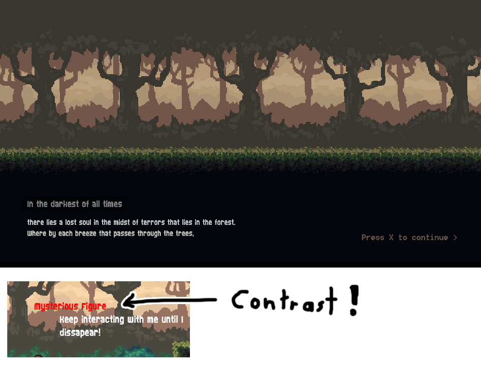
1) The scrolling text in the intro may be a common thing in your genre (not sure) but I think I once read that it was originally done in old/handheld games because of restrictions like screen size. You don't suffer from these restrictions. Don't scoll your text, it makes it hard to read. I constantly have to reposition my eyes to follow it.
Another "issue" would be speed of reading. Some people read faster, others solwer. Your game assumes a constant reading speed which you defined for all your players. I would rather have more lines on one screen with a "press X to resume" button. I for one found it too slowly timed, yet hard to read (hope this makes sense).
I like that scrolling background (trees!).
Just and idea but: if you have most screens with multiple lines of text and just at the end a screen with only one line, then this gives that lonely sentence a feel of importance. If you do it for every line then that's no longer true. I suggest to keept the tool of the lonely sentence in your box until you need it for the last intro screen.
One more (sorry): If I press any key the "Hold space text" flashes ALL THE TIME through the intro. I know it's meant to grab your attention but again this distracts from reading your text. And I think it's an attempt to fix the "skip/reading speed" issue which could be avoided. In addition: it is hard to look at the text while something is flashing below. I have compiled a screenshot of how I would have prefered this at the end (just an idea ^^).
Also the font feels a bit heavy on a fullscreen monitor. I am not sure if you are targeting some smaller devices, so maybe it's necessary for legibility but maybe another font for the big screen might be an option? I spend so much time on this because your game seems to be a story heavy one and then you should make reading as pleasant as possible (imho). Also, why not use (Escape) as the default "skip" key? Or maybe just pause the intro when escape is pressed. Think of people being distracted unexpectedly (or slow readers).
2) Not sure if a game with an installer is the best for people to try it out. Can you make a WebGL build? I assume you would get more people to try it out with a web build.
3) Love the Desktop Icon :D - It looks cool!
4) The Menu does not support mouse clicking - maybe hide the cursor then. Found myself trying to click. Gotta say: I tabbed out a lot to take notes, so maybe not an issue for "real" players.
5) I don't like the invisible wall on the left at the start. It breaks immersion immediately. Can you put a rock or something there?
6) How are those jumps timed? As I said I am not a platformer player but it feels like the character falls very fast. I remember reading once that super mario kind of defined 1.# seconds as "the" duration for jumps (I assume you already know :). Maybe it's spot on, not sure, felt quite fast to me. I would have liked to jump with "space" but that's just my personal perference.
7) Please put your controls into the pause menu or somewhere into the game. I had to browse back to itch to find it (it's not on the download page therefore I really had to got "back"). I know the figure teaches it but hey: I didn't know how to jump because I am lazy and don't read all the text on your itch page (I am exagerating of course, or am I?). Why am I picky about this: well not many people will do what I did. Instead they will just rant about the controls (unjustified) and quit (have seen it happen). - I like that tutorial character btw. :)
8) The contrast of the red text could be better (have scaled it down in my collage at the end to make the effect more visible). It's hard to read.
9) Sadly I failed at the wall jump. I got it once, jumped down to retry and never made it up again. It's just too difficult for me (call me a noob if need be, I can take it ^^). Those timings are surely doable but it takes practice I assume. I am a firm believer in that a hard game should never be hard because of the controls. Yet again, I almost never play platformers so maybe it's just me. Here is a nice gdc talk regarding "make forgiving controls". Maybe I can persuade you to watch it: https://gdcvault.com/play/1026606/Forgiveness-Mechanics-Reading-Minds-for
Sadly I am out of time for this one. I hope my feedback was helpful.
Btw.: don't listen to what I say. I am just one random player.
I once read that you should not cater to the wishes of your testers but rather look for the root cause and fix that (if needed). After all, you know your game best :)
Thanks for making this and putting it out into the world.
itch.io Community » Game Development » Get Feedback · Posted in Dark Jump - Jump and run in the dark
Hi,
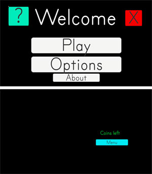
I played your game but it seems I have run into some bugs.
I have compiled a screenshot to illustrate the problems:
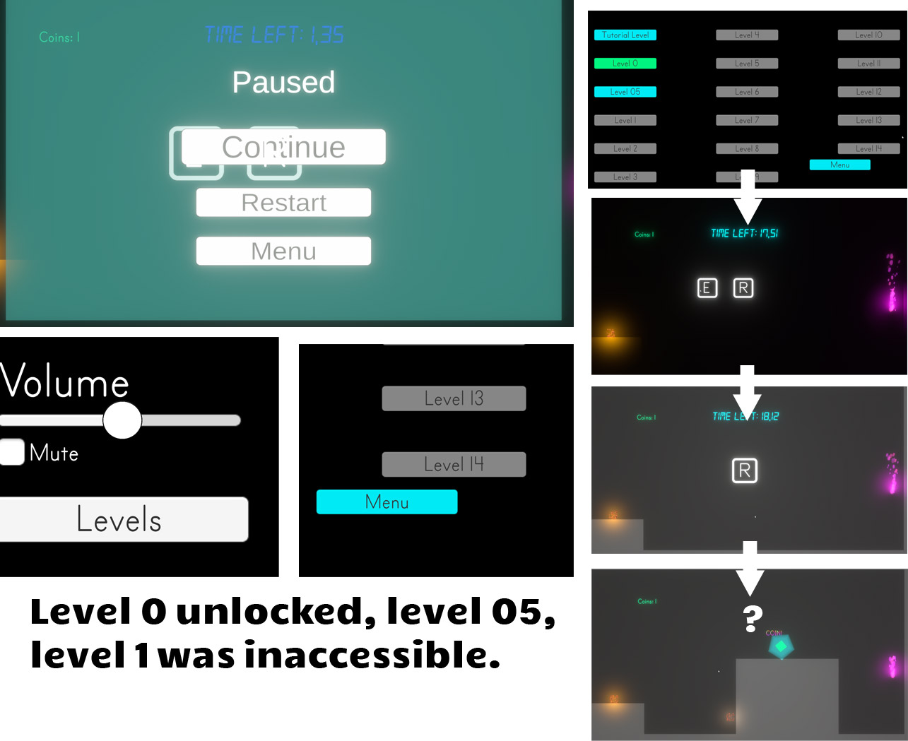
1) The ui seems all over the place. Maybe you have misplaced some of the ui anchors. Try to set the "game" view in unity to "free aspect" ratio and then resize the window. This is usually the quickest way to spot those problems.
2) After the tutorial "level 05" was unlocked for me but I was stuck there. I assume pressing "E" should reveal some info but I did not see anything (did pass right trough that other glowing cube.
3) As a rule of thumb, try to give your text some pace. A good ratio is 20% padding 60% text 20% padding (in the vertical). Give it a try, it will make your ui look much better :-) - If you want to learn more about this, here is a nice video (I am not affiliated with the creator. It's just the first that came to mind):
4) Your pause menu seems to overlap the tutorial keys. Looks a bit weird.
5) Your menu flow is a bit all over the place too. For example: if you go to options then leaving those drops you into the levels screen. That's unlogical. It is convention to put the player back where he/she came from. In this case "the main menu".
Thank you for sharing your first game.
I know it's though to hear such "found errors" feedback but "this is the way" to learn (if you forgive the Mandalorian pun here ^^).
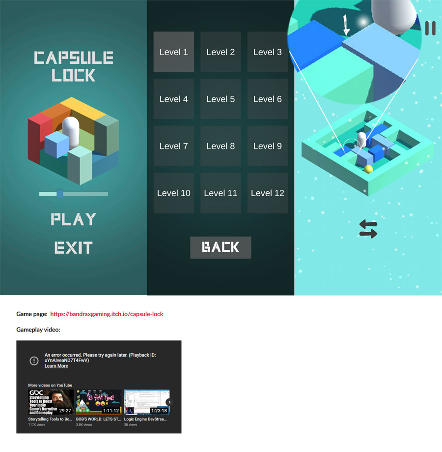
itch.io Community » Game Development » Get Feedback · Replied to BandraxGaming in Capsule Lock - Feedback Required
Hi,
I played it just now. Very neat. I liked that sound slider on the start screen. A nice way to hint on the game mechanics. Also like those colors :)
Now I'll play devils advocat, so I'll be brutal (hope you don't mind, no harm intended). I think honest feedback is the best. Of course all I say is highly subjective.
* The first two screens are very nice with bright colors and then the level screen is all "grey" with very minimal text. That felt like a little downer to me. The level afterwards is very nice again. So that screen just feels off. Same goes for the pause screen. It is just visually inconsistent (roundcornders on the buttons).
* I am writing this being "in" the first level. Honestly I did not understand why the "switch" button at the bottom is necessary. Maybe it's necessary for some mechanic to work later on. But even then I think it would be better to introduce that when it is needed.
Why can I not just drag both (blocks and pill) at the same time? If it's a ux issue (accidental drag of blocks while the player wants the pill) then maybe another solution can be found to solve that root cause. First I tried to move the pill without looking at the button below and was puzzled why nothing happened (had cleared the blocks first).
The pill and blocks glow shortly after switching. That's nice but imho this hints on a deeper problem, namely: it is unclear from just looking at the screen which elements (blocks or pills) are currently active. This offloads the bookkeeping on which "mode" is active to the players brain, not really desireable. If you look away (just talk to someone for a moment) you forget which mode you are in and thus are frustrated once you try to move a part only to realise that you have to switch modes. It's quickly corrected but kills the flow. I really think that this game could improve a lot if you "fix" this.
Also, why can I not flick the pill around just like the blocks. I think that would be a lot of fun :D.
Sidenote/Idea: maybe you could make the pill emmit some white lines and then let the ball (also white) emmit some lines too (all at the start of the level). It would be to hint on their relation (also would have to be minimal to match your style). Maybe similar to this:

* Maybe a bug, not sure. I once had a block being stoppen by a very tiny overlap with another block (screenshot at the end). That felt like breaking the theme of the game (it being logic based, not physics based and finicky).
Very minor things:
* The gradient in the main menu is not as smooth as it could be. Is this a compressed image? Maybe it's my device but if it's an image then you could use a shader on a sprite to get nice uncompressed gradients. If I remember correctly then there are some very nice solutions in the asset store.
* The menu sound repeats after a few seconds. It's nice at first but gets repetitive very quickly. Maybe add 2,3 more loops and mix them up.
* I think it could profit from some minor transition animations between menus.
* Your youtube video seem to be broken (see screenshot)?
I hope I did not hurt your feelings too much. I wrote it in the interest of makeing your game better and I know it's always hard to get/accept that critique.
Also, don't listen to what I say. You know your game best. So, think about why I had the experience I had and maybe you can fix the root cause instead of just catering to any reviewers wishes.
Thank you for making this and grats on getting a finished game out the door :)
itch.io Community » Game Development » Get Feedback · Created a new topic My little racing / exploration game is looking for a name.
Hi, I'll jump right in with some pretty pictures (text below).
Thanks to everyone who's reading / helping :-)

It's a motocross racing game with loot (gear, hidden items). It features a mix of exploration, racing and some optional physics puzzles along the way. In the tutorial you will get a glider. So the player will be airborne quite often.
Here are some gifs (very bad quality to keep the file size low):
Name ideas which I had (maybe these will spark new ideas, my favourites are first):
airborne motocross
take wing motocross
spring bike ("Spring Break", "Spring colors and emotions", "Spring like in jumping")
wing-mounted motocross / Wing Mount Motocross
jump a Motocross (pun like "jump-a-cross", badum tss, meh)
rise Up Motocross (lots of games are called "rise up" already)
on the wing
ride the sky
ravine Racing (lots of ravines in the game. I am not a native speaker, so not sure.)
Please give some feedback on the names listed above or if you have new ideas I am all ears.
Also, if you want to know more, here is the (temporary) homepage: https://sbr2.kamgam.com
Itch game page will follow once I have a name :D
Thank you !!!