Indie game storeFree gamesFun gamesHorror games
Game developmentAssetsComics
SalesBundles
Jobs
Tags
(7 edits)

Hi, I played your game.
Brace yourselves, this will be a lengthy comment with some ciriticism included (no harm intended) ;)

1) I love the idea of exploring such lively sceneries with a little drone. I admit I spent more time just flying around than racing. Which brings me to my first point: Maybe you could capitalize more on the "exploration" of the world than the racing aspect of your gameplay (just a though, also a nice USP). From what I gathered from your screenshots the scenery is your main marketing angle. It would fit a more explorative game well (imho).

2) Why drones? That mechanical, hard edged look of a drone kind of breaks immersion a bit (at least in the bandit and western scenes). I can see that you are maybe going full "Assassins Creed" with a kind of modern backstory to explain it all. Just not sure if the drones are the best fit. I noticed the skins one can unlock. Maybe you can not only make drones, helicopters etc. but also offer some other "organic" stuff (birds, balloons, zeppelins, ...) - I would love a bird.

3) Are you sure this 6 degrees of freedom controls are the right thing to start off with right at the beginning? You will have a pretty steep learning curve for newcomers. There is a reason drone piloting is a profession on its own. Not sure how, but maybe simplify it for the first few levels and then introduce it more gradually.

4) I am sure your ui/ux is still work in progress but the ui in games is kind of a pet peeve of mine, so here we go. Your text is (imho) not adequatly spaced and there are some inconsistencies within your design language. Here are some screenshots of me attempting a quick "fix" (just suggestions).

4a) Popup text box (text spacing)

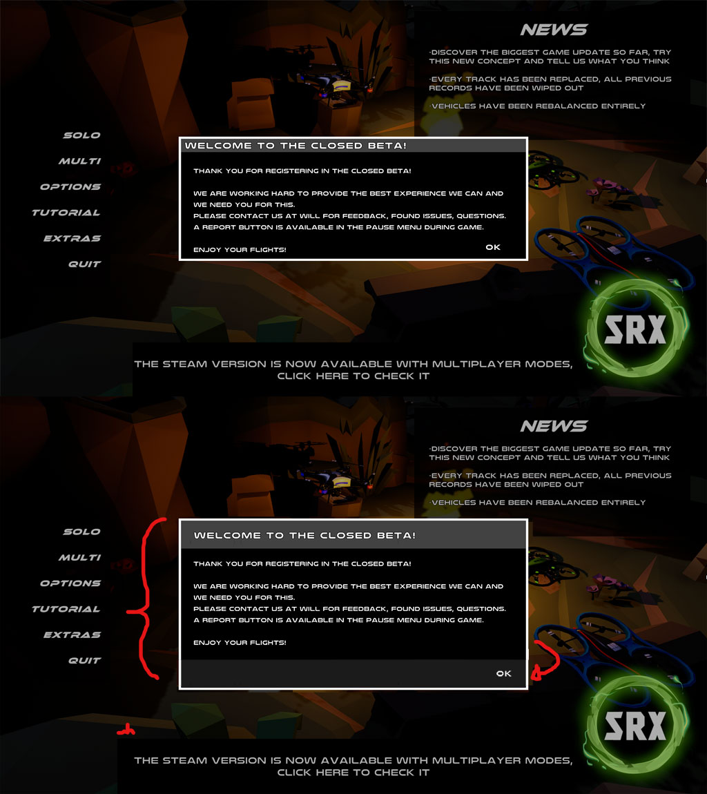
4b) Is that a submenu? Turns out it is not (or I didn't understand how to access it).

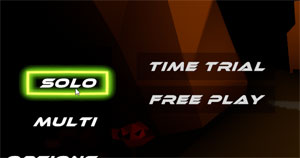
4c) Long text should not be center aligned. Maybe even make the header text left aligned. Also, nice blur effect in the background but sadly it distracts from the text. And: all caps font for a long text to read, hm, not sure about that. Aaand the menu text (menu, back etc.) on the left is all over the place (no horizontal alignment).

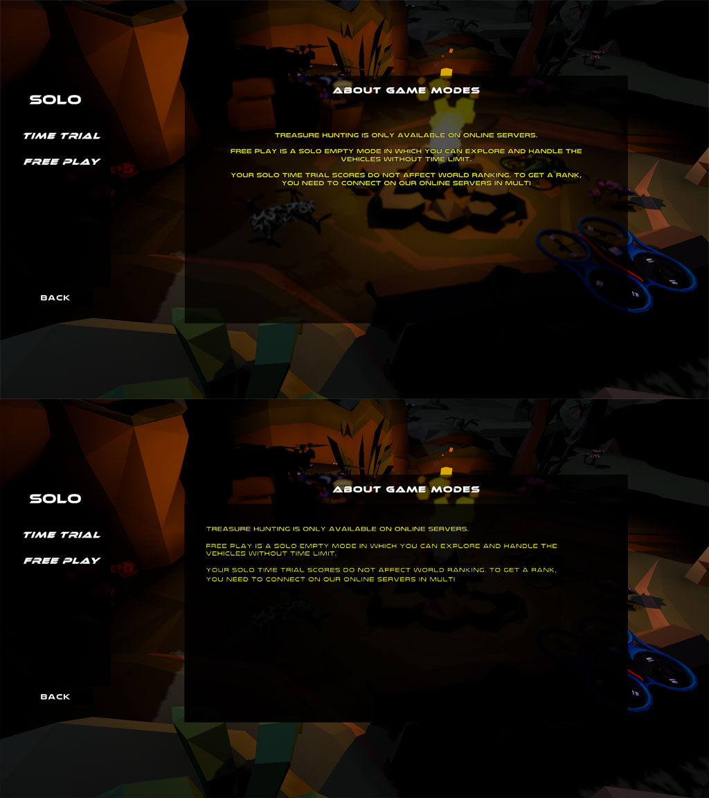
4d) Inconsistent highlight effects (just a minor one)

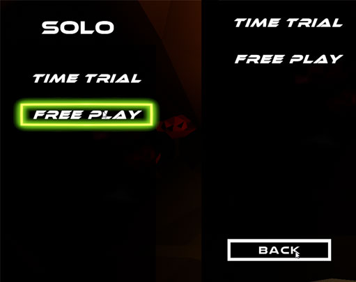
4e) Oh, so many font types on one single screen. And the lock icon sticks into the text (now I am getting really picky, sorry)

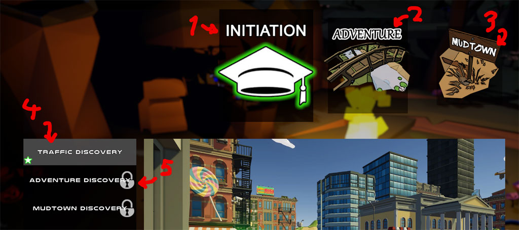
5) The rotors of the drones could use some blur. You can easily fake it with a transparent plane and some "pre blurred" rotors. I have quickly faked this here to show the effect.

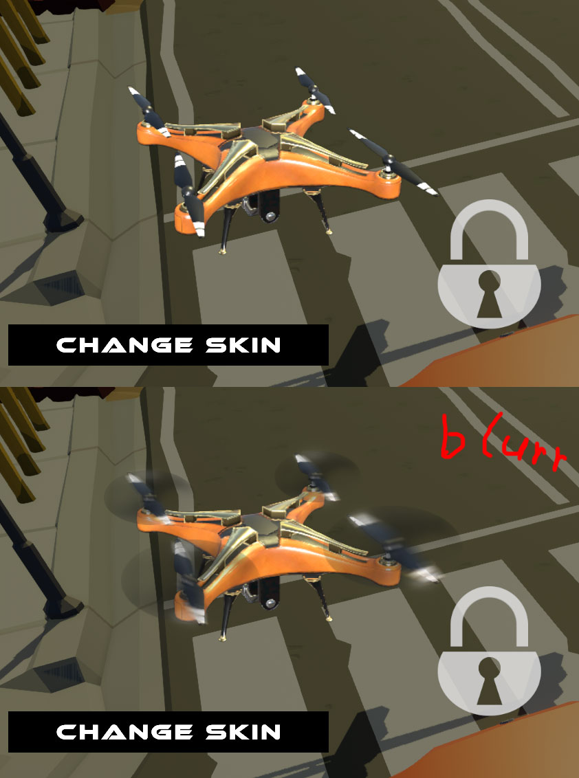
6) The drone shadows seems to be very low res compared to the evironment but both are dynamic shadows. What's up with that?

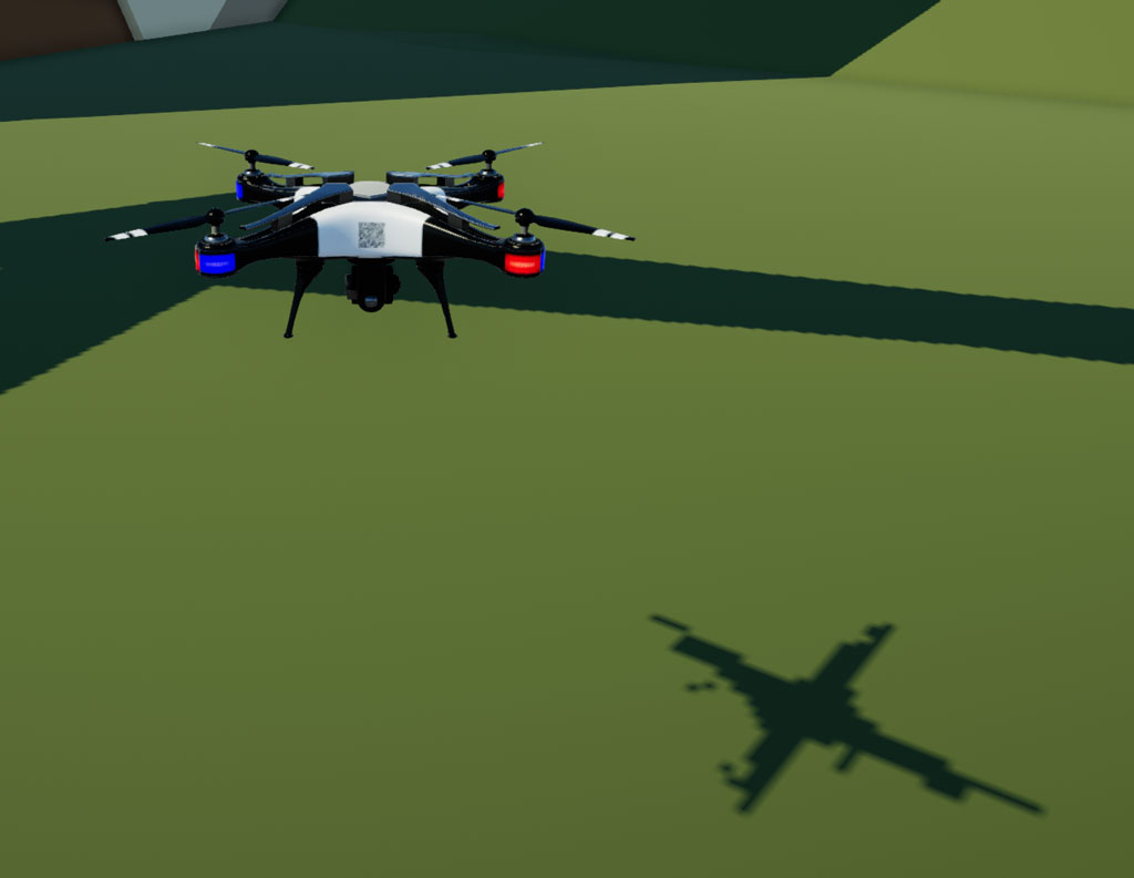
7) Okay, now I am hungry too :D

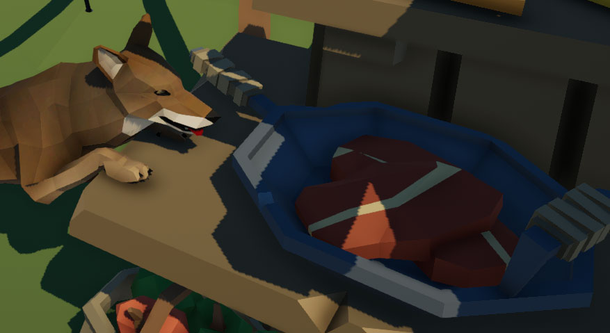
I hope my feedback will be helpful and I did not hurt your feelings too much. I meant no ill, just wanted to give you an honest first impression.

And since I have now criticised you so heavily, I would love if maybe you could do the same for me and hurt my feelings in return ;).

Thank you for making this!

Hi!

Thank you very much for taking the time to list and explain all the things you noticed.

All the aspects you are mentioning are interesting, we were aware of some of them and are even  fixing some others for the next updates (including a revamp of the UI planned)

This is a first answer in order to thank you, but will provide more after discussing all those things internally.

We crave for this kind of feedback so thank you very much once again and we will do the same after the holidays.

Have a good end of this weird year!

Cheers.

(1 edit)

Thanks, to you too. And thank you for your quick reply. Take your time. I did not mean to disturbe your holidays :)

(1 edit)

Hey! Answers are finally here:

1) We aim to create more activities around the exploration mode. Actually there is already more in the Steam version where you have a small treasure hunt on each Exploration map, the treasures being skin parts.
We would like to extend this treasure hunt to get a more competitive aspect by instanciating objects only one player can pick up when he finds it before the others.

2) The "drone" question is a good one. The game was first meant for real flying objects like drones or helicopters. We recently redid all the background aspect, adding the scenarios and different eras (the game was set in a modern era only). We wanted to add more funny vehicles, which
would furthermore lead to better sound. Balloons and Zeppelins are very interesting, we did not think of that. Birds are indeeed interesting but more difficult to set up as we do not have artists in our team.

3) Thank you for this feedback, we had a big discussion with the members and decided that we will add more tracks to fill the gaps in the progression curve
and will also make some easy tracks funnier to play.

4) Thanks for taking the time to visually match your feedback. We are currently discussing the whole UI update, including font changes as it does not match our themes anymore (remember, the game was "modern"). However we did not notice some facts you mentionned and will fix them in the next udpates, good job ;)

5) Very interesting point for multiple reasons (performance, FPS differences between computers, mesh handling), we will definitly give it a try.

6) That is sadly a real issue linked to the game scale. Unity shadow details are calculated with display distance and as the player in our game is very small, detailed shadows would mean very short distance. We managed to get much better results with URP though and will probably switch to it when a few more features are added.

7) I mean, who wouldn't want a juicy boxy steak ?

Thanks a lot for your feedback, no constructive feedback can hurt us, it means a lot.
A member of our team already used your in-game feedback report to give some ideas and we are gathering info to return the complete it on your game page, brace yourself ;)

Keep up the good work and happy new year!

(3 edits)

Thank for your detailed response. I am glad my feedback was useful. Detailed feedback is really scarce, even here on itch you don't get much.

A word of caution before you switch to urp completely. I had my fair share of problems with it (mainly performance with post pro effects and custom shadergraph functions misbehaving [_worldLightPos0, lightColor], all on mobile, desktop seems fine). If you want to go mobile too then maybe do some shader test builds before the switch.

Also, thanks for playing and filling out the form :)

Happy New Year to you too.