
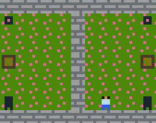
When I was playing through Night Shift, one of the things that stood out to me during my playthrough was the use of space. Through the whole of the game, the amount of space that you can move around is pretty limited, with most of the game window being a sort of static moving texture that could be taken as representing the unknown of the darkness that surrounds you while you travel through the halls. The significance of most of the game window being taken up by all of this static is that it makes the player feel small and restricted by the darkness that surrounds them, which is integral to the overall tone of this game. In a couple of rooms that we have access to, there is a limited area that we are allowed to see with the rest covered in pure darkness. This is further enforcing that feeling of being limited by the surrounding darkness and the unknown that comes with it. Another thing that stood out to me while playing Night Shift was that the game was cut into a few repetitive segments that would change in each iteration. To me, this could be representative of the repetitive nature of the night shift that the character in the game is having to work through as well as the limitations that the character has to face in his current situation working in this space. Overall the feeling of being engulfed in the darkness is very strong to me due to these characteristics of the game.
Jerod Zimmer
Creator of

Recent community posts
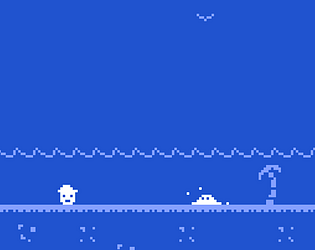
One of the things that stood out to me when playing through Nest was the use of colors to convey a mood and progression of a story. The game starts out with a green color for the background, which I took as representing the warmth of the summer season. Next the game converts to a blue color, which could represent the end of the day and beginning of a cool night. This subtly tells the player that time is passing between the scenes as well as gives a general tone for the feeling of the world that these characters are living in. The next scene the background is changed to the color red. I took this as representing the season of autumn, where the weather is getting colder in the transition to the winter months and nature is starting to wind down until the next spring. This again is a good indicator of the passage of time you’re experiencing in the world of the game as well as gives you some insight to how these characters in this world are living. In the final scene of the game the color pallet changes to a white color. This to me is representative of the season of winter and the cold and brutal weather that comes with that time of year. As we can see, most of the NPC’s that we have been able to interact with in the rest of the seasons are now missing, presumably due to the cold weather.