


Wow I've been watching your YT for years blissfully unaware you were so based
A member registered Apr 29, 2017 · View creator page →
Creator of
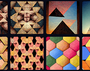
CV-style resume of Gunnar Clovis

Play in browser

Play in browser

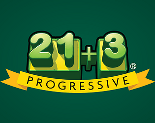
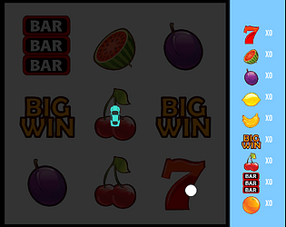
Progressive prototype demo for 21+3 for Galaxy Gaming
Play in browser
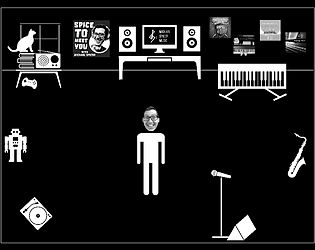
Use the arrow keys to make Michael Spicer rustle up some sounds in his home studio!
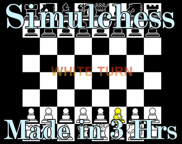
Simulation
Play in browser


Play in browser
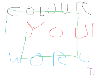
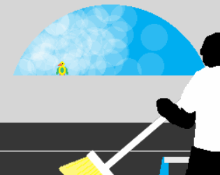
Paint yourself and your waifu in this thrilling story! Made in 3 hours!
Adventure
Play in browser


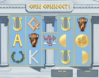
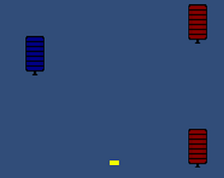
A concept demo of a Roulette Up display board for Galaxy Gaming
Play in browser


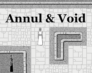
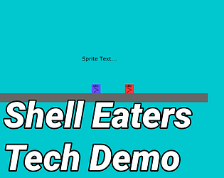
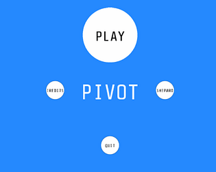
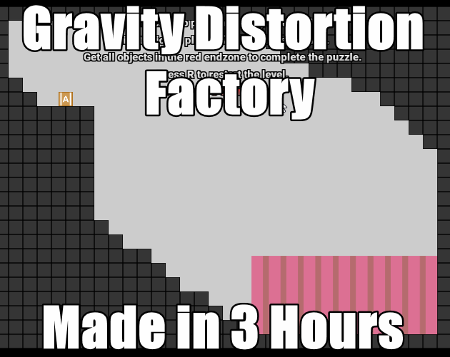
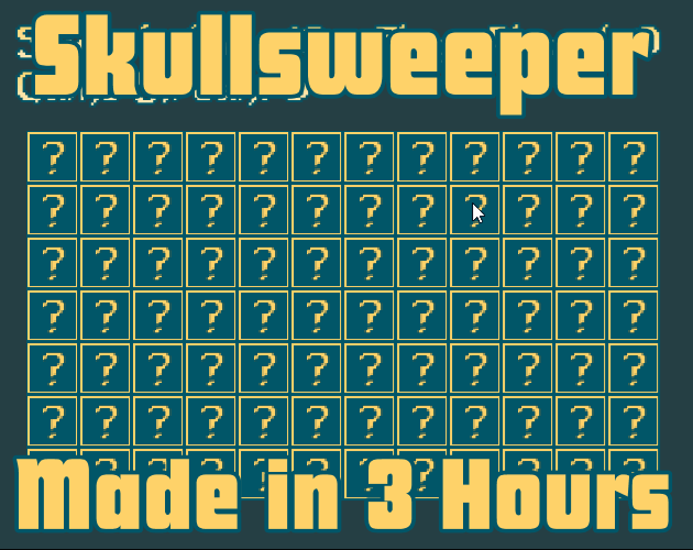
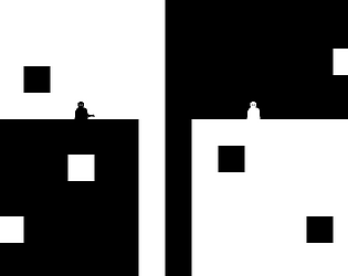
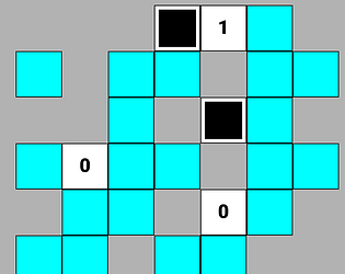
A bad game where the challenge is to figure out how to play it
Puzzle
Play in browser

Game Trailer for a Giant Robot Dating Sim made in 48 Hours


A small collection of background game audio tracks

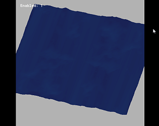
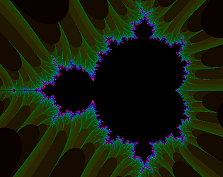
A Mandelbrot Set program using GLSL shaders in GMS2
Simulation
Play in browser
An old 2D shader test application


A collection of poems, some old, some new
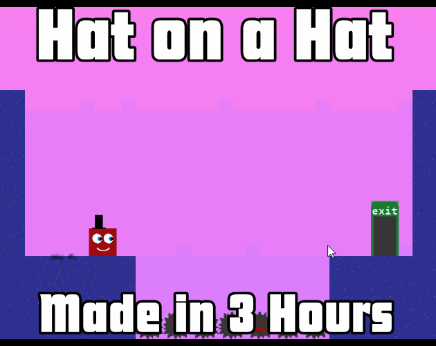
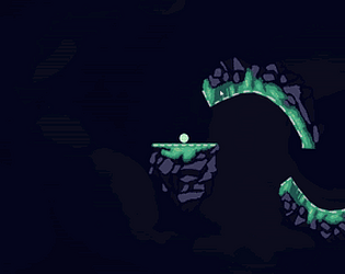
A 3D laser-dodging speedrun platformer made in 3 hours
Platformer
Play in browser

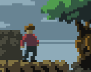
A short story about the passing seasons, made in under 3 hours


An old prototype playing with GMS1 surfaces for blood splatter, lighting, and scaling
Action
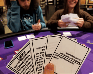
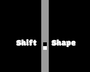
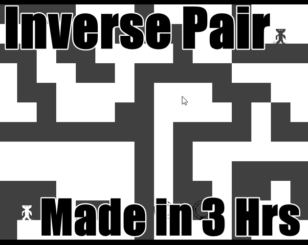
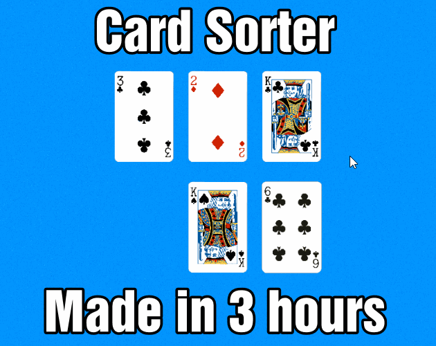
A reversible dual-effect card game

A trio of chill music tracks

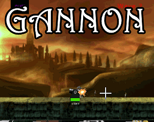
Action
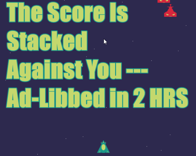
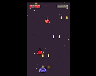
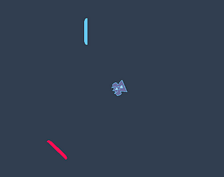
Fight against the score in this arcade space shooter
Action
Play in browser
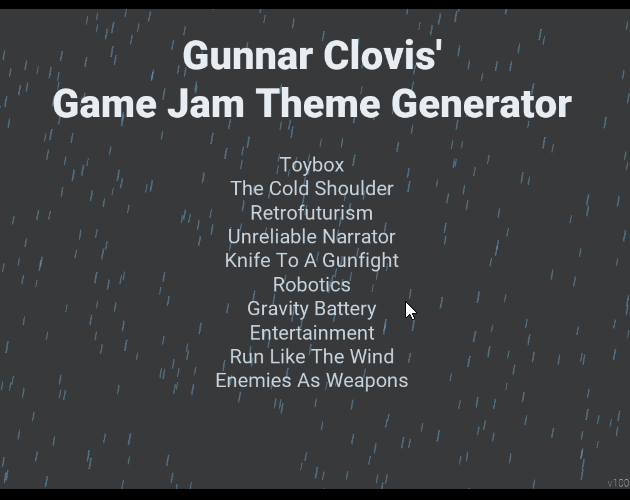
A game jam theme generator that generates game jam themes for game jams
Run in browser

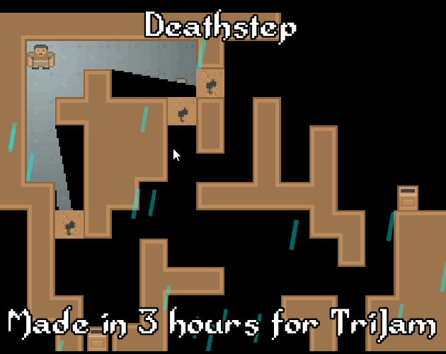
A Discord for the TriJam!
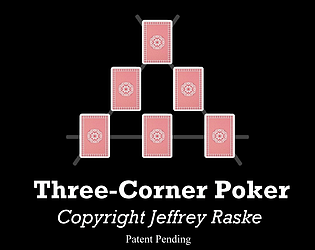


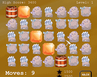
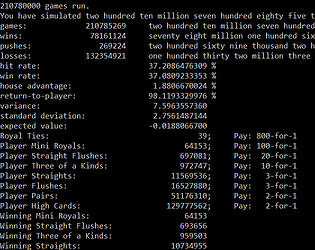
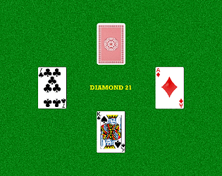
My novel three-card video poker game where you steal cards from the dealer, Patent Pending
Card Game
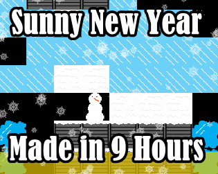
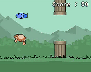
Escape the New Years sunlight before your snowman body melts!
Puzzle
Play in browser

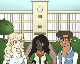
Find the love of your life in this heart-thumping visual novel!
Visual Novel
Play in browser

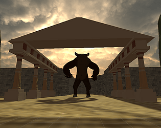
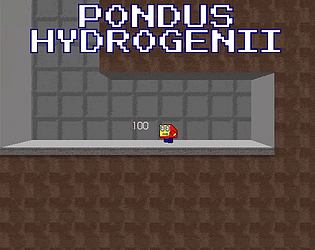
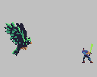
INCOMPLETE DEMO - The Manticore has kidnapped Arina! Daniella must save her in this bullet-hell action-narrative RPG!
Adventure
Play in browser

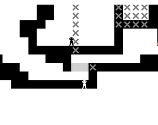
A hard-as-nails metroidvania-lite platformer with hours of hand-crafted levels
Platformer