Indie game storeFree gamesFun gamesHorror games
Game developmentAssetsComics
SalesBundles
Jobs
TagsGame Engines

gobblegon

5
Posts
2
Followers
1
Following
A member registered 96 days ago · View creator page →

Creator of

Recent community posts

(1 edit)

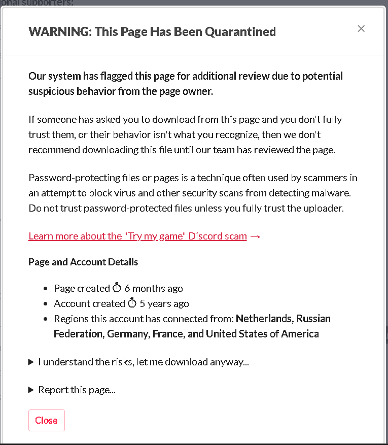
I want to play this game, but your software has been quarantined. Perhaps there is some way to change this by removing the password protection or some alternative method. I will still try to play it, but I think you will receive more playtesters and feedback if you fix this, because this message could scare other people off.
The PSX horror aesthetic has had a big resurgence these days with low-poly modeling, darker and duller color palettes, and lower resolution textures. The title screen fits this aesthetic well. I like the font used for "Chapel of The Thicket".

However, I find that the text '"Space" to start' is much brighter in color, clashing with the other colors on the title screen. Further it's in a different font than the other letters above. This breaks the immersion and makes it feel less like a horror game. I would expect the font to be the same color and to be a similar or at least complimentary style.

The title screen, apart from its color and low resolution texture, doesn't really have that much "juice" to engage with the player. There is music, which is good, but it's a short repetitive loop that doesn't follow anything metrical. I would remove this music and replace it with an SFX track if it could provide a more varied soundscape. Adding a lightning effect with some SFX on the title screen would engage with the player and be just as memorable. Adding a deep voiceover for the Chapel of The Thicket might sound corny, but campy horror tropes do grab attention, especially if this game is more about aesthetics. But the overall thematic direction is up to you, of course. 

The other thing to consider is that there really isn't much going on for the title screen. I'm not sure what I'm supposed to look at as the player. I think it's supposed to be the spear(?) plunged into the ground. Perhaps it is a shovel, not a spear, but I cannot tell what it is because it's too zoomed in. Some variance in color to make it so that the chapel pops out more from the background would be desired. This could be a simple outline or just different baked in lighting for the chapel compared to the background. If you really want to capture attention to the spear, you could show the chapel first, then have a short animation plunging the spear/shovel into the ground.

But one of the simplest, most understated animations you could implement to make the title screen more memorable is just text animation. Simply fading in and out "space" to start would be reminiscent of many other PSX and retro games. Animating the text "Chapel of The Thicket" would also draw attention.

I also noticed there wasn't a settings screen to control volume, resolution (windowed, widescreen, control options for gamepad or mouse), text size and text speed for accessibility, or control input sensitivity. this will be a very important feature to add later on. And I suspect many other testers will complain about this. People can be very critical, but this is the audience we have to work with--and we want them to play the game in the way that heightens their enjoyment the most!

When starting the game the text font from the title screen appears, and then we are spawned in the first part of the environment. I noticed that the resolution was very blurry and poor. I can understand the desire to capture a retro feel in this way, but many modern developers for retro games will keep low poly models and smaller textures while also trying to make the image clear. If you do want to keep the picture blurry, then there has to be a justification behind it that enhances the experience of the player. Right now, it just makes looking at the game rather tedious. A recommendation: many low poly games had low poly not only due to hardware limitations, but also because a CRT TV had scanlines that actually made the graphics look better than they actually were. You may look into replacing the blurriness with a CRTV filter (toggleable of course).

The fixed cameras is reminiscent of resident evil and other PSX horror games. Good. However, the environmental triggers that switches from camera to camera is a bit finnicky. There were a few times in the starting area where I would accidentally trigger a camera switch and not know where I was. Make sure the camera angles for the fixed cameras point towards where the player should go. It should give the player some important visual information.

There are no instructions that come with the game, as far as I'm aware. You should change that for the next release. Either a graphic in the game similar to an instruction booklet or just instructions on the screen would suffice.

The controls are a bit clunky. It's expected that tank controls would be included, but the camera angles switching sporadically and the inability to input multiple directions does make the player avatar difficult to control. I would suggest looking at Croc or Tomb Raider for inspiration on better tank control movement. I suggest them over Resident Evil, because I personally find their control schemes more sophisticated.

The simple objectives of picking up items and using them makes the core gameplay loop monotonous. If you want to recapture the horror psx gameplay loop, make it so that there are some puzzles you need to solve with your items instead of picking them up and using them (i.e. placing items in a specific order in a wall puzzle to turn the door or something).

This is my biggest critique for the game, and I say this with care: the atmosphere of the environment is not very cohesive. I noticed some high quality tree assets mixed in with grass and trails that were essentially textureless. If you do go textureless, then the game resembles Alone in the Dark much more than something like Silent Hill, which is a viable path, but not PSX horror. If you want to keep the photographed tree assets you should make them either lower quality resolution or explore the option of having pre-rendered backgrounds. That would make the game tie in together much more.

Thank you for sharing your game. I enjoyed playing it!

The art style is great--it's what originally drew my attention to the game. Telling the player the game is played with a mouse is also good. It communicates how the game is intended to be played so they don’t get confused.

I do wish there were more visuals during the explanation of the puppet performance in the beginning. I think it would draw in the player a bit more. Or maybe there could be a bit more scenes with Rainy going through her day-to-day life before getting to the library scene. A longer buildup of innocent and mundane dialogue could disarm the player and make the switch to Jonathan's perspective much more  jarring and memorable.

Filling in the blank does seem like a novel concept, and I was very interested in this mini game because my game also uses a similar mechanic at some point lol!  But I had trouble seeing why this mechanic was included. There doesn’t seem to be any punishment for putting in the wrong words, because the text just shakes. I want to see consequences for selecting the incorrect options and I want to see how selecting different options might affect the outcome of the game. 

There was a grammatical error in one of the fill in the blank segments: “I feel ___ because he ___ me. No one ever this ____ to me.” The last sentence here should be something like “No one has ever been this ____ to me,” or “No one was ever this ____ to me”. 

There were some other errors in grammar as well, like “whatever let’s just talk about firework”, instead of “whatever, let’s just talk about the fireworks festival”. It would be good to look over the dialogue to check the grammar again.

The music in the background with the rain SFX was initially pleasant to listen to, but the looping eventually became somewhat jarring to listen to over and over. My suggestion is to allow for moments of silence in between to let the player immerse themselves in the atmosphere of the game. I do like how the music changed when going from Rainy to Jonathan however.

Perhaps this is because the game is in development, but I wanted to see more dialogue choices.

Furthermore, I didn’t see an option to access the game settings after leaving the title screen to start the game. A player might want to adjust the resolution and sound after starting the game.

Additional settings might be separate SFX and music volume channels, text speed, and possibly keeping the text windows open for slow readers to reread dialogue. Also, to make the game accessible, there should be the option to play the game with the keyboard or a gamepad. Even if it’s just using the arrow keys and pressing enter for the keyboard, and then using the control stick and the select button for the gamepad, these additions will make the game playable for many more people. More options are good!

 Overall I enjoyed it,  and I think this game has great potential. There were portions when it was genuinely creepy. Perhaps including a few jumpscares (sparingly) would help keep the player on edge. Thank you for sharing this game and best of luck on your future endeavors!

Mhm, I agree. Derek is highly peelable. Thank you for playing!

I haven't played this type of game before, and I'm also trying to develop games, so take my background into consideration since I am probably not the target demographic. But I like the game and here's why:

The lower resolution and rasterization paired with the muted colors definitely creates a memorable aesthetic. The difficulty of the enemies combined with the limited ammo forces the player to plan out their path — I can really feel the stakes when playing. There also seem to be multiple viable strategies, like using the knife to repeatedly evade while plinking enemies with the pistol, or saving the pistol for dire situations and leaning on the knife otherwise. That shows real gameplay depth.

A couple of UI things also work well: the GPS's green outline contrasts nicely with the background, so it pops and stays readable, and the yellowish highlighting is high-contrast enough to be easy to spot.

Here are the critiques:

  • The UI is a bit confusing to me overall. I think it's a combination of the font, the color palette, the placement of buttons, and the "screen changing":

    • The close button for the inventory is near the bottom of the screen. As a PC user, I expected it near the top-right or top-left, similar to closing a window.
    • The shortcut key next to the "INVENTORY" button in the player hub looks like a lowercase "L" rather than an uppercase "I". A lowercase "i" would be more legible.
    • The other buttons in the player HUD only brighten slightly on hover, without a yellow outline. This makes it hard to tell which option I'm hovering over. One fix would be a thin bright-white border by default that turns yellow on hover, similar to the inventory menu.
    • The language for toggling between the two GPS views, "FOLLOW" and "FIT", is a bit confusing — I'm not sure if that's intentional, to mimic handheld GPS jargon. Renaming "FOLLOW" to "ZOOM IN" and "FIT" to "ZOOM OUT" might read more intuitively.
    • A nitpick: When I use the keys to navigate the gps and the icon for a bandit or infected shows up, I feel like clicking the "bandit" or "infected" icon directly to enter battle feels more intuitive than clicking their square on the GPS. Different types of controls (keyboard/mouse) have been taken into account, but I think the average user would use the keyboard and mouse together, rather than one or the other exclusively. It may be a good idea to take into account that sort of synergy when developing the controls.
  • The point I most want to emphasize is the "screen changing" — and this may just be from building too many single-page React apps — but switching scenes to reach the inventory and other menus is a tad disorienting. My suggestion would be to have the inventory slide out from the side as an overlay when selected, and to make the other menus overlays too. That way the player always knows where they are and how to get back to the main screen.

  • The tutorial popups are useful, but they interrupt the gameplay loop. Toast messages instead of popups might be less invasive.

  • On the "more content" point others have raised: the core mechanic is solid but a bit thin. That's expected for a demo, but adding horror elements and constraints could deepen engagement. Some optional brainstorming — take or leave freely:

    • A timer, so the player has to leave or descend to the next floor before time runs out.
    • An undefeatable enemy that occasionally enters floors and stalks the player, forcing them to think about where to move so they don't get cornered in a dead end.
    • Additional objectives (e.g. someone calling for help that you have to find).
    • More resource management.
    • There's already an "escalation meter" — maybe a fear/psyche-style meter that, when full, increases strange events (new characters, unique enemies, different environments) or affects the player's stats. In a way the game reminds me of traversing the map in the original Fallout — might be an interesting reference point.

Anyway, I hope this feedback is helpful. I admire your work and regularly watch your videos on YouTube. Good luck with the project!