

hey, thank you so much for the kind words, glad you dig it!
giantrobottackler
89
Posts
1
Topics
214
Followers
225
Following
A member registered Dec 05, 2019 · View creator page →
Creator of
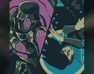
Two Knights and two Myths for Mythic Bastionland, inspired by the Mabinogion




a staring contest destroys the world
Interactive Fiction
Play in browser

a community college horror story
Interactive Fiction
Play in browser
Recent community posts
The Violet Flame Ascending jam comments · Replied to Roseline in The Violet Flame Ascending jam comments
looove that an expanded version's potentially in the works 👀👀👀 tbh, i've been chewing on alternatives to Taste Blood since writing this and haven't come up with anything good. even the potential energy and feeling of like, a looming frenzy is just hard to match. going with the cool first thought was the right move i think!
very solid, very old school vibe. feels similar in quality, atmosphere, and presentation to the first-party DCC stuff i've run. lots of fun stuff to interact with. this ship feels like the one in event horizon lmao just an over the top nightmare zone. the prince and tolliver are two true freaks and the stars of the module tbh - the art and brief descriptions make me excited to bust them out!
some minor notes that had me thinking:
- the intro text names the elves as ancestors of the ship's slaves / fuel - should this be descendants or am i missing some weird nuance here? maybe it speaks to the vibes that i wouldn't be surprised if it were the latter
- the necro drive chamber is explicitly cube-shaped, but the given measurements (and the map) paint it as 50x50x10 - is it supposed to be uniform? fun fact: while chewing on this i did google what a 3D rectangle shape would be called and all the answers feel way over the top and off-putting for this use case lol
- infection seems like an odd flavor choice for tolliver's shield DoT - seems like all the text around it is telegraphing bleeding, not something bacterial or poisonous
cool stuff overall. the prince's art radiates some truly diabolical energy. gonna be thinking about him for a while
yeah this uhhh pretty much rips. killer concept, art, and vibes. just bristling with energy. y'all were in sync on this one. incredible that it's so packed with text but the visuals still have room to breathe and even charm with little details - i like the little cutout indicator on the playbooks. impressive that you took this balls-to-the-wall premise and still left room for emotional intensity in the roleplay. i do think there's some sneaky difficulty to GMing this that's hidden under the tight presentation - players can't die or really be stopped until the end, so adding non-damage complications with that in mind and keeping the pace up seems tough. good complications are the hardest part of basically everything but OG apocalypse world though, so, not a big deal lol
high: the playbooks are standouts and are so slick they make most PbtA books i've seen feel absolutely bloated in comparison. the martyr's line nails the atmosphere harder than anything else here IMO. to lay down your life is to return what you only borrowed. goes crazy tbh
low: this is just personal preference, but i wish the questions for going to a new floor had a little more heat behind them. they feel low-energy to me. "what kind of world is it?" feels less like i'm asking about a layer of a sickass apocalyptic machine tower and more like i'm asking about a new super mario 64 level lol. if i run this i might replace that with something like "what purpose does this floor serve?" in general, i think it's possible to punch these up with more evocative phrasing while still getting similar info from the players
in-between: i really dig the move name "Taste Blood in the Water". it's punchy, vivid, and carries some intense force behind it. however... it kind of feels out of place in a dry, desert-and-fire based post apoc setting?? i can't help but wonder if there's a vibe-appropriate name out there that still keeps this same energy lmao
overall: incredible work. please make more stuff together!
the cover radiates crazy aura on its own but the vibes across the board are good on this one. lots of good details in the keying. this feels on theme for appendix n but brought to life with some pretty out there sauce on top. i appreciate that the NPCs inside each roughly relate to the disguises - i'd probably minimize repeats on those if i ran this to give each player a niche. i also think the artifice of each disguise getting listed in your starting inventory is a great touch. also, the text says martians have 7 fingers, but the king on the cover has 5. is this deep lore for the king's true origin????
this is pretty tough to get a good feel for because the map just makes it near impossible to work out how this might play in action. i do think there are a few places where you could turn the screws some more and really make this pop:
- the heat rising on the encounter table is a great fit for a heist. i do think it's weird for this heist because you've set up the station as specifically abandoned (due to the spatial stuff i assume). that kind of mechanic would feel really cool if the higher tier encounters represented harsher response, but one of them is environmental and unrelated to your presence. idk, just doesn't sing with the situation you've set up to me. also, if you expand this, i think that kind of escalating die table feels better with more room to breathe (1d4 to d6 to d8 or even larger if you're nasty)
- obviously the tesseract stuff is a sick concept. i think it doesn't land for me as much as i'd like because it feels pretty disconnected from the rest of what's happening here. it has no clear source and a maybe implied purpose (isolating the prisoner?), and is clearly malfunctioning but can also be fixed by a battery powered remote control? that nobody is using? it's also not mentioned in the intro text, so there's not much intrigue or tension for the players as they go in - it just kinda comes out of left field. in general it's dope as fuck and worth having, just would wanna make sure i nail its introduction to the players if i ran this
- into the odd was an underutilized choice IMO - it makes the marketing copy feel weird (it's a "low level heist", but into the odd doesn't have levels 🤓☝️), but also it's missing a sick ass magic item to find. i like the violet lantern, but you start with it so there's nothing fun to loot lol. i think you've set up an interesting blank space to reconcile this: the whole deal of the heist is to "swap" the violet flame with the red one, so, i'd love to see what kind of effects keeping the red flame in the lantern might have!
overall, very very cool. the energy here feels incredible. one of a growing number of modules i'd love to see expanded after the jam ends!
love love love the art, the big thick lines around the crater radiate so much power and i like the hills nearby that seem to have some kind of larges caves or divots. having a leader for your peasant crew is such a fun, easy concept that i'm shocked i haven't seen or thought about it before! gonna steal that if i ever write a funnel lol. the inklings are already a fun encounter by themselves, and the emotion-heavy way they communicate adds a nice intensity to them. and all of this from a title that, frankly, gave you absolutely nothing interesting to work with - great job!
high: the council setup is like a top three funnel opener for me. what a good way to start the session off with some Big Energy - give them all a character with a clear drive and identity and let them argue for a little while. big fan
low: i think for me what i'm looking for in a funnel is a bespoke death trap experience. sort of like a haunted house lol. i want to look through the text and say "omg i cannot WAIT for this room to kill them." this has a great setup, and would even play well as a level 1 adventure, but the lack of detail on the back half leaves me wanting a lot more in a funnel context. let me run vanay valero through a real meat grinder!!!
in-between: is the dancing figure the children dream of supposed to be the pilot? i hope not, i would really love it if that's a completely unexplained phenomenon that just happens to be going on right now. so eerie!
overall: very cool, hope to see more from this after voting ends!
Calling Upon the Bright Blizzard jam comments · Posted in Calling Upon the Bright Blizzard jam comments
i think the radiation angle is immediately gripping. you sell the eerie feeling behind it with some simple but potent visual choices. i read the design diary post on your blog and love how much the robot art shifted some gears for you. it would've done the same for me, but more than that it's such a clear showing of how easy it is to be moved and inspired by other folks' work. taipan rocks and is the biggest win of the module IMO - the thing i look at that makes me say "oh, i've gotta see this guy at the table." peep the name, but i am a little biased there 😌 i like the faux-handwriting on the map, just one of those human touches that would add interesting flavor if this were on a handout.
in general, i think the thing this module wants is More Energy. take what you've already got and go even bigger with it! some thoughts:
- on the night cat's crit, 1d4 damage from an intelligent pack hunter is measly. crits are your chance to swing hard! rip a chunk out of their leg so they can't get away, make the damage recurring as the cat latches on and needs to be shaken off, just go bigger with it. if you only want damage, i would double or even triple the size of that die
- brother, why is taipan not on the map. you gotta put that guy somewhere. you're really gonna leave a party running into the sickass necromantic cancer machine up to random chance? be so for real. if this is at my table, i'm putting him in the mist in area 6. i also wouldn't mind some kind of trigger to bring him in once the party grabs the uranium - maybe the forest is shielding it from him, but once it's out from that spot he hones in fast.
- the environment table is a shining star and a great showing of the undead stuff which otherwise feels underutilized. i think you could have given this more mechanical grip by hooking into cairn 2e's established wilderness weather rules - adding fatigue or increasing the number of watches between points would sell the vibe even more, i think
- i like the use of radiation as a long-term poison, although i have no idea how your average cairn character is going to cure it lmao. weirdly, this made me consider where my line is on sci-fi stuff in a fantasy RPG. the big robot feels fine, mostly because it's very bold and also unexplained. but the nuclear bomb fliers in area 3 feel firmly out of place. like it pushes everything into more modern territory and turns Taipan from a bizarre relic into something that makes a little more sense. aura loss! spiritually i would say this feels more like an Into the Odd module, but that's minor tbh.
high: big robot........... i also dig the random gruesome horror show in area 9. one of those places where the intense cold of the mountain setting can be felt the most. very cool area to hide away on the map like that.
low: hate to be this guy but there are enough typos that it does stand out. a few here or there is fine, but calling the title phenomenon the Bright Blizard in your intro text is demonic work lmao
in-between: the angle of the forest withering under this uranium and deciding to lean into that as if acclimating to snake venom RULES. your current implementation doesn't shine though, because like... the uranium is already in the forest. like it's just in the woods' control. you can't even touch it unless the forest lets you. i think this would've felt less off if the uranium were protected in some kind of rigid structure that the forest couldn't sink its tendrils into (or something similar)
overall: keep making stuff!! i really like your vision and just want to see more. great work!
heretical doomsday prophets are like tabletop salt tbh i'll always support sprinkling some around for extra flavor. you're correct in how the veil is supposed to work, but the lack of clarity there feels so obvious in hindsight i'm mad i didn't catch it lol. i appreciate the kind words and feedback, thank you for digging into this!
idk why but i'm so tickled by the phrase "a focal point for jurassic magic." i read it twice before stopping to marvel at how much it says about the world that dinosaur magic both exists and is some kind of studied phenomenon. in general, dinosaurs land on the boring side of appendix N for me, so i'm impressed with what you've managed to make here! lots of fun, descriptive keying that sells the environment well. the factions, especially the bone-ferals (again, with a fascinating line like "prehistoric energy"), are a great touch. the ritual clock is the most interesting thing here, IMO - gives it kind of a board game-y feel and an interesting strategic element that i don't see often in hex crawls. idk if the saurian king's parties are meant to be player-facing, but that's how i'd play it. it's interesting and ominous to me that the central spires go unkeyed. nice work!
high: i appreciate the bone / general bodily theming across each region. i felt the more i read that this entire island was one big decomposing corpse. my fav spot is the marrow river - the emphasis on its slow, gunky pace makes it sing to me
low: with how much i like the race against the Saurian King, i would've liked a little more care given to where these landmarks are on the map. it'd let players feel a twinge of fear as they see one of the saurian king's groups make a beeline for an unknown spot, and add more strategic nuance in terms of exploring, i think!
in-between: you mention in the intro that the island is a safari spot for the wealthy and famous, but don't explore that much in the text or encounters. i wish you had! some useless NPCs to distract players from the impending ritual would have been an interesting campy touch.
jurassic magic, man. i can't stop thinking about it lmao
yooo thank you for spending time with this! robin CRUSHED it on the map, seeing it come together felt like magic.
i fear razzmatazz will always be an ask-forgiveness-not-permission thing for me, but your notes ring true - there's room to wring more usability from some of these without losing much energy. i've actually been chewing on yours some more after reviewing bc it maintains so much momentum while still feeling tangible. thanks for making it, and for reading!
it's just so vivid. the rain, the olive sky, and the immensity of the statue set the mood beautifully. i love how much the current jade order can't stand that their prophet got a little bit freaky on the side. great work fleshing out the space, it feels like everything here flows out naturally from your core concept.
a few thoughts while reading:
- the Nymph has some fun stuff going on mechanically. the kisses benefiting from seduced targets is a great touch with good flavorful "flow".
- A11 feels off to me. it's one of the few images that doesn't resonate with the rest of what's going on here. i think it's the effect of the kiss combined with depicting the woman as a demon - feels like something the current Order would create, not an ancient statue that takes you directly to the prophet. am i underthinking this? also, are there any hints to the puzzle here for parties who don't take Xuengkun?
- i really like the room of love! i know the focus is on Zalphia, but i would've liked to see the other two Desires have a prominent space somewhere in the dungeon
- there's a weird mix of ideas in terms of how this space is used. part history that the current Order rejects, part holy site that the current Order uses to push its teachings (i got the vibe it's in active renovation?), part... indiscriminate killing field? not bad weird, just weird. unsettling to chew on.
high: lots of great keys, but my fav is A18. by that point i'd stopped thinking about the whole intro hook and the brutal realistic followthrough hit like a sack of bricks. great addition.
low: these fonts are all over the place!! i think you've got such a bold visual language in the background that i don't mind a little punky chaos in the fonts, i just think you can bring that energy without using off-the-rack Impact lmao. your title font was a great pick, but it's busy and distracting as the intro text (even overlapping with lower lines in the second paragraph). i think you could have made your intro pop more by using your normal body text there to really make the shiny title font stand out. idk much about working with fonts to be clear, so, grains of salt etc.
in-between: it was a great choice to make the jade tears pantomime search for Zalphia in A20. there's no shortage of good flavor in this module, but i think you could have added a lot of depth by giving them a similar action to take in their other appearances, even if it's subtle.
overall, getting to see stuff like this is what makes the jam worth it. great work!
by my reckoning, this is one of the hardest titles i've seen: a specific creature in an uninspiring spot, without the raw power of a proper name, and a culturally loaded term on top of that. i would've been sweating in my boots if i got this lmao. i'm impressed with what you were able to turn out here - it's moody, strange, but still cleanly written and playable. the keying is functional without skimping out on some striking imagery. i really like the color choices, especially the fleshy pale purple associated with the jikininki!
some minor thoughts:
- i like using the colored bottom margin for notes, but i'm not sure the encounters were the most effective choice. partly because it's skimpy, partly because the dungeon is written with enough tense buildup that i think it could work on its own without the pressure of encounters. not sure what i would put there instead, maybe the relic text.
- fezza's finger: i'm a fan, but i think you kneecapped it too much! unusable under daylight AND once per day is harsh. i think you could make it more usable while wringing more flavor out if you used cairn's charging format (limited uses with an evocative recharge method). on the other hand, the Breadblade is perfect, no notes.
- you really elevated this with bold, physical descriptions. the way you play the jikininki, the corpse worms with his face, the bizarre statue in the shrine - yuck (complimentary)! you're tight on space, but i would've liked to see plumcuff and bogglebeard get that same love
high: two of the keys are stellar. the jikininki's house made from bits of the village that fade in and out overnight is just... mwah. straight out of mushishi. but i think i like the hall of busts more: the way it's written feels like a jumpscare. i can picture the slow pan over the busts and creeping reveal of this gross old man crystal clear in my head.
low: i think you could reorganize the first page significantly to draw a lot more blood from this stone. the punchy village description followed by the punchier line of Agnes' chimney disappearing at night is great and full of intrigue - put that first! it grabbed me immediately. the rumors share informational overlap with the (more interesting, IMO) everybody/nobody knows list, i think you can merge them without much trouble. with a little extra space, you could have fleshed out the otherwise blurry Lord Filchskin (crazy name btw) and given this thing a hook that really shines!
in-between: i love the cover. so ominous! i appreciate that you gave it the proper number of teeth. i kind of wish you'd given it more. just one or two, for a little bit of uncanniness, as a treat.
overall: great work! and put more stuff on itch lol i can't believe this is your first release
glad you dig it! jamming with robin was a great push here. he talked early on about wanting to work with abstract shape language - since his art wouldn't be directly backing up my imagery, he suggested hammering harder than usual on evocative phrasing. i'm glad it panned out!
It's a pity about the font size, though
why does this sound like something a hitman would say before leaving me dead in a ditch for font crimes
this is a blast!! full of energy from the get. the wain art was a great choice. i like the light touch of real-world-thrift-store-find aesthetics - really elevates this. landing on DRIVE as the WIL replacement was kinda crazy, it actually fits well lmao. so much fun, easily gameable detail, especially in the encounter table. you brought the heat with this.
a few minor thoughts:
- beleth seems like a really shitty road trip buddy. i think you should have made her shittier
- would've liked a better consequence for failure on the DRIVE save in area 2. one of the few areas i think you could have gone Bigger here. as-is, i'd probably play that as having beleth get mad and pushy if you try the save again.
- it's crazy to me that you leave the cat cultists driving a little car up to random chance!! give them all little cars dude come on. also, gut feeling, but 12 STR feels a touch high flavor-wise. i might have made that DEX instead, since they're cats lol
- i was gonna say i respect your game for shouting out Astral Tourists, then saw that you made it. so, i still respect your game, but in a different way!
- is there a reason the header text on Beleth's Sanctum isn't fully colored?
high: hard to pick between the cloud giant plagued by Protestant Work Ethic and the knight bluffing about being able to detect evil. they're character-full situations that spring right off the page and feel super easy to play.
low: this is splitting hairs, but i'm kiiinda against the sanctum dungeon. when i read this module, it's the road trip that compels me the most - smoking cigs, talking shit with Beleth, sitting on the hood joking about being "bone cursed", all those ideas grab me and pull me in. the setup with the sanctum being attacked is a fun situation, and there's a lot of good stuff there, but it doesn't feel like the star of the show to me. in the confines of the jam, i would've loved to see a much larger pointcrawl with a shrunken-down description of this fight at the end.
(really what i'm saying is that you should have both cakes and write an expanded edition after voting ends 😉)
in-between: you used "stats as Bear" so many times i thought for sure you were doing a bit, but the brotherhood of giants break that pattern. if you were doing a bit, i think you're a coward for not giving the giants bear stats too 😌
overall: this fucks. great work! 🚗
Thrice-Bound in the Sigil Vault jam comments · Posted in Thrice-Bound in the Sigil Vault jam comments
wow, what a work!! the prose is laser-focused and also not even remotely subtle (in a good way). emotion that shines so bright i wanted to look away and protect myself. i like that the secrets feel connected to each Phenomenal but provide interesting nuance no matter who rolls them. it seems like it'd be weirdly fast-paced in play - i wish each encounter had more room to breathe. definitely a module that wants high trust at the table.
high: i mean, obviously the art. explosive energy in a module that's hungry for it. it feels like the pages are screaming. also: can't understate the whiplash of reading the second bullet point in the Bathroom, then scrolling up and noticing the fuckass "😄👍 $1.49!!!" sticker immediately after
low: the intro text under Background just doesn't punch on the same weight class as the rest. i think for me it's the fragmented sentences - they feel stilted and almost off-the-dome, which sucks the air out IMO. lines like "And each entity, more powerful and more in tune with her feelings at the time than the last" are just a little too clunky for the raw intensity in this section to pop. it's noticeable compared to the Phenomenal backgrounds, which bring more heat in fewer words! also, very minor, but you introduce the three entities here in a different order than they appear in the actual map; could tighten this up slightly by making those match
in-between: i don't think this needed uhhhhh mechanics? definitely not these mechanics, at least. you could cut all the "roll 1d6" lines and not lose anything meaningful. since you add the note to the GM about telling the story first, there's almost an angle of, like, treating your chosen system as something the players have to push past in order to engage honestly with the emotion at the core of this thing. but i don't think the text as-is helps bring that to life. not to be cheeky lol but the way this is written feels too bound by the "form" of a TTRPG adventure text to be fully realized.
stellar stuff overall. thank you for making it!
as a concept this is right up the appendix N alley. feels like i saw an episode of Dexter's Lab about this once. i really like the idea of a tournament full of freaks where you're stymied at every turn by magical nonsense - weapons turning hot after the battle ends is a GREAT "fuck you" for the party to make them seethe. ostensibly system neutral, but the way everything's written feels more aligned with 5e / battlemap combat than typical systemless fare. there are a few bits of odd phrasing (like in rooms 1 and 9) but overall the presentation is crisp and accessible.
high: the downtime procedures are a great idea and the thing that sells the tournament vibe the best. little vignettes between each fight to flesh out the world and socially maneuver is exactly the setup i want. nice touch on how people treat you better as your fame rises. i would've loved to see a list of patrons to pull from - a table full of rich weirdos would've added some great flavor i think!
low: so......... this is just personal preference, but the inclusion of a keyed dungeon was a miss for me!! i think you had a lot more room to turn the screws here. it's not bad, but it doesn't click for a few reasons
- the downtime procedures already give you something interesting to do between fights. a whole ass dungeon on the side pulls this module in a very different direction mechanically and leaves both halves not feeling fully realized, IMO
- if i'm running an appendix N inspired module about a tournament of glory and gore, the two most important qualities to me are Glory and Gore. i'm looking for big characters, big energy, and big violence. i'm not looking to skulk around avoiding guard patrols for an hour lol. i think if you'd spent this space adding more excitement to the actual tournament, you could have ramped up the energy and really left this thing feeling electric.
- i think there's also a world where you marry the map to the downtime procedures rather than using it as an exploration site. my head goes to, like, a note on the Security Wing that says "Scheme once for a new downtime action: steal one player's gear out per night". abstracting exploration out to the mechanics you already made might've given this a more cohesive feel
in-between: i'm curious how you numbered the map. it looked random at first. i think i almost see the vision - is it roughly the order that areas become accessible? the cells take you directly from 1 to 3, so you pass through 7 but can't immediately get there? am i overthinking this??
nice work overall, i hope to see more from you!
conceptually this is very fun! i think you took a solid core conceit and explored it well. feels like a 90s point n click game scenario that would kill me til i ragequit. the bride soaking in the bath not knowing the final discovery is such a sad image. she's so close!
i think i'm not reading the intro text right. it describes the final discovery, then points you to the secrets table, but i'm not sure why - that discovery (understandably) is not one of the listed secrets. what connection am i missing there?
i'll echo some comments below - the way you cut off the letter doesn't quite land. it's like a GM-only joke that doesn't work for players lol. i know my friends are opening that thing minute 1 and i'm gonna have to grit my teeth and bullshit about it getting wet in transit or something.
high: the soul overlap in the lab animals adds a lot to the eerie tone and seems fun, easy, and effective to play. my favorite detail is the ant-like mice. i would've loved to see you explore that more with something grotesque - a thief who drank an animal's soul and can barely function, a cat with the surgeon's soul cutting open its prey, stuff like that.
low: ditto the person below asking for more contrast - the chaotic folder aesthetic is cool and well-realized, but all the overlap without any depth feels too busy imo. the map is especially rough although i do respect you sticking with the blueprint look for the numbering.
in-between: idk why, but the marination hint on a big dumb post-it note in this otherwise crumbling house felt so out of place and incongruous to me that i googled when tape was invented to see if it even fit the vibe. turns out: 1845! that's crazy. i didn't recognize your game, 19th century surgeons.
hey, thank you so much for spending time with this! i agree with your thoughts here, and i appreciate the care you gave to the module. the note on religious imagery is especially hurtful (complimentary) because i felt the same way before publishing but figured nobody would call me on it lmao
i almost wish there were less opportunities to release burdens to force players to make more difficult decisions with who they unload on, but that's my sadistic gm side talking.
yeah, this ended up easier than i'd like - originally you got a burden whenever you moved between rooms. i chickened out, overcorrected without cutting any release options, and here we are. should've been meaner 😌
the more i think about it the more i think it's the combination of the two back to back.
i think you've articulated what felt off to me on this room but couldn't quite put my finger on. i kept coming back to it and liking the individual details enough that i didn't change anything. good food for thought.
and the refuse pit.
shoutout my editor for convincing me not to cut the poop room in my darkest hour
thank you again for reading! 🙂
i was taken off guard by how much i liked the atmosphere on this one. the climb up the mountain is abundant with intense vignettes that build up tension as you go. i love the description of phasing - it's grotesque. and, i think, interestingly placed in a game about climbing. the image of alternate versions of these townsfolk tumbling down the mountain and then snapping back to flat ground is compelling.
for the routes, are the modifiers (soft plants, rushing water) like, details that players can use to their advantage, or flavor text for you to bring in after they make a route assessment? i checked out the mountain resonance rules (which are very cool), but still wasn't able to get a good feel on using these
high: the constant attention paid to the fact that fireworks are always bursting overhead, starting from the very first segment. what a striking image! very cool detail to anchor my narration when GMing.
low: the melody source table - i don't mind that the ways to resist it are random, but i'm cold on the actual source not being defined. it's a major detail, but the lack of definition makes it feel disconnected from the rest of the town, especially notable since the text otherwise feels tightly woven. i think in my ideal version of this, you pin down one source for the melody and hint at it throughout some other segments/events to elevate the whole package.
great work on the cover design too!
you nailed the atmosphere. great, descriptive language that feels vivid but more importantly, fun. i want to see this place in action, i want take people to the blooming garden and endless archives just to see what happens! and the art's stellar too, i adore the chrome soldier. it all just comes to life so well!
high: the flesh pools, my fav imagery of the whole thing. the unfinished half's line is a small detail but gave me goosebumps on first read
low: i'm not familiar with shadowdark so i may be missing something, but this feels toothless. the locals read polite, unbothered, or otherwise static until bothered by the players. there's nothing wrong with an exploration heavy module, but... i think, especially with the listed inspirations, that i'd like to see more stuff that's a threat not because of aggressive posturing but because it's alien and incompatible with you. the encounter roll that can forcibly "upgrade" you is in line with what i was looking for - would've loved to see more like that!
thank you for the thoughtful feedback! this was my first time cutting bullet points and trying a prose-ier key - i think that lent itself to more atmospheric text, but i felt clumsier when it comes to ease of use. so, i don't think the parseability is a you issue lmao. i'm still figuring out layout myself, so i appreciate your thoughts there. in hindsight, i think i should've crammed burdens/encounters/signs/environ onto the same page and moved the rest to the back 🤔 the former are all tied to cairn 2e's dungeon roll procedure, which is triggered by elevation change (like stairs), so they should all have been together near the map lol.
glad you enjoyed it and thanks for reading!
it's hard to pin down unfortunately lol, the short of it is that you defer to the logic of the world before deferring to rules or system. the idea is kind of like, if you understand the world and you understand what the players are capable of, you can usually make a reasonable decision about how their actions play out without needing randomness. some FKR tables don't have any player-facing mechanics. for the long of it, here's a great megapost!
not my preferred style (i like improvising around random results). but in this case, a magic gun that makes you a better shot when you're nasty is a Very cool piece of world logic to work with, and i don't need a rulebook to say what happens when you take a bullet in the desert. since the world is otherwise grounded, there's some appeal for me in stripping away the rules and just playing the space!
oh i do love a good western. thank you for committing to the written voice throughout - it works without being cheesy. i especially like it in the location text. feels like narration you'd hear over a montage in a pulpy movie. love the art, especially my man Jack
high: the guns! terse, great flavor, cool mechanics. if this document was just four pages of those i'd still dig it tbh
low: mechanically this is barebones, but in a way that generally is flavorful and gives a good feel for how to play it. the only whiff for me is the location of the rabbit's eye mineshaft, which is just kinda "idk, put it wherever". i would've liked that to be bespoke, or have a little more sauce in the text to inspire me when putting these pieces together
in-between: the gun rules feel too specific to slot into any old system, but, tbh, very close to just being playable as-is. i don't know if i'd even adapt this - probably i'd just label everything by how many bullets they can take and run it closer to an FKR-style game.
Thaumaturge of the Alizarin Pool jam comments · Posted in Thaumaturge of the Alizarin Pool jam comments
solid work! imo the layout + flow of information shine here. the whole thing is clean, easy to read, and sells the old book feel nicely. well put-together, especially for a first module.
high: the observatorium read-out text. great setpiece. it's a spike of energy that shifts the mood in an otherwise subdued dungeon. i also think it's cosmically funny that the thaumaturge gets the reputation of "keeper of the ledger of fates" but actually his statue does the keeping while he hangs out in his hot tub of ecstasy and terror.
low: the constellation list is cool, but i don't love making the puzzle elements random. it's a missed opportunity IMO. little details like being specific about the thaumaturge's birthsign add depth of flavor that piques my interest as reader and GM. so, i would've liked to see that!
in-between: the vault statue can easily kill people with its evil gas. but the corpse next to it seems to be both desiccated and bludgeoned. why did the statue do that. what's its deal.
wow, you have fleshed out this space so well! every location is (or was) [or still is, technically] full of life. i love all the little tangible details to poke and prod. the crew relationships and interpersonal nuance fill it with heart in a way i dig. great cover art too!
high: you actually managed to cram in some stuff for the cairn 2e dungeon roll! and they're solid entries too despite the space constraints. i also love that the PCs are required to wear campy classic bubble helmets lol
low: lots of typos 😬 also, i think the 2.2 dome is mislabeled as an extra 2.3 in the research base map!
in-between: naming all the crew members. it takes up a LOT of real estate for info that's mostly insignificant. i don't know if you're crazy (positive) or crazy (negative) for it. but i can't help but think that the players looking at a corpse and me being able to immediately rattle off its nametag is a great (and very sci-fi) detail, so i'll lean positive
for me, it's a solid setup that doesn't quite come to life. i think there's a gap between the stated tone and what the text is selling. the big missing piece IMO is the Kept, who feel out of focus and understated despite being the emotional core of the module. what are the locals in each area feeling? how fast is word spreading about the breach? how are they reacting to the bear??? even the apocalypse clock undersells them - the world crumbles and all that brings out is graffiti and whispers!
a few rooms (the Archive and especially the Procession) shine because they show off the deep-rooted melancholy i was looking for - the ritual mourning for a dead world that is itself turned rote and hollow. if that same emotion were injected into the other room descriptions, i think this would really sing!