ay pretty good for a week, regardless 😅id definitely be interested to see how a sorta rpg solitaire would work honestly 👀 im not bold enough or confident or courageous to make an rpg so i salute u in ur endeavours lol
FromCellar
Recent community posts
as a person who also participated in the jam but didnt submit anything (cuz im not very disciplined 😅), i couldnt see the entries lol. its cool to be able to see someones skill in a lil package like this.
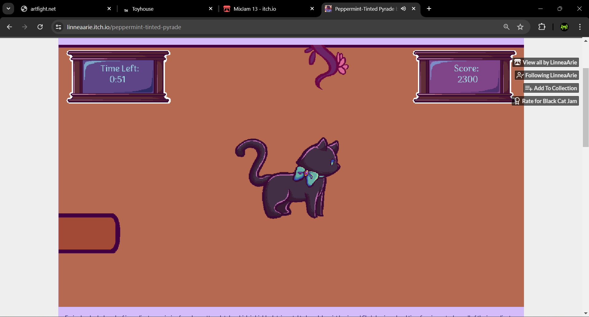
i wouldv rated this pretty highly, honestly. increasingly varied gameplay by adding more mechanics and time and also have dialogue sections, lil bit of a story, the characters were dripping with personality
first level i got an A, second level i got a D cuz i got stuck in the wall or floor or idk what ud call it lol. somehow approached it from the left wall n then phased thru it idk

but the third level i got an S so i feel like i got my revenge lol .
the keys were a little awkward for me, but then again im not very experienced with PC games compared to console games lol, i just got a computer likee 9 months ago. more used to wasd
i wonder if instead of just a level select screen, maybe if it had more dialogue sections before it that maybe subtly tutorialized the upcoming mechanics like the cauldrons or the flyin books
also u can make it to where the timer is more motivated in the scope of the story, like somethin "new" happens in the story every time the timer runs out so the timer doesnt seem as arbitrary, yknow? i understand the game has more of an arcadey feel to it, im just the type of person to want to motivate everything lol
good job tho honestly truly truly honestly. coming from a person who also tried to make their first catformer 😅

good good job
i know very little about meter in music theory cuz im just a metal guitar weeb so if u wrote it in a daw in 7/4 then it is 7/4 🙈 i just figured it was alil quick to be quarter notes but listenin to it again its slower than i remembered it was lol sry about that
yea it kinda is a blessing and a curse just how many different ways u can go about doing the exact same thing in game enginess i need structure lol. thanks for the tips tho! i always appreciate tips from people who are exponentially more experienced in game development that i am 😅
i google searched the lyrics and it said its an ezra glatt song 😅 iv not heard of it but in case you havent figured it out yet i thought id do a bit of research for ya
btw im also pretty new to godot but its my first engine ripp. so i have no idea how to make likee interactables and dialogue boxes and stuff like that in the typical way lol so i just tryin to figure out like on_body_entered signals and for text boxes just spawn sprites that i drew text on😆 i try asking Copilot for help but they tend to give me outdated info pff.
ya music in a 7/8 ish tho, bold but i like it alot. cute cute cute project vibe. also love how u made the godobot blushy lol
cute lil game. i love the stylee. i do realise its a prototype, and im not sure if youd abandoned the project or anything, id just like to give my thoughts anyway so i hope you dont mind 🙈
took me forever to realize that the 10 is displayed as an X which looks a bit too similar to the K lol. if they were all in roman numerals then it wouldv made more sense to assume that it was a 10. or maybe if the X was less stylized with the serifs
the Q and 8 are also kinda similar heh. i understand the limitations in the pixel art tho.
the letter names for the suits was a bit non-intuitive for me. i got it eventually but it took awhile 😅 maybe an accessibility option can be toggled where it shows suit symbols in the art instead. im sure u could make some cute suit symbols
pause menus are pretty easy things to implement in code that most people would appreciate, especially especially in games with timers
ayyy i really liked that. i like sharing my two cents as well so ima give some unsolicited advice lmao
particle effects look nice, alil bright tho. they draw attention a bit more than the character does tho, a tiny bit. in my opinion. especially when more zoomed in. maybe some more transparency might help with that, idk. sure i could just turn them off but i like them lol. i think they were pretty well done, honestly. i just dont like how my eye is drawn to da floor over the character itself yknow. but maybe thats noob-dev me just being more aware of particle effects lol
level names all shaky and sexy lookin but its way in the corner and theres alot that happens at that transition point that its like "wat what did it say? dang i missed it i was too busy lookin around" etc. the eye wants to go to them rule of thirds points so i found maself fighting between the center of the screen to see the supersonic transitions, and the character to see the animations, and the lid flyin, and the metallic bits scattering, and the screen zoomin, and the corner where the level name is, etc
maybe if the level transition and the level name happened at different times, or if the level name was in a different place on the screen. or better yet if the level name lasted longer on screen idk. obvi pretty irrelevant and unimportant if it's just level names but still. im no gen alpha 😅 i take a bit of time to take in all the information
music alil loud by default. same as the ambient fx. so i set the music and the ambience like a third of max while the others are max. alil bit better balance for me, i like the sfx to really stand out over the music, so idk if other people would as well. just gives the game a bit more tactility i suppose. dont want the jams drownin out the audio feedback from the inputs.
could come down to volume, but also if u like mixing and mastering music, maybe some of the frequency ends can be taken out of the music so its not all fighting for the same frequency space. orrrr, idk ur moral stance on lofi lol but lofi might not be a bad filter to try. just so the sounds stand out
when evrything wants ur attention, then nothin gets ya attention, ykwim? visual and audible heirarchies are very very important. timing, placement, volumes, brightness, etc
some ux and ui animations could def be integrated maybe. just to give it a bit more flow and a bit less flashy jumpcut jumpscariness. at least on the pause action, alil zoom-in maybe. or quick flyin from the left or somethingg with alil metallic sound as it slams into place in the center lmao etc. the rabbithole for the importance of ui animations and ux is hella deep tho
alsoo, when i enable an option, idk if i like the fact that enabling and disabling an option has the same clicky sound effect lol. if i turn an option on, i kinda want a sorta positive kind of moree affirming yessy sound. and if im disabling an option, maybe u can make the click a lil duller or something, lower pitch mayhaps. just some audio feedback to match the visual feedback. cuz i kinda look at things in passing but when they both the same click its like waitt did i enable this option or not lol idk. maybe a problem with my brain. i want it to sound like i turned it on, yknow. im not crazy am i lol
iv seen other people talk about this but the sounds dont rly sound like they exist in the same space yknow. audibly. idk if thats due to frequency pockets or differing reverb or something idk. maybe givin em all the same filter or fx chain might help with that
them waterfall sounds omgg so intrusive lol and not in a calming rain way. no offense i just think better when my brain isnt filled wit all sorts of sound. maybe if the water had anything to do with the puzzles then maybe u can draw attention to em like that but otherwise its alil distracting honestly. a more peaceful wooshing mayhaps, or differing volume or frequency domination idk. but maybe u want the player to feel unnerved and distracted because u this character who just like falls into some random place and u want the audience to be immersed with a relevant and applicable emotional response idk lol.
i understand the use of the action button to grab onto the hangy things, n maybe it is more efficient like that idk. it is pretty satisfying gameplay. especially on grabbing the ol magnet buddy. i suppose im used to old sonic games where u just jump at somethin like that and he automatically grabs onto it. the most intuitive gameplay doesnt always mean the best tho. sonic def grabs when i dont want him to grab sometimes lol. nice when its nice, but not nice when it isnt. somethin to think about maybe. im sure u probably already have tho. i also went to press B on an xbox controller to let go of the hangy thing but it didnt workk. same button to grab and to let go is probably better once ppl get used to it but its def not the most intuitive. tho ik B is reserved for something else. B to aim, not LT? cmonn man lol jk
obvi i can tell you know what atmospheric perspective is, which is greattt. idkk. (again, this is just me tryin hard to think of things to say cuz i wanna help out 😅) maybe the bg can be a bit more desaturated. my eyes are kinda fighting around the screen a bit, and a more deliberate visual heirarchy might help that. i like the custom backgrounds over the simples cuz theyr cool af, yet they could maybe benefit from even less contrast or less saturation maybe. i saw the screenshots of the more fiery red level and dang i bet that level must be hard to look at lol. no offense, just makes it harder to differentiate the foreground from the background when theyr both bright and saturated etc
im sure uv heard of likee squash and stretch or whatever its called. i dont remember if ud tried that kinda animation style prior. if not then maybe itd be somethin to at least play around with. at least to have the experience. ik u separate the wheel from the body a bit but maybe animations in the sprite pieces themselves would sorta help give the characters alil more life maybe. at least in the ol tire wheel idk what the wheel is made of lol but still. oo lil bouncy rubber sound for the wheel tire if its made of rubber oo. satisfying lmao.
puzzle design pretty good tho, i like challengin my brain. literally went "Ahhhhhhhhhh.." like at least 4 times lol. its crazy how simple the puzzles are in terms of mechanics and features, but its just the unintuitive order of operations which makes them difficult. fascinating stuff. played on windows. no bugs in the slightest. satisfying controls and gameplay

