
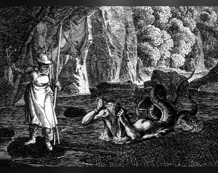
the goblin with seastrider boots encounter is awesome. lots of adventures possibility packed in there.
A member registered Jun 21, 2022 · View creator page →
Creator of
An Adventure with Dungeon Whales
Small Dungeon Adventure for Black Sword Hack or Mork Borg
Wilderness Encounter Table for Experiencing the Sublime
Holiday Add-on for TTRPGs
Player Skill Based Fishing Mini-Game
A City Setting Adventure
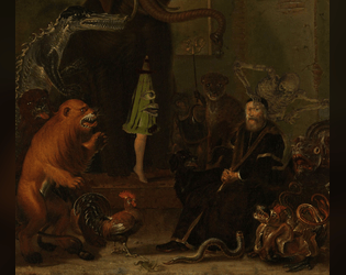
A Baroque Bestiary