I just wanted to tell you - when this notification popped up on my system notifications, it made accidental poetry: "Meet Blaster Joe - from Itchi.io"!
Domarius Games
Creator of
Recent community posts
Ah yes, you are correct, of course many sprite based games have hand drawn artwork for each direction. It's just that, the way I read it, the article seemed to tell the user; if they want to avoid seeing rotated pixels they needed to hand draw the sprites. So I was responding to that.
> "but the user might not display the game you intented as a developer"
Well, its your game, they can only choose the options you provide. It's true you can just let your "full screen" setting scale to fill whatever display the user has, it's certainly the easiest option, but the developer has final say - it's just whether or not you want to take on the extra work of designing how the game behaves on the different display sizes.
Eg. for my game HopSquash! when the user undocks and goes to handheld mode which is 1280x720, I scale my 480x270 game up 3x, and then I only had to crop 1 row of tiles off the top, and 1 column of tiles off either side, and the pixels stay sharp. Cross Code and Blazing Chrome could do something like that if they wanted, Most displays on desktop are 1920x1080 or 4k. But it's not free of course. You have to add the extra work of designing your game like a mobile game or a website, where your game has to be "responsive" to the likely different display sizes. I had to make sure all my levels were playable without those extra tiles on the edges :) I don't know if I'd bother with this for every game, it certainly does add extra work, but the point is the control is always in your hands, you just have to test on the different hardware.
That's a good read and I especially like the attention you gave to how things were in the 80's and 90's and how the artwork was perceived back then.
Just a small correction: under the heading "2.) The way sprites are rotated:" , you say "This usually requires us to draw multiple rotated images and clean them up by hand, which also results in more work." hmm... if anyone is actually doing this, it's a phenomenal waste of time, I've never actually heard of doing it that way! The issue is easily solved by the "Low resolution setup" you described in your heading "A “Pixel-perfect” setup:" If the game's output is rendered to a low resolution pixel buffer (eg. 480x270) and then scaled up with no filtering to 1920x1080, you will get a "pixel perfect" result, meaning all sprites will stay on the pixel grid and all rotations will look "twinkly" just like they did on the SNES, as in the 2rd cup image, rather than seeing individual rotated pixels as in the 3rd cup image. Effectively, the game is emulating old hardware by first rendering the game to a virtual "low resolution screen" before scaling the whole thing up to fill the hardware display in real life.
Also I'm curious what you mean by "There is however no agreement if the user then stretches the view." Do you mean running in "windowed mode" perhaps? As the developer, you have complete control over how the game behaves at different screen sizes and the user need not "destroy" the aesthetic by "stretching the view". If the goal is to maintain sharp pixels at different display sizes, you can do this, and there are several options available to you. It's the same scenario as in the beginning of your article - you need to know what hardware displays you're targeting and design the game to look good on those displays. In modern times, we can afford the game to be "responsive" and adjust itself to look good on a variety of screen ratios and resolutions. Usually by cropping and adjusting the GUI to align with the edges properly. Of course you can just scale and apply filtering and have slightly fuzzy pixels but not have to do any tweaking for different display sizes.
I like your notion of being "consistent", that's the key in any good artwork and the one thing that matters above all else.
As for myself, I used to prefer all pixel art games to render to the low resolution pixel buffer first as above, but after seeing all the amazing pixel art games that play with the limitations, I've come to a similar 2 options you have I think, I just like to define them a little further:
1. For a nostalgic option, I like the idea of "faithfully retro" games that only render to the low resolution pixel buffer, and never use any transparencies or any gradient effects, only using GPU shaders to emulate old hardware effects like scanline effects and palette swapping effects. And then on top of that, sticking to the colour and sprite size limitations of the hardware you're pretending to be. This is only necessary when you want to hit a target audience that wants to see your game and feel like they would have seen this kind of game growing up in the 80's or 90's.
2. For a modern pixel art aesthetic, It's enough that the pixels are all of a consistent size, but it's rendered to the high resolution display with the individual elements scaled up by the same amount, meaning they move in "less than 1 pixel increments" for smoother movement, and rotations show the actual rotated pixels, and they are free to add lighting effects and gradient colours, transparency, glowing effects, particles etc. as they see fit to fit their artistic vision. It's great that the pixel art aesthetic is hanging around through this approach and being appreciated by a new, younger audience.
How did you manage all this unique art? I attempted a "larger scaled" game like this with my Alex Kidd Pico 8 de-make, and even trying to come up with a level storage format that re-used level sequences to "compress" the level, I still hit every graphical, code, storage and even sound limit there is to hit (I had to reduce the music to use arpeggio chords to save "tracks" for other songs and sounds). Just looking at the gifs and screenshots on your page here, I really wonder what techniques you used...
Actually I did - when I made the post above, i was trying to remember why I hadn't done it and now I know - I remember jumping around and pressing all buttons, pulling triggers, in frustration - the only clear moves are jump, wall jump (which I thought was a double jump initially) and dash.
The issue is I didn't know you could "climb". Notice I worked it out right after the previous poster told me I could climb. You have little chance to find out you can climb by accident - because it only works when you happen to be in contact with the wall, which only lasts for a second, and even then, you have to be holding the trigger for it to happen, pressing everything experimentally won't work. So it requires foreknowledge.
After reading comments, I'm guessing most people here are Celeste fans. The only version I've played is the Pico8 one, the original. I guarantee you, if you test this game on non-Celeste fans, the majority of people will get stuck on the same point. I've had gamers get stuck on my games for far less egregious reasons than this during my testing sessions.
Continue works :)
Actually the problem with "New game" is the popup after - "No" or "Yes" both don't do anything.
Also this is one of my personal gripes with modern retro games, curious to hear your thoughts - I notice your main character has 8 way directional movement, and yet the d-pad does nothing, you can only control them with the thumbstick. Do you plan on supporting the d-pad?
Dev team, for your own sake, do even the tiniest thing about this progression blocker, even a controls listing on the Itch page. Now that I've just got past that jump i can see this is a beautifully constructed, probably well designed, Nintendo 64 style game, but I've spent all my patience on that first pillar and really need to get back to work. I might've completed a level or something otherwise.
Thanks for the additional tip. It's probably a great game but I reckon 90% of the people who try this will stop dead where I did and you won't even see them take the time to post here like I did.
I was legit resigned to figuring the game was still WIP and figured I'd come back later when they fixed it. I couldn't progress.
It's the trigger. Do you know I tried all 4 face buttons, found they were doubled up (2 jumps, 2 dashes) and without a spare thought, I intuitively took from that there are no more controls (otherwise why would they double up instead of adding more actions to those buttons?) And I definitely wouldn't have thought to pull triggers in a retro game.
Dev team; if you had no time for a tutorial or prompt in a week, I get it - but not even a control description on the Itch page like every other mini game on Itch?
Where is the moving platform in this screenshot? The things I have circled are just aesthetic element that you clip through if you jump at them. The platform on the far right has the car and nowhere to progress.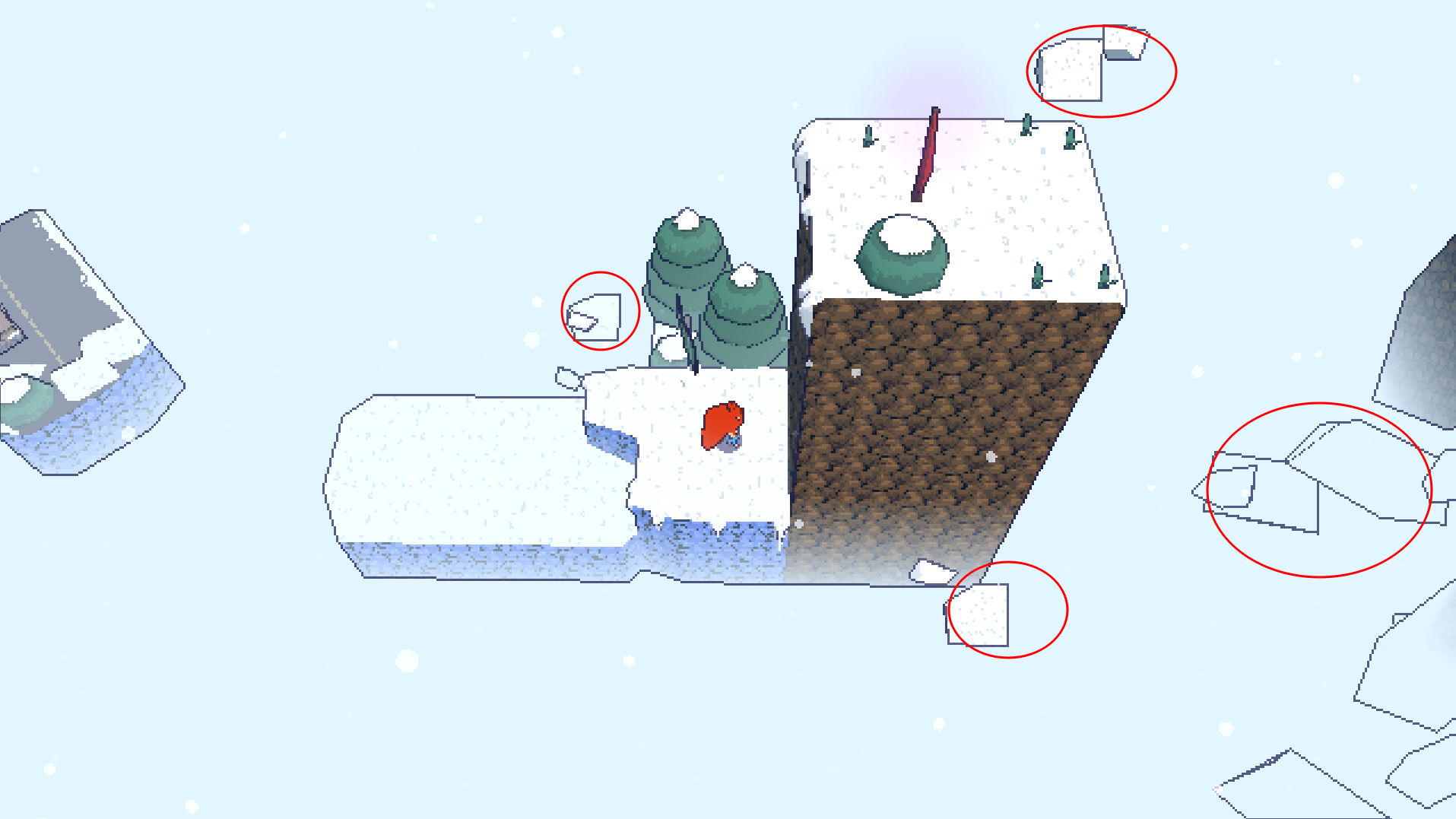
if there really is supposed to be a moving platform somewhere, then I say this is a bug and the platform hasn't shown up. I have looked all around that pillar and spent too long jumping to my death.
I didn't see any moving platform. The game starts with a vertical pillar that you can't ascend because the dash only moves horizontally, and I spun the camera all around, all I found was a platform behind me with a car on it. I was able to jump onto that no problem, but there's no where to go from there.
There is a sign at the base of the pillar that simply has an arrow pointing up. The goal is clear - ascend the pillar, using your movement mechanics I assume.
When you write code for those old consoles, you have to build an entire engine from scratch using nothing but the SDK for the console, it's usually only worth the investment if you are planning on building a company around that and releasing several games. Celeste, like most indie games, is built using an existing game engine.
I can't get over the first jump either, been trying for over 10 minutes on this one jump. Sorry guys. I know it's made in a week but not having SOME direction for this impossible jump is cutting the corners a bit too much. I've tried every combination of double jump and dash that I can see - the best I can get is she's blue and she's above the ledge but heading away from it so she can't land on it.
I even glitched through the wall to my death in my attempts.
As far as I can tell, you can jump, wall jump, and dash in any direction horizontally only. If there's a way to dash upwards to make it up the ledge, I cannot for the life of me, work this out.
I can't get over the first jump either, been trying for 10 minutes. Sorry guys. I know it's made in a week but not having some direction for this impossible jump is cutting the corners a bit too much. I've tried every combination of double jump and dash that I can see - the best I can get is she's blue and she's above the ledge but heading away from it so she can't land on it.
I even glitched through the wall to my death in my attempts.
According to the other reply, if 2nd thumbstick is required to move the camera 90 degrees to perform the jump, why doesn't the camera start out that way? Not that it helped, so not sure if that's the answer either.
Coincidentally, someone this week posted a fix for exactly that problem on the HopSquash Steam forums!
https://steamcommunity.com/app/1012450/discussions/0/3182362958577461213/
Yes that's the best process - finish current projects and take out some extra time to look into how other engines work. I think it's exciting actually. Defold looks really good for super efficient 2D pixel art games. Cocos looks good for low spec 3D like for VR and mobile. And of course you have Unreal for high end 3D.
Oh yes I read about the original Kings Quest games, they did store the art as vectors, because they had to, it was the only way to fit it in RAM on the Apple computer. But Monkey Island etc. the ones your game looks like, they stored them as proper bitmaps.
Yes I completely skipped over mentioning the music :) Just plain note data...
Unity adds a lot of overhead. Looking at the graphics, this game probably would've come out to a handful of disks at the most, if it was actually made in the 90's. They would've used C, wrote their own engine specifically for the target platform, and the graphics would've been stored as paletted indexed formats instead of RGB (so, for a 16 colour game, 1/2 a byte per pixel, instead of 3 bytes per pixel).
I say a handful of disks, because games like Monkey Island came on a couple of disks, but this game has much larger sprites than those games did on average!


