
Maybe later on, towards 1.0. For now I will just do Steam and see if it gets any traction. Keeping the GoG build updated was a bit of a pain, and Necrovale made virtually nothing there.
CLYDE
293
Posts
1
Topics
295
Followers
57
Following
A member registered Oct 15, 2014 · View creator page →
Creator of
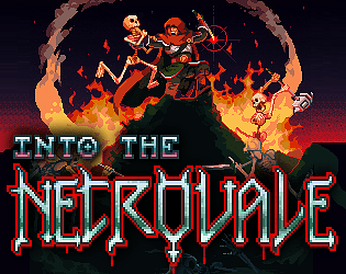
Fight your way through the Necrovale using powerful combinations of items.
Action
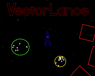
Lance orbs to gain energy and see how far you can explore into the galaxy.
Action
Play in browser
Recent community posts
Hey, writing down a few thoughts as I play:
- Enemy attack clarity is good. But it can be a bit frustrating to avoid the attacks, with no dash or sprint option. It means when an enemy begins an attack, you have to move immediately or you will get hit. Especially the circular attacks. The clarity is not as helpful when you don't have an appropriate response.
- This is especially frustrating when you are playing the axe guy. When you attack and the enemy attacks, you're just locked into taking that damage.
- The attacks from the axe guy feel good. I personally don't mind that you stop moving, I think it gives it more weight.
- The attacks from the ranged guy do such pathetic little damage I exited back to the main menu to go play the axe guy again.
- Going back to the axe guy, it feels like he is pathetically weak now too. Exiting the game and starting again seemed to fix it.
- I feel like the camera could be 20%-50% more zoomed out.
- The player movement could have a little more play to it. Right now it feels a bit stiff, like a 1:1 translation of input to movement. If the input vector is fed into the acceleration instead of the velocity, and you have a high acceleration, it will feel smoother and more fun. As a trick, I reduce drag when input is active, and increase it when no input is active.
- Once you have this, you can also rotate the player model to its movement vector, instead of snapping it instantly. This would help improve the feel of the game, I think.
- The axe attacks could probably have more "nudge" to them. As in, an impulse to your velocity when you attack, in the direction of your attack. I found in Necrovale that this significantly improves the feeling of melee weapons.
- The stamina/breaking system is good, I like how its displayed along with health. It feels pretty intuitive. There also seems to be a blocking system, where enemies can block your attacks. I wonder if it's a bit too much, as it can read as enemies just taking no damage. Especially if there is a crowd.
- Axe guy M2 move feels good
Overall it is good. I think with a bit more work on the feel, it will help it sing.
Cool game, I like the concept. It's a bit like MMO healer gameplay, without the MMO part. I see in another comment you mention hotkey gameplay being challenging to do right. I would look into Monks in Guild Wars 1, specifically the protective spells. It is without a doubt the best designed hotkey gameplay I have ever seen, and it's not even close. Prot monks in GW1 PvP was some of the deepest and most interesting stuff, I'm getting nostalgic talking about it. It encouraged an extremely proactive gameplay style that really rewarded the player for having deep knowledge of how the game worked, what the enemy team was doing, what your own team was doing, etc... It's such a deep well, and it's barely been tapped. It would be a great resource to draw from here.
I also see similar complaints as to what I had earlier in Necrovale gameplay (its boring, just fighting the same skelly over and over). I think the problem more turned out to be one of higher level game structure, not repetition. You have done a lot of work to guide the player to their next objective, but where things really started to click together for me is when I gave them a bigger picture. In my case, it was just a map that came up showing all runs they would be doing, and where the bosses were. Nothing more than Mario did over 30 years ago. It's a minor thing, but it gives the players a sense that there is a certain journey they will be undertaking.
The idea that there is a long way to go needs to be embedded in the back of the players mind. If they have that, they can endure a lot of repetition and tedium and grinding and imbalance and whatever other problems inevitably come up. Because ultimately, the player wants to be spending time in the game world. Its important as the designer to message to the player that you want them there, that you are on the same wavelength.
Keep it up.
For fitting screens while maintaining an integer scaling value, what I did was set an upper and lower breakpoint for width and height, for each scaling value. Meaning, if the game window is under say 1080x640, you go 1x. Once both width and height are above that, pop into 2x. Same for 3x, all the way to 8x. It takes some testing, but once you get the values right, the game will look good and crisp on nearly every screen. The vast majority will have the entire screen filled, a minority will have some letterboxing. Look here for what resolutions are worth testing up front (you can expand the display resolution line item):
https://store.steampowered.com/hwsurvey/Steam-Hardware-Software-Survey-Welcome-t...
- The effects work of the weapon, the environment, and killing things is perfect. Very nice work.
- Needs more visual clarity. Saturation and luminance can help a lot here, if you want to keep things beige. The player, environment, and enemies all sit way too close to each other. For a game, readability is more important than almost anything. Not being able to easily pick out yourself, the enemies, and the obstacles feels like fighting against the game, not against the enemies.
- UI needs a hierarchy. Everything is the same size, same color, etc... Make the most important parts much more obvious. When you lose health, they can flash red. When you spend ammo, the ammo counter can shake or something.
- I'd personally soften the aim tween. It feels too chaotic as you're trying to move around. You could either limit cursor speed, or keep cursor speed, and just make the camera a little more floaty. Not sure which would be better.
- Gameplay wise, I think it has a good feel but might need some more elements. The core moment-to-moment play might need a dash, or a shield, or sprint, or something like that. When you start adding higher level goals and such, it will help, but I think you'll still find that something is missing.
- Start the game fullscreen. I think it's a big mistake when games start windowed. It's saying, eh, this isn't very important. Go check your email, go scroll social media. Fullscreen says, you've given me your attention, I will make good use of that.
- Hard to talk about difficulty, because the clarity of the gameplay and menus are obscuring the issue. Once those are clear, then I think real balance work can take place.
Overall, great work dude. There's a ton of potential here. With a bit more clarity I think you have a really solid base, and there are quite a few directions you can take this in. Keep it up.
Really excellent start. I won't reiterate all the things that are specifically excellent, because it's most of it. I've been admiring the clips of this you posted in the thread so I'm glad to finally get my hands on it. My feedback, is that I personally don't think the camera, controls and movement are quite there yet. Close, but there's a certain last 5% which I think this still needs to achieve. The three are tightly related, so its difficult to change one without changing the others.
When building the camera, there are two dangers. The first is that you're the developer, you've played with this camera over and over and over and over. It's very easy to become accustomed to it. The second is that there isn't one single camera setup that is perfect for everyone. However we can say, that for those whose ideal camera is slower, a faster camera is a problem. And for those whose ideal camera is faster, a slower camera is not a problem. For this reason, a slower camera is preferable. I would classify your camera as a too-fast camera, by about 20% or so.
To get the camera under better control, I think the first thing to do is stop moving it out front of the player. This is the sort of thing that seems smart on paper, but in practice it just adds so much unnecessary movement to the camera. The ideal camera is never even noticed by the players. And this sort of thing really announced itself. In my opinion, toss it. A far better thing to do would be to calculate a camera offset based on the aim offset. Just take the aim vector, and run it through an easing function so that the farther the aim reticule in any direction, the more the camera moves that way. Being a shooting game, I think this will feel a lot better.
The second thing I think the camera needs, it proper lerping. Aside from sticking out front of the player, it feels perfectly glued to the player in an uncomfortable way. Lerping softens the edges of all those movements, making everything easier to visually track. It can be a pretty tight lerp, just add it in and then play with the factor. It's just cameraPos += (cameraPos - targetPos) * lerpFactor * dt. Higher lerp factor for tighter camera movements. Additionally, if you add the aim offset like I suggested above, you can overlay a second lerp, which is the camera lerping to the aim offset position. This one can be a lot softer, so that little adjustments to the aim are not immediately felt by the camera.
Of course, the camera is related to the character movement speed, which I think is also about 20% too fast. The movement speed depends a lot on the character sprite size vs screen size. Here you have a pretty big player, and your screen is fairly small. Zooming out 20% would have a similar effect. Jumping also feels very stiff, and without any camera lerp, is a bit jarring and disorienting. I think setting Y velocity to zero on releasing jump is too harsh, halving Y velocity feels a lot better and smoother, in my experience. That combined with a proper camera lerp should be good, but you can give the camera a different Y lerp factor than X lerp factor if needed.
The ledges and platforming aspect could also be improved. Personally, I think it's a huge mistake to have really technical platforming. That is such a niche thing, that if a game isn't explicitly and obviously leaning into that as its core mechanic, it should be minimized as much as possible. The Dead Cells creator says it a lot better than I ever could, but the essential idea is that as far as movement goes, whatever the players intention was should be executed. That means every time a player tries to jump a gap, get up onto a platform, etc... and they fail, you have made a mistake as the designer.
Anyway, great work. In my humble opinion it has really huge potential. Here's the Dead Cells creator with a great talk I mentioned:
Devil's Little Dungeon Tech Demo V2 jam comments · Posted in Devil's Little Dungeon Tech Demo V2 jam comments
Technically, it's the most impressive thing I've ever seen come out of agdg. If the mechanics or execution were lesser, I wouldn't be giving the following feedback, but as it stands I think it's worth saying.
You give us this incredible avatar, a wizard that can bend space and time to his will. And what do we do with such power? Whack little bugs and plants. Jump over spikes. Climb random structures. Nothing out of the ordinary for an SNES era platformer. In a way, it's kind of awesome how it transforms those tedious experiences into something new. You really have to relearn your risk assessment, and how to think non-linearly and experiment with how to use the mechanics.
But on the other hand, I can't help but think about the game that these mechanics want to be a part of. It's a bit like you've just created Superman, but are only facing him up against run of the mills robbers and crooks. When what you need is a Lex Luthor. Not even in terms of a specific villain, but in terms of the types of challenges you're giving to the player.
Imagine fighting an actual God. 10x your size, more powerful than you can even imagine. In a straight up fight, you stand no chance. But you are a wizard who controls time and space. When the player finishes him off, it feels like they basically achieved the impossible. Imagine traversing a crumbling necropolis, using your time rewind powers to actually interact with the far past, unlocking the secrets of the city and the long-dead civilization that inhabited it.
Anyway, sorry if this feedback is presumptuous. I don't really know where you're at with development. I just want to see the best for this project, because I see such awesome potential in it.
This is fantastic dude, nice work. The level of polish is so high, and the core premise and execution is great. I went through 5 or so battles and had fun.
My feedback is that parts of it feel a little over-designed. The premise of solitaire is that it's simple, fun, satisfying, an easy way to spend some time. So tapping into that with an auto-battler is really smart. But a lot of the skills, effects, extra mechanics, are working against that. If I'm being honest about my experience, I really loved clicking cards and finding "paths" to maximize how many I could click. But when I get to the skills, and statuses, and other mechanical bric-a-brac, I felt like I just wanted to skip past it and ignore it. I wanted to get back to clicking cards, not read some really dense and complicated rules situation in these skills I was getting.
There is an impulse when designing, to feel like it's not enough, and I need to add X Y and Z feature. But the core here is strong enough to stand on it's own. It's worth protecting.
Wow, coming out of Velocity Noodle hot. I love it. This is a winner dude. The presentation is excellent. The game feels great to play, and the concept of "connect anything" is really exciting. I think there is so much potential there.
Only real feedback, is to perhaps make the hacking part a little more smooth feeling to control. That will help keep the pace of the game up. For instance, when you go into hacking mode, the actual click target for objects is small. That makes sense for enemies where there is a skill component that is enjoyable (missing is a mistake, then finally hitting feels great). Missing the click on a hack target just feels tedious. Perhaps instead of well-defined click targets, in hacking mode, there could be some sort of "nearest to mouse" hueristic, with a boundary of course. That would be much more conducive to quickly going "pause -> click -> click -> click -> unpause -> boom", which I think is really the core of the game.
I think going over the top with highlighting the hackable targets in hack-mode is also a good idea. When you pause, you have a cool effect. But the actual hackable targets are a tad bit lost in there.
Oh yeah, and the visible sightlines on the enemies is excellent. I think you have a great design sensibility, and that's a good example of it. You've already found the fun with this game, it's seriously cool. Keep it up.
Hey Vita, glad to see you back after setting down Samsara. I tried to play the game, but was having issues moving around. WASD would only sort of wiggle my guy forward a little bit at a time. If I got clear of any obstacles, holding W would eventually get him moving. But then hitting A or D would make him stop, and make the camera zoom in. Not sure what the issues was, the framerate seemed fine and everything.
Hey, just tried this for the first time. I am absolute shit at difficult platforming games, but thought this one was quite fun. I like the feel of the movement a lot, and even though I sucked I did not feel like I was fighting the controls at all, which is an accomplishment. The idea of automatically using your jetpack constantly, and being able to lock in your height feels great. It's somewhere between a top down shooter and a platformer.
A few times I just kind of bumrushed some obstacles I was having a tough time with. Which seemed to be a viable strategy, at least early on. I had a lot of fun fighting the enemies, brought me back to MMX a bit.
Keep it up, it's solid.
Awesome stuff, this game has a really strong perspective. The world you're developing feels fresh and unique. The story aspects and gameplay aspects feel well balanced, I think that is a big strength here. Either of those can easily take over if allowed, so good job there.
My main feedback is to give people a little more time to soak things in. For instance, when you first meet a character, a sheet comes up for them with lots of things going on. But it disappears so quickly I can't read it. Looking at the gif of the girls sheet I can get a better look, and it's really fascinating. It's something people are going to want to look at in detail. The Deerhunter 2 cutscene as well, it's awesome but flys by so fast that I can't fully appreciate it. I love that you're thinking in terms of creating cool and memorable moments, but let those moments shine. Especially for someone playing the game for the first time. If someone just wants to skip the cutscenes, they are playing the wrong game and shouldn't really be factored into your feedback, in my opinion.
Keep it up bro, great work.
It's fun and polished, nice work. I enjoyed it more than I expected. I had a few satisfying moments where a big chain reaction would go off. I think that's really the key moment of the game. And it probably happened not quite enough. I'd consider adding a little more "chaos" when two emojis merge, like making the merge cause a proportional force wave that jitters things around a bit. The bigger the emoji you create, the more jitter. That way, I think you'd create more of those "cascade" moments. As it stands, the emoji structure feels just a tiny bit too static as it starts getting full.
AGE OF BRASS (prototype) jam comments · Replied to Rezydent in AGE OF BRASS (prototype) jam comments
Excellent progress since last DD.
Positives:
- The movement already feels massively better and more fun. The combination of MMX style wall jumping and gun hovering is starting to feel really good. Most of the time, I didn't have a problem moving vertically, while it felt overly difficult last time.
- I like how the first boss tests your ability to hover with the gun.
- I see you starting to build the larger structure of the game. This is good, keep going. The level select already makes it feel more like a full game and less like a cool prototype. Of course it call be taken a lot farther, but it's a good start and the right direction. Not sure what the gun points you earn at the end at, but I'm assuming you might unlock some new abilities or levels or something.
- The tokens you find are nice.
- I see some new enemies, love your designs a lot. They definitely feel unique and cool. The world in general has a unique perspective, big props there.
What could be improved:
- I feel there are still a few inconsistencies in the movement system. At least how they're presented. I learn how to grab walls and jump up, and then later it's mentioned that there is a ledge grab. And the level has a bunch of little grab points. But it felt like earlier I was able to just climb up any wall? By holding against it and jumping up. I'm not sure if this is actually two overly similar systems, or an issue with the messaging.
- I think you're still trying to lean on platforming as a source of gameplay. Personally, I think that's a huge mistake, especially when you have so many more interesting and fun and cool things happening. Namely, the gun and combat. The boss fight was awesome and fun, it felt great. The level where I was tediously trying to climb over some ledges and the two swarms of bugs, not fun at all. Look at the promise you make at the beginning of the game: hold left mouse to shoot (and never stop). That is what the game clearly wants to be: blasting the fuck out of aliens, blasting so hard the room is filling with shells and your gun is overheating. Listen to what your game is telling you. Tediously and repetitively bungling around some ledges is the exact opposite experience of that.
This talk feels extremely relevant:
He says, far more eloquently, what I'm trying to say here. The fun of your game is the fighting. The platforming should basically be something that is so intuitive and forgiving and easy that players don't even notice it. If you want skill around movement, make it so that 0% effort will get the job done. 10% effort will let you do cool shit.The game itself can be pixel perfect, even if the camera is moving at a higher resolution. Because when you translate the game to the screen, each pixel is actually 2-6 pixels wide/high. Everything within the game, effects, sprites, tiles, etc... can all line up perfectly at the lower resolution (though they dont need to, it can look really good if they dont).
Wow, this is so much more than I was expecting. It's really excellent. Factorio is one of the games I've played most in my life, and this certainly stands up against it. I will be playing this fully once it releases. Tutorial was great, the possibilities feel dizzying. Interaction system feels intuitive, only took a short bit of time to use it fluidly. Very fun seeing unexpected things happen, and chaos unfold. When the roller started bulldozing me and a tree through everything I build it was hilarious. Gotta be better about welding.
Deserves a better name and player sprite, that's my only comments. The name is really wacky and doesn't capture what the game is about at all, in my opinion. Perhaps its memorable, but conjures images of a silly cowboy game or something. Consider the most important vector of a game becoming popular, people telling their friends about it. "Dude, have you tried Roody Toody? It's awesome!". It doesn't sound cool, it requires a lot of "I know it sounds dumb but trust me" type stuff. Or think about when you try and explain what you're working on to your dad. "What is the game you're making, son?" Do you really want to say "Roody Toody"? This stuff is important. Factorio is a perfect name. It sounds mathematical, complicated, and kind of sophisticated. It instantly primes someone for what to expect. Minecraft, Infinifactory, SHENZEN I/O. Those are good names. Even Satisfactory, a kind of stupid name, is better. And your game is already better than that one. Anyway, I've said my piece there.
The concept of the player sprite is great, I like that he is 1 block in size exactly, that's perfect. And the mask coming down when going into welding mode is an excellent touch. But at first he looks like a tard with some orange clown hair. He doesn't have an iconic look, when I really think he should.
Great work. Carry on
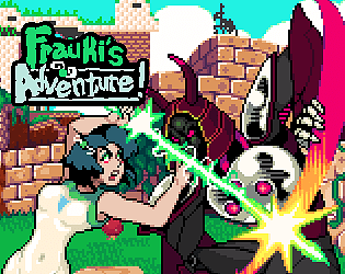
Wow, this is amazing. This is the closest I've ever felt to playing MMX, even when considering the MMX "clones", like 20XX/30XX. And this is no clone! MMX was probably the game I played the most of as a child, and inspired my first game (Frauki's Adventure!). But this game is significantly better than that, so well done. There are a couple things I think could be improved, and a couple random ideas.
- The font in the dialog boxes is really bad. It looks ugly and is hard to read. You can get 10x better fonts for pennies, or for free.
- The camera could be improved. The game is at 240x190 or whatever base resolution, but that doesn't mean the camera should be moving in that space. The camera should be moving in the full unscaled resolution. That will reduce the jitteriness of the game a lot. Also, the camera could stand to be tweened to the player, instead of perfectly locked on. It just makes the game a lot easier for your eyes to track things, and makes it look more professional. Of course, you first need to get the camera moving in unscaled space, or the movement will look blocky and strange.
- The difficulty of the first boss is too high, in my opinion. I was loving the difficulty up until that point, at which time it seemed to jump. I loved the challenge of MMX games, and will always remember the first time I beat Chill Penguin. But the difficulty jumps too much too quickly at the first boss, in my opinion.
- In my game, I made it so that if you attacked while jumping, you would attack somewhat above yourself, instead of just in front. I think that could be really beneficial here, because you have aspects that cause you to float while attacking. Jumping up into an enemy and missing an attack off to the side doesn't feel great.
I think this game has massive potential. It's really cool and with some work it could do well. At minimum, you should get a Steam page ready to go. I'd also look for publishers, if you want to go that route. Contact me if you want me to put you in touch with some people.