
Indie game storeFree gamesFun gamesHorror games
Game developmentAssetsComics
SalesBundles
Jobs
TagsGame Engines

Chard

66
Posts
1
Topics
35
Followers
79
Following
A member registered May 27, 2020 · View creator page →

Creator of

Recent community posts
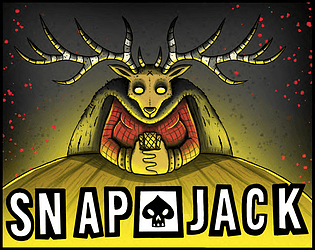
That was a work of art!That was a work of art!That was a work of art!That was a work of art!That was a work of art!That was a work of art!That was a work of art!That was a work of art!

check your inbox ;)

woah looks great!

great game!

(9 edits)

Hi everyone!

We’ve just made Snap Jack public on itch.io after coming 5th in the Indie Game Clinic COLLAB JAM ’26.

Play here: https://chardigan.itch.io/snap-jack

Snap Jack is a fast, mouse-only arcade card game inspired by Snap. You owe a debt to the Devil, and the only way out is to spot matching cards anywhere on the table, draw a connection between them, and claim the pile before your opponents snap it away from you.

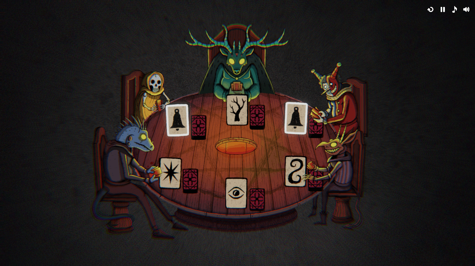
It starts simple, then gets much more chaotic as more players, more cards, and faster turns are added. The game is currently a free browser prototype and takes around 20-30 minutes to play through.

This version is a post-jam update based on player feedback. We’ve tightened up the early tutorial pacing, made the later table pacing smoother, added animated chip rewards, and added a score/results screen so the run has a clearer sense of progression.

I’d love to hear what people think, especially around usability, pacing and whether the core “spot a match, draw the snap” interaction stays readable once the table gets crowded.

Thanks for taking a look!


Thank you so much!

Polish, like animations?

great idea! Thanks so much for the feedback :)


any thoughts about which rules?

I’ve learned so much from all the feedback!

(1 edit)

yeah that’s a good call!

There’s a Snap on space bar which is still in the game from a previous iteration, which if you press at the wrong time results in forfeiting the cards in-front of you.

However I never found a suitable failure state for the drawing behaviour whilst still maintaining the player’s intent.

yeah at its core it’s based upon Snap, a classic children’s game. Then I added drawing and we had to create custom card art for the jam brief.

https://www.pagat.com/war/snap.html

I really like this! Do you think you can support touch screen input? Or vertical aspect ratio?

(1 edit)

It looks fine when scaled full screen but scaled down and embedded in the browser window there's some shimmering, called Aliasing I believe. Should be able to enable MipMapping on the textures. Or use anti-aliasing on your camera / post processing.

Hope that helps!

I love it, very french! It feels like you've taken the concept of Wilmots warehouse and remixed it in an interesting way. I could very much see this being a full game on the Switch!

I found all of the mime drawings to be quite clear in their communication of the activity!

Some of the items sprites were not very clear on the shelf. I think there was a videotape? I think the cigarettes were also not so clear.

Also there appears to be a rendering issue with your sprites, perhaps they were drawn too high resolution and not compressed?

I would like to see more characters - in a classic shop sim style, they're waiting for you to find the thing, they get ticked off if you're slow, they leave once they get it, etc.

The only setting which this game truly makes sense for me - is if the patron is blocked from entering the shop, then we are sent into the shop, or the back rooms to find the item. Otherwise they would be like an old lady customer who can't find anything and asks at the till, or a gas station late at night where the customers physically can't enter.

I completed the game, really enjoyed my time, very charming.

(1 edit)

It's just missing background art and consistency (of the whole screen). I like your artwork and I think the sprites on show are cohesive together. I'm not suggesting you switch to an asset pack... But if you look at Tiny Swords,  you can see how it all ties nicely together https://pixelfrog-assets.itch.io/tiny-swords

I love the affordances in the design, such as merging the goos. I also love how intuitive it is when one input has multiple actions. It gives the game a sense of wonder "what happens if I try smash this thing?" Although the early game is quite a challenge, it feels fair and encourages you to try stuff!

(2 edits)

I really like this genre of game, I've spent a lot of time in Archero and Vampire survivors. Unfortunately it's just a little too unpolished in it's current state. The balance is off and the character is too tall. But with some polish on the game feel you've got something really promising here. It's just a shame it's quite derivative.

I'm surprised I'm getting performance issues because the game itself is quite simple visually. It also took a very long time to load which is unusual for a browser game, I thought perhaps it was broken.

(1 edit)

It's one of those ideas that is so pure I'm shocked I've never seen it before. Combining scooker with an environment. Amazing!
It got a bit tricky for me early on when I had a blue and pink ball to manage simultaneously, we kept getting stuck in the room at the bottom. Perhaps close the door after I leave it?

There's a nugget of something great here, the theming, music, art and mechanic combination are very evocativ.
If you iterated a bit more on the puzzle designs I think this would be really good!

Not for me, I liked the sliding block puzzle but felt it could've been integrated into the world a bit more seamlessly. You could also have provided a simpler puzzle before jumping into a 4x4. I had no idea my character could jump 3 blocks high yet, so I was going in a bit blind.

I kept falling in the first level with the 2nd moving platform. I quit out, sorry!

Very nice! It's drawing from crazy taxi or dredge. The goals are clearly communicated and the map helps a lot.
The visuals, game feel, etc are all really well executed.
The game struggled with differentiation between areas of the map. If I were to play a longer game of this, I would hope for some more visual variety, so I could recall and navigate to areas I'd seen before.
The game was lacking in challenge - until I got to the yellow girl I didn't realise I had lives or a timer. If you added more missions it'd be great to see more like that.
However, the clown had great communication of place, so it was very clear where he lived, I was able to remember and return back to it.
In a larger game I think you could add a bit of variety to the missions, such as deliveries of goods to multiple people. Finding lost children around the map. Races. Steering challenges. All the things you'd expect to find in an open world nintendo sports game.

The grey and the blue may be a little too similar, and some of the hitboxes for the fences could be more forgiving.
But the tutorial and game feel was 10/10

the game feel, theming and music are superb. well done!

This is a gorgeous little game, it's an intuitive little puzzle that gave me enough clues to figure it out.
The juice and vibe were perfect.
Negatives: The cursor felt a little off-center. It felt to me like the wheel may be turning backwards from the layout I have on the revolver at the bottom.

ah, I think the turn timer is too slow perhaps, I can tweak that per number of players remaining.

I’m planning to incentivise larger snaps with a score multiplier, and the AI already back off a bit if there’s 3 or more matches on the table to give you a chance :)

surprisingly it does work on mobile! We’ve been playtesting on mobile and tablet all week.

I have similar thoughts about the end-game, any ideas about how to improve it?

Waiting for an opportunity and missing it feels like it’s just at the heart of snap, no?

hmm yeah I was thinking about indicating who’s turn it is to place the card with a turn timer.

But why specifically do you want to expose the AI’s response times?

I’ll add some tutorialisation around matching more than two cards, thanks!

yeah I’m thinking the same. I’ll make a more interactive tutorial after the jam.

I had a lot of feedback about the main game being too fast which is why I ramped it up slowly through the two starter tables. And I reduced the number of cards to make sure we got through fairly quickly, but RNG can throw that off.

thanks for the feedback!

(1 edit)

I think I freed mandi!

Okay, so there's an interesting concept / design here. You've got essentially a survivors-like on an extra terrestrial planet. You've got a playground to explore speculative biology, ecosystems, etc.

I would raise the camera up a bit higher - 30-40 degree pitch.

Good luck!

I would've liked for the basic input to be more intuitive

Music was great, I didn't really understand the gameplay. But it felt very polished!

(1 edit)

Sadly I think the game is unplayable? Or at-least I couldn't figure out how to dig or climb any ledges.

The art is adorable

There could be better communication around you punching / only being allowed to punch on the beat. moving the character around felt a bit redundant. I'd simplify and just present one enemy at a time.

Interesting concept, I really like your combination of mechanics but it felt very clunky to control. With a little bit more work on the communication this can be viable! I would even play it without the arrow keys.

(1 edit)

I got stuck right at the start of the game, I could do with an indicator to show your mouse is tied to the jump vector.

WOW what a game!
I love the concept, I love the drawings. But I only started to understand the story line towards the end of my play session after I healed 3 people.
It feels like you're roleplaying a joke writer in a 3 panel comic strip. Very interesting!

I wasn't sure why I couldn't put more than three sweets on my horse upgrade.
Also thought the hitboxes for the sweets could be a little more forgiving.

So charming. I didn't expect to get a metroidvania in my walking simulator :D
Really appreciate how minimalist the control sceheme is, makes collecting the rubbish extremely intuitive and I played to completion because of it.

(1 edit)

You could, for example, pick up a block by it's tip, then the weight of that block vs where your pivot point is would make it rotate to a more vertical position.

Also I appreciate that you have the little cone to help demonstrate where the object is in 3d space, but perhaps a more explicit drop shadow / blob shadow would help line things up easier.