

thanks, glad the comic look lands. the screenshot with the snake is worth a second look though. that block of text is a real folklore note rather than flavor text, and the guy holding the snake is a thief out of a 14th century novel who also turns up in folk dance troupes as the snake master.
Celestial9
5
Posts
1
Topics
1
Followers
2
Following
A member registered 31 days ago · View creator page →
Creator of
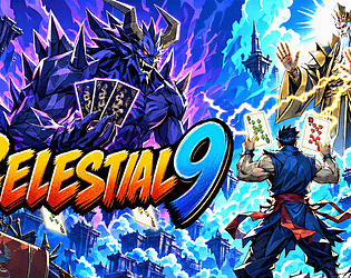
A Teochew folk card game reborn as a roguelike. Rewrite one hand, forge divine synergies, and face fallen gods.
Card Game
Recent community posts
itch.io Community » Game Development » Get Feedback · Posted in Looking for feedback on my free browser arcade shooter, Space Ranger
Came back and played the update. Thank you for turning all four around that fast, and for writing up what you changed rather than just saying "fixed".
All four are gone on my end:
- The title screen saying CLICK HERE OR PUSH ENTER, plus the canvas grabbing focus when you click it, completely removes the "is this thing broken?" moment. That was the one that mattered.
- Controls under the canvas are English first with Japanese underneath, and the title screen itself now lists A/D and Z. Nothing left to guess at.
- Pause no longer dead-ends. It tells you CLICK OR PUSH P, and a click really does bring you back.
- The pause text and the round banner no longer land on top of each other.
On round one difficulty: it is not too easy. I lost ships in it. What struck me is that the difficulty inside round one isn't flat. The opening is calm and very readable, only a couple of divers at a time and they all arc in the same shape. Then it tightens noticeably near the end, once the formation has thinned out and the dives start coming much closer together. So round one spends most of its length teaching you that this is gentle, and does most of its killing in the last stretch.
I think that shape is right for the game. I would only soften it for round one specifically. Round one's job is to teach a new player how to read a dive; round two onward can punish them for reading it wrong. At the moment the punishment shows up slightly before the lesson lands.
On the weapons I should be upfront: I never got far enough to hold all four, so I got curious and read the source, since it's a browser game and it's right there. What I found lines up with how the first one felt. The chance of firing a special instead of a normal shot stays the same no matter how many weapons you are carrying, and which one comes out is a random pick between them. So the first weapon is a genuine change, and every weapon after it quietly makes the others rarer. Four weapons doesn't play as four times the firepower, it plays as "I can't rely on any of them".
If you want stacking to feel like growth, two directions. Let the player choose which weapon is live with a cycle key, which keeps it skillful. Or have each new weapon raise the special-shot rate rather than divide it, which keeps it simple. Either one turns the boss reward into something you feel.
Great turnaround. And the score table is still the nicest thing on the title screen. Good luck with the remaining rounds.
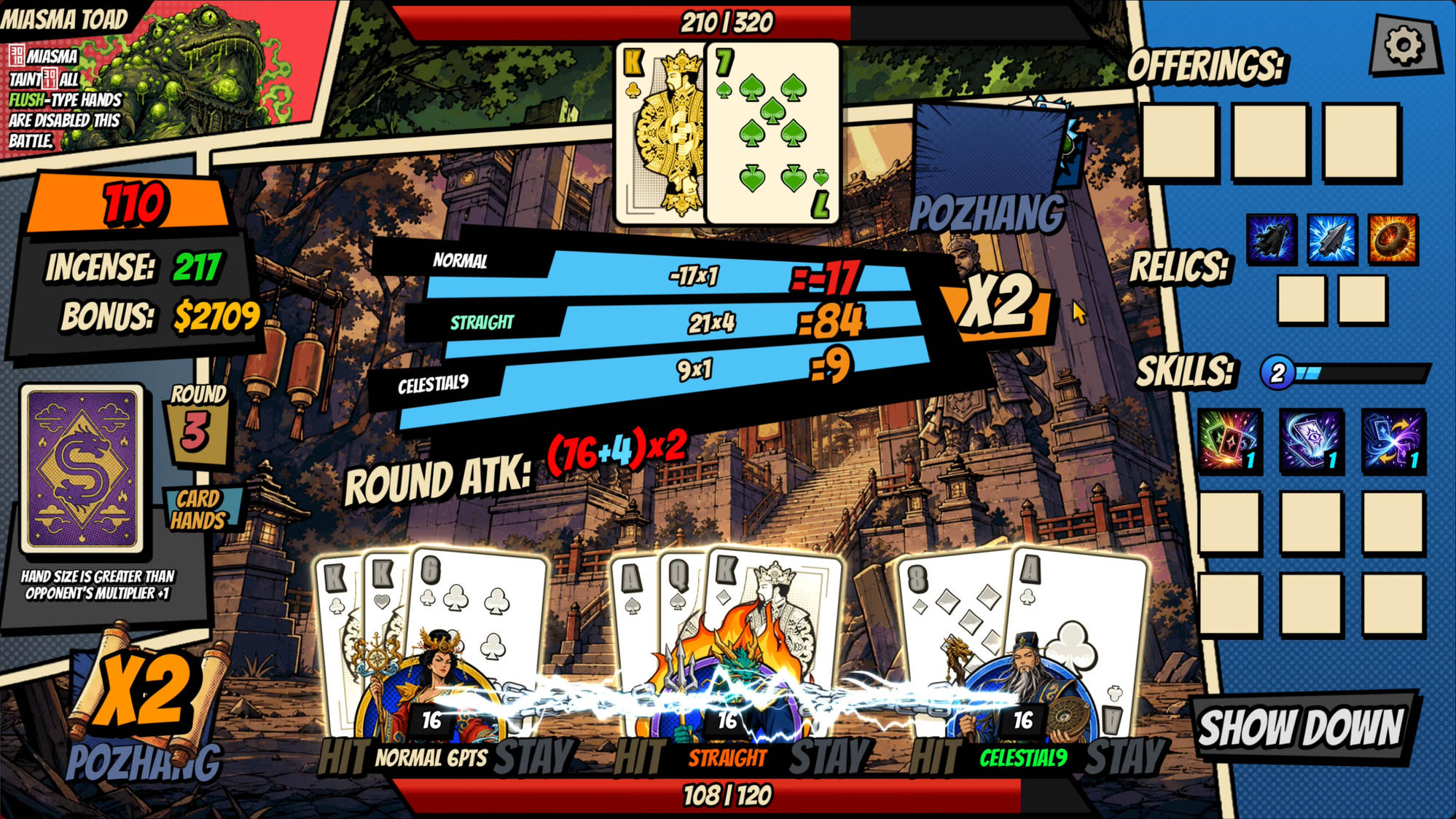
itch.io Community » Game Development » Get Feedback · Created a new topic Page went live today — please tell me what's wrong with it (roguelike deckbuilder, no demo yet)
Page went live today, so it has had no contact with strangers yet and I'd rather find out what's wrong now than in October. Please be blunt — I'm after the things that made you hesitate, not encouragement.
CELESTIAL 9 — a roguelike deckbuilder built on Mu Shi (木虱), a folk gambling card game from Teochew in southern China. Free demo coming, nothing playable on the page yet, so this is purely about whether the page does its job.
The four things I'm least sure about:
- Does the capsule art tell you what kind of game this is within a second? My worry is that the mythology art reads as an action RPG or a beat-em-up, and by the time anyone learns it's a card game they've already scrolled past.
- Does the tagline land, or does it read like it was translated? We're a Chinese-speaking team writing our own English, and this is exactly the kind of thing we have no instinct for. If a sentence sounds slightly off to you, please quote it back at me.
- Is "a folk gambling card game from Teochew" interesting or just noise? It's the honest hook and the reason the game exists, but I genuinely cannot tell whether that reads as intriguing or as an unfamiliar word doing no work. If it means nothing to you, say so — that's useful.
- Five screenshots, ordered battle → shop → deity → map → item pick. Is the first one the right first one? Does anything in there look confusing or ugly at thumbnail size?
The Steam page is here if it's easier to critique that instead — same assets, same problems, and honestly the same question.
Happy to return the favour on anything. I replied to the Space Ranger thread further down this board earlier and will keep working through others; if you leave feedback here, link me your page and I'll give you the same treatment properly rather than a one-liner.
itch.io Community » Game Development » Get Feedback · Posted in Looking for feedback on my free browser arcade shooter, Space Ranger
Played it in Chrome on macOS just now. I couldn't get far enough to answer your balance questions, and the reason why is probably the most useful thing I can tell you, so I'll lead with that.
1. Keyboard input didn't register until I clicked inside the game canvas. I hit Enter on the title screen and nothing happened, twice. Once I clicked into the frame it worked immediately. A lot of people will read that as "the game is broken" and close the tab. A one-line "click here to start" prompt on the canvas, or auto-focusing the iframe, would fix it.
2. I then got stuck on the pause screen. It auto-paused (I assume on focus loss, which is good behaviour in itself), but pressing P didn't bring me back — I tried several times and stayed on PAUSE. Possibly the same focus problem biting again, but from the player's side it just reads as being stuck.
3. Two overlay strings collide. On that pause screen, "PUSH P TO RESUME" and "PLAYER ONE READY" render on top of each other and both become hard to read. Easy fix, and it's the first thing I saw when things went wrong, which is the worst possible moment for the UI to look broken.
4. The control list under the canvas is Japanese only, while the in-game title screen is English. Worth mirroring, especially because the Japanese line mentions A/D for movement and Z for fire — the English title screen only tells you arrow keys and Space. You're hiding your own accessibility options from English readers.
Everything I did see looks good, for what that's worth — the title screen with the enemy score table is a genuinely nice touch and immediately signals "this person knows the genre". The formation and the sprite work read clearly at that resolution.
Fix the entry friction and I'll come back and actually answer the round-one difficulty and weapon questions properly — I'd like to, the game clearly deserves a real playthrough.