
Amen.
Carbon Canine
45
Posts
9
Followers
1
Following
A member registered Feb 13, 2019 · View creator page →
Creator of

Explore an increasingly unfamiliar world in this puzzle platformer inspired by the album of the same name
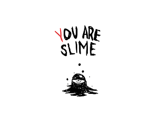
Can you, *Slime,* manage to get adopted by a loving family?
Play in browser

A student made clone of Keep Talking and Nobody Explodes
Simulation
Recent community posts
As I write this, the screen continues to fill with individuals whose needs are increasingly impossible to satisfy. Is this our fate as a species? Despite the fact that time and space continue to compress thanks to technological advancement, are we destined to remain strangers? Even the magic of mythical beings, once worshipped for their omnipotence, isn't enough to stand against our loneliness and fear of vulnerability. We watch helplessly as the names pile on, as the prayers go unanswered, as they swarm into a growing monument to human weakness.
Anyway, I think the concept is pretty strong. Others have mentioned possible UI and UX improvements, so I won't harp on about them for too long, but I agree that the game could benefit from some visual improvements that provide a bit more clarity and guidance amidst the chaos (color-coding personality types would be a great help). I appreciate all of the possible activities that the characters can do, but they admittedly get lost amidst all of the mixing and matching. One element I'll certainly praise is the tutorial. Considering how crazy things can get in this game and how unique the system is, it's nice to have a safe space to figure out the controls and see how things play out between characters. It's clear that a lot of thought went into this one, and I'd love to see how it could be expanded upon in potential iterations. Nice work!
Maybe I'm just a little bit dense, but I found it somewhat difficult to piece together my appearance using the hints provided by the characters (aside from the group of kids), so I just gave what I thought might've been the correct answers and wound up with the good ending. That may have been the whole point, that we redefine ourselves every day and aren't bound to our pasts or others' perceptions of us, and if that's the case, I really do appreciate the message (having read a couple of other takes on the game, though, I have a feeling I might've missed the mark). Even so, I think it could've been reinforced a little more (but then you run the risk of beating the player over the head with your message, so...touché). That said, I really enjoy the concept here - talking to people to find out who you were, and your impressions come true whether you like it or not - there's something that feels truthful and honest about this premise, even if I can't pin down exactly what.
I can definitely appreciate the sheer strangeness radiating from this one. The mere idea of playing as a car to trick some cockroach into thinking it's in control (complete with sound effects) is rad, and the obstacle-filled road is a great addition that completes the concept (having to sometimes sacrifice believability for the sake of survival makes for an engaging give and take), but I think the disconnect created by the inverted controls in the top-down perspective is just a little too disorienting considering that the player is already trying appease a cockroach without crashing. I think I understand why the feature is in place, maybe the game would be a little too easy otherwise, but I'd at least like to try playing without it. The text boxes commenting on the player's performance are welcome feedback, but I might appreciate a bar that measures how close I might be to fully convincing the cockroach. Maybe that's unnecessary, but it might at least motivate me to strategize around my "safety turns" when I know I can afford to lose a few points. Overall, awesome job! I'm definitely gonna hear that hiss in my nightmares.
I actually wondered about this myself - how do you truly make a non-human POV game when the player themselves, presumably, is human - and I think you did a fantastic job answering that prompt by manipulating the player outside of the constraints of the machine, further disorienting them by changing "up" to "down" and "left" to "right" so they can't rely on their own sense of logic. The player becomes as much like a computer as is possible for a game of this scope, and it's very well executed (the jibberish complaints are an especially nice touch). If I were to offer a suggestion, I think just one more key outside the range of 'W,' 'S,' 'I,' and 'O' would add the slightest bit more confusion into the mix, as the player might lose track of the keys they're supposed to press, but that might bring the game a little too far from its CPU premise. Great work overall!
Beyond Our Current Metaphysical Plain comments · Posted in Beyond Our Current Metaphysical Plain comments
I think the idea of hiding obstacles among otherwise helpful items is a good concept for a game, but it might've been more effective if the spawn points were spread out and the items' differences were more subtle. Maybe even more fun is the idea that the fate of the entire universe would be contingent on something as mundane as the quality of Jim's bananas, the basic concept might be amusing enough to work in something a little more fleshed out. I don't want to harp on for too long, considering you've been having a rough go of it recently, but suffice it to say that I think you found a certain kind of energy here that you could tap into in the future.
"Oh, to be a disembodied head firing oranges at sentient brains," or so the saying goes. A classic setup, made all the better with the addition of Sprite™. For the most part, this is a pretty solid top-down shooter. The camera provides a clear view of the map, the player avatar, enemies, and projectiles all move at fair speeds, I like how certain rooms are clouded before entering, and enemy placement is well-considered. If I had to pick at nits, I'd start with the mapping of the sprite-drinking button. It's only accessible with the left shift key, and since I'll be using most of the fingers on my left hand to move, I think I'd appreciate the option to use the right shift (though I'd probably reconsider if I were using a mouse instead of a trackpad). I sometimes find that I seem to take more than 1 hit of damage from enemy projectiles as well, and brain behavior makes them a little too easy to exploit (but that's understandable, considering the allotted time). I'd also suggest adding a few more collision barriers inside of rooms (perhaps with the furniture) to add a little more tactical variety. Lastly, I skipped straight past the end screen on accident because I was still clicking to kill the last brain, so either an input buffer or the use of a different key would be appreciated for that final bit. I had a pretty good time with this one overall. Great job!
Are you doing alright, Cooper? Not that I don't appreciate the attempt to give this game a sort of nihilistic attitude, but I think it's a pretty big jump to go from preventing eggs from reaching the edge of a circle to staring down the meaningless of life. Sure, we're bound to go through boring, repetitive cycles from time to time, and it's bound to come to an end, but living is more than a tedious burden (a major difference between "Eyes" and our lives is that it won't end without our input). Even now, in the midst of a low point in our history, we can still support each other, make new discoveries, and improve ourselves. We have an eternity to be dead, but only this tiny slice of time to exist and experience the world. Isn't that something special?
Anyway, I really admire the way that you decided to present this concept, even if it didn't totally resonate with me. The bait and switch from the initial pitch to the actual game is properly surprising, and the lingering "End" button in the corner hovers ominously the entire time. Other commenters have mentioned this, but I appreciate the way that the player's score and maximum combo worked their way into the finale. Great stuff overall, I just hope you haven't adopted this philosophy yourself.
You really managed to build an eerie and unsettling atmosphere with this one, due in no small part to the pulsating brain, scrolling background, garbled text, and choice of music. I found the audio, paired with the day transitions, somewhat reminiscent of Majora's Mask (in the best way). Funnily enough, I only managed to reach the end of the week by ignoring the shield mechanic and going straight for the jumbled sentences. Make of that what you will (maybe the addition of resource management simply distracted me from the main mechanic), but I think some rebalancing might be necessary if you'd prefer the shields to become a more prominent gameplay element. Awesome job overall!
The fuzzy filter layered over the panoramic background is a unique artistic choice, it gives an otherwise static image a touch of life without being overly distracting. My biggest issue with the gameplay is that, while there is a warning once the dodge balls come within range, it's just too difficult to tell where they could be without some sort of directional indicator. There's no way of knowing how far the player is able to "shoot" to make balls disappear either, so, while I'm waiting for one ball to come within that ambiguous space (and is, for all I know, causing the warning flash), another could easily sneak up on me from any direction. That being said, I still had fun trying to find the rhythm of the game, whipping around and eliminating dodge balls left and right, and I think some tweaks to the interface could go a long way. Nice work!
I really appreciate your attention to detail. I considered positioning the player behind the slime to emphasize their role, but decided on the second-person perspective so that they'd be able to empathize with him a little better from the adopter's point of view. I'm glad the art style and UI resonated with you, I spent some time debating whether to add a clock or a score, but felt they would only get lost during the snappy gameplay. I am aware of the source of the input problem, it came about as a solution to something else, so it was a bit risky to try and fix within the allotted time, but it's definitely noted. Thanks for playing and sharing your thoughts!
I agree, a future iteration could use a few more tricks. I implemented an input timer because key presses kept being read after the prompt had changed, causing strikes to be wrongfully called, but I'm sure there's a better way to do something like that (especially since speed is a key factor). Thanks for playing, and I appreciate the feedback!
I played the Mac version, so I may not have gotten the full intended experience, but I had a good time anyway! I appreciate how extensive and thoughtful the naming mechanics were - it was fun having Angle refer to me by different nicknames and pronouns instead of just jamming my first name into various sentences, and I tried mixing things up as I played. It was a nice change of pace to play something so supportive and reassuring, and I'd say that the naming features were definitely successful (though I'll admit that the slow, deep remix of Nyan Cat added an uncanny tinge to the atmosphere). I like the idea of choosing how much food to put in the bowl and having to find the best petting spot, but I found Angle's telegraphs a little inconsistent and confusing. There didn't appear to be much of a reaction to my feeding and petting, so I was concerned that I just wasn't doing it correctly and tried a bunch of different things to see what might happen. Eventually I resolved to go with the flow, but if you do ever decide to flesh things out, that's where I'd start. I don't mean to harp on about that stuff though, you clearly focused on the naming system, and that effort definitely shows. Awesome job!
(Nothing needs to be said, it's just a normal internet comment like all other internet comments...but while I'm here, I might as well...)
I'll cut right to the chase. "Cat Time" is undeniably Tube Cat's most remarkable feature (I really like how there's a Cat Time for both cucumbers and fish), and after playing it, I think the whole game could've benefitted from a little more focus on the Tube Cat's stretchy neck. Moving around as the Tube Cat during normal gameplay is a little awkward, since the verticality of its body makes horizontal movement difficult without bumping into cucumbers (and you can't aim the cat's neck independently of its direction, which might've helped). That said, I love this game's personality. The way the Tube Cat reacts to the different snacks is adorable, and I really like how you've gotta give it the opposite treat depending on whether you win or lose. As noted, Cat Time makes for an awesome climax, and the graphical effects on its twisting neck work really well. Great work overall!
The idea of making the window itself into a virtual pet is awesome, and I can already imagine a lot of interesting possibilities if you decide to take this concept further (maybe the player could click and gently drag it back and forth across the desktop to rock it to sleep). That being said, the lack of a full-screen option is conspicuous; I'd love to expand the void across my entire laptop and make the computer itself into my little buddy. There are a handful of simple, but very effective creative choices here. The airbrushed body, the way the chicken leg just vanishes into it, and the eerie hum of the audio all give this creature a whimsical, otherworldly vibe that I really enjoyed. Great work!
I appreciate the creativity of the premise here. Most virtual pet games are all about coddling your little buddy with love and affection, so piling on various stressful chores and nerve-wracking activities is an adorable twist. The colorful illustrations and animations create a pleasant atmosphere (so it feels less like I'm torturing this thing with work and more like I'm helping him along). Just a few points to note: if finding each of the relevant objects is meant to be a big part of the game, I think it could be a little more involved. Having to investigate the room is a good idea, so I think it could be given a little more depth by allowing the player to explore the space a little more, moving couch cushions and opening drawers 'n such. It also appears that the aspect ratio is a bit mismatched from the game, the UI elements seem to extend past the border. The pressure decreases so slowly that it hasn't depleted in the time I've spent writing this, so I think making it a little faster could've kept players involved a bit more. Last (and least), I'm a little confused about the Blobfish's relationship with Lady Blobfish. It says they're going on a blind date, but the only way to date her is to click on the massive portrait of her we've got in the house. Overall, I think the presentation is strong, but a future version could be improved with a smidge more mechanical depth. Nice work!
Awesome work! You did an excellent job evoking empathy with relatively little text, and I definitely felt weird about feeding Max after he told me it was effectively useless (the irony is that, by framing him as a self-aware entity, you've created another, even stronger illusion in place of the one you've shattered by breaking the fourth wall. Maybe I was made to consider that because his introspection was completely motivated by treats that he claims not to require). It's all really well paced and I especially enjoyed all the little touches (Max takes three bites out of the cookies before finishing them, he does a little happy bounce when he's done, the screen transitions are slick, and the ability to advance text quickly is an appreciated feature), He's still smiling there as I'm writing this, awaiting the destruction of his own memories. Maybe I'll keep the window open for a little longer.
Alright, time for criticism. Most pressing is that, on multiple occasions, if I accidentally advanced past certain text boxes when I was expected to feed Max, the "food" icon would disappear and the game would soft lock (this may or may not have contributed to my impression of the meta-narrative). In regard to the story, I think it jumps a little too quickly from "horror" to commentary. We have this setup where Max is actually a forty year-old possibly demonic cat monster, and it all falls away in an instant. If the horror aspects were more tightly connected to the meta-narrative (let's say Max was attempting to scare off players so that he wouldn't have to get emotionally attached (maybe that was the point and I missed it)), I think it would've landed a little better. Lastly (and most nitpickish-ly), while the presentation is generally fantastic, the hunger bar stands out as a little out of place (I think it's got to do with the line weight). That's about all I've got to say! I'll definitely remember this one.
I was hoping the staging of the heads in the composition would be enough to communicate which of them you're playing as, but you're right, it could use a lot more clarification. I'll see if I can smooth over the cursor transition from icon to icon and the input detection in a future version (I'm glad you pointed out the input problem because I was wondering whether it was exclusive to my computer. I'll try to get it patched up). Thanks for playing!
All great points! I did consider overhauling and expanding the UI and randomizing the order (I even thought about having icons swap during play, but that seemed too mean for what is essentially a first stage), and only settled on the current version to keep it doable within the time constraints and my skill level. We're definitely on the same page, I'd love to try implementing those features in future iterations. Thanks for the feedback!
First things first: this is an absolutely adorable package. The soft color palette, the hand drawn art style, the pace of the petting animation, the music, the incredible video reward, it all culminates in a heartwarming bunny experience. That being said, I think more could've been done to get across the game mechanics. On my first attempt, I assumed I'd have to hold and release the space bar with some sort of timing. When the hand first started speeding up, I was worried I'd hurt the bunny and receive a lower friendship rating, so I assumed that was when I was meant to release the space bar. If I knew I had to wait until the game told me to release the bar, I would've been able to see that amazing video sooner. More importantly (debatably), I think the game could've been more fun if there was more variation in when the player was meant to hold and release the space bar. Maybe the speed at which the gauge would increase or the size of the gauge could vary from pet to pet, and you'd have to adapt to properly massage Cha Cha. Otherwise, I think the game definitely achieved its aesthetic goals, and I had a good time earning Cha Cha's friendship.
I went in expecting something akin to the aptly-titled "quick draw" minigame from Kirby's Adventure, you know, a "push the button faster than the other guy" sort of game, but I was pleasantly surprised to find a bit of added depth in there. The audiovisual presentation is consistent and appropriate for the theme (with a couple of minor exceptions), and I appreciate the addition of difficulty options, even if there aren't a whole lot of distinguishing features between them. I only have a couple of tiny criticisms with this one.
I'll get this one out of the way first: it threw me off a little that the crosshair didn't rebound off of the side of the screen, since the bullet icon bounces between the edges of the first gauge. That may have been entirely intentional, and I can understand the reasoning behind it, but it came across as a tad inconsistent (I haven't tested it, but I wrote this assuming you can get shot while aiming. If not, it makes sense for the crosshair to drift offscreen).
Somewhat more importantly, I haven't been able to select my difficulty level after dying and resetting the game. As a fan of "Impossible" mode, it's a bit annoying to have to reload the page whenever I want to get my QUICKDRAW fix, but I've learned to live with it.
This one's a bit more of a suggestion than a criticism: I think the game would be more interesting if opponents came in different shapes and sizes. Aiming and firing can be challenging as is, but having to adapt to uniquely-shaped enemies would give it significantly higher replay value in my opinion.
That about covers my thoughts. Great job!
As a "Sword Saint" I'd first like to commend the presentation of "Thousand Cuts." What would otherwise be a simple button-masher is given this sort of grand, epic scope thanks to the falling flower pedals, the whistling breeze, the camera pan down to a mysterious structure, the quick and satisfying slashes across the black screen, and the bloody conclusion. The transitions are slick, and the ranking system is reason enough to retry for a better score. My issue is that it, even though the visuals are well designed, it just takes too long to get from the title screen to the action. The cutscenes and transitions are awesome on a first playthrough, but I'd appreciate the option to skip past the intro to get back to rapid slashing, if only so I could find out whether I beat my previous score.
I don't have too much to criticize about Super Triangle itself - the controls are responsive, the presentation is clean, stage transitions are smooth, the difficulty ramps up at an even pace, I like how the drums seem to beat faster as the game's speed increases, I had fun once I got into the groove and began darting from triangle to triangle - my biggest concern is that the mechanics aren't well-communicated. I almost gave up on trying the game because the instructions refer to the diegetic timer as a "platform beneath" the player. I assumed from this that I could collide with the timer and that there was some form of gravity involved, and so waited for an opening before pressing the space bar. Of course, nothing came of this, and it's only when I took the game's appearance at face value that I started making real progress.
Otherwise, I think the idea of being rewarded for landing at the center of the grey triangles is great and should be expanded upon with some form of scoring system (I wouldn't have even noticed that precision had an influence on the timer if I hadn't read the instructions). I'd probably have played Super Triangle a whole lot more if there was a number counting up my successes, and the added nuance provided by the precision mechanic could've provided greater incentive to play well.
Lastly, and this is a very minor point, the plain "Retry" text clashes pretty heavily with the otherwise minimalistic aesthetic, and I think players would understand how to reset the game well enough without it, since everything is done with just one button.
Awesome job!
A few minutes into Polar Vortex, I was ready to criticize the spontaneous intermittent spinning for making it unreasonable for players to predict the positions of obstacles ahead of time, but I kept at it a little longer. And a little longer. And about twenty minutes later, I'd earned a score of 90.68 and finally felt qualified to leave a comment. I kept playing until I earned a slightly higher score, and now I'm here.
You don't need me to tell you that this game is incredibly well-polished and thoughtfully designed - the collision detection feels fair, obstructions spawn in with enough time and distance for players to become aware of their presence, and the visual and audio presentation speaks for itself. It took some time to adjust to the pace of the player avatar's movement and the sharp angle of its turn, but once I did, I appreciated how well the obstacles' shapes and positions were tuned around my capabilities. Needless to say, the spinning grew on me. The most satisfying part of Polar Vortex is the process of adapting and reacting and threading the needle through the moving map until the player feels completely in sync with the game. It's awesome, and made even better when restarts are both quick and cleverly incorporated into the soundtrack. This is a critical response, though, so I have a couple of nitpicks.
For one, the timer is already built into the game's aesthetic in such an elegant way that the ever-increasing number in the top left corner feels tacked on, and its hovering in my peripheral vision distracted during gameplay more than once (I started covering it up with my left hand after a while). I think it would've been more appropriate for the number to show up in the center of the screen after death, so as to keep the player immersed until it's no longer necessary. My only other gripe is that when obstacles transition back into the center circle, they can harmlessly pass through the player avatar in a sort of jarring way. Everything else in the play area is so clean and consistent that I may or may not have freaked out a tiny bit when this happened for the first time. This behavior might've been easier to read if they shrank down into nothingness instead. Otherwise, I had a great time with this one. It's got my stamp of approval.
If you ask me, this is an improvement over the original in almost every category (the artistic vision of an experimental game is, of course, difficult to judge, but I can at least say that I prefer your iteration strictly in regards to playability and visual design). The CRT filter is a nice touch, and (I'm not sure whether or not this was possible in the original game) I enjoyed being able to wrap around the screen to reach otherwise inaccessible spinning objects. I've only got two criticisms: First, if I'm able to reset the audio countdown multiple times over, I should be able to reset the on-screen countdown as well to ensure they're in sync. The only other issue is that the spinning objects are a bit slow to react to collision (this was most detectable on the first screen, I'm not sure if it's a problem elsewhere), but that's not really a big deal. Awesome job!
Even if it may not technically align with the goals of this project, I appreciate that your version allows players to immediately begin the first challenge instead of sitting through the intro. I'm not sure if I'm missing something, but it doesn't seem that my action or inaction has any influence on the speed of the animated sprites. Regardless, the presentation has been very faithfully reproduced, save for, perhaps, the percentage symbol, but I'd rather not get overly snippy about that stuff. Nicely done overall!
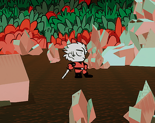
I am slightly disappointed that pressing 'T' did not result in an apocalyptic eruption of tears but, that aside, the environmental design of 3D Deathchase was really well recreated here (this is coming from someone who couldn't get it to work properly, so I'm genuinely impressed). I particularly appreciate that you went for a unique cotton candy color palette. My only true complaint is more of a curiosity - the player sprite is hardly visible in the game itself, and I'm wondering whether you may have input the wrong aspect ratio during submission. Otherwise, I genuinely believe this is pretty cool. Nice job!