Fantastic prototype build Brendan. Also, great work with creating the “Intensity” of your main game character's eyes aswell.
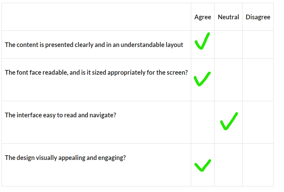
I really like how you have paid close attention to the alignment and positioning of your menu scene menu and game scene game control interface. By designing/placing these elements this way, it makes these buttons/controls feel naturally “Intuitive” for the user which essentially reduces cognitive load and improves overall UX.
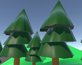
One small issue is regarding the consistency/colours of the buttons. Some buttons lack a hover state, which makes some buttons behave differently and thus reduces the overall level of functional consistency for the buttons. Also, the normal button colour of green makes it slightly challenging for the user to clearly differentiate the buttons from the game scene because this colour is similar to the environment's green colour as well.