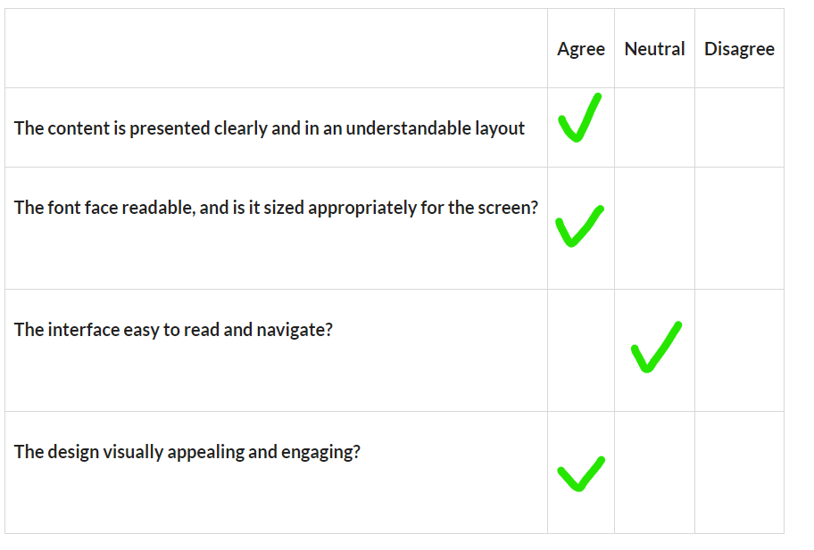
Great prototype design Victor, and well done with adding the cloud animation to the menu scene.
I really like your overall use of colours, especially the colours that you choose for your buttons and the UI panels. Grey buttons on a dark background provide good contrast, and the yellow and blue button colour states provide an easily recognised visual feedback to the user when they interact with these buttons (Hover or click on them). The combination of these UI panel/button colour choices really helps to create clear visual separation with these elements from the environment in the scenes.
One minor critique is regarding the positioning of some buttons on the game scene. If you moved the “Reset” button to the bottom of the other buttons (Because its frequency of use would be less than the other buttons) and repositioned the “Grow” button to be on the right side of the “Shrink” button, this would help to reduce cognitive load for the user and improve the overall UX due to all the buttons being in a more logical location.


