Love the aesthetic of this game. Ran into a game breaking bug where if you have the ice power up and run out of time it locks you out of continuing to play. The pushing mechanics are also very finnicky. I pushed the first block into and invisible wall which stopped me from progressing. I was also able to push that block further than intended.
Anticdope
Creator of
Recent community posts
There is a core game in here that could be executed well given more time! I appreciate the effort. The assets you used really appealed to me, so I thought I'd give it a try. Not a huge fan of the AI generated title screen, but to each their own.
More visual feedback would be super helpful. knowing when I am hitting an enemy and when I am being hit by an enemy is super important in these types of games and typically my hp going down isn't enough of an indicator.
The boar flashing was helpful, but it stayed white after the first hit. The bees didn't have any visual indication of me actually hitting them and I got stuck in the hive with no way out and nothing to kill me to reset so I had to call it quits even though I wanted to play further.
Love the art and the spacey music. I was really impressed with the comic style introduction.
I had a really difficult time with the jump timing on this. The narrow jump window made it really frustrating. Not sure if that was the intention or not. It seemed more geared towards exploring the ship since there was no clear indication of direction. With both frustrations combined, I found myself not wanting to continue, but I pressed on, finding the helmet, then jetpack, then flashlight and making my escape.
Overall it's a great submission despite my personal trials. I could see others having a very different experience. Well done!
I can see the Dredge influence here! I was drawn in by the title card, and while the UI had some elements of the title card, it was very different from what I expected.
A 3D game is always a challenge so I respect your team for giving that a go! I wish the UI wasn't sticking so I could get a good look at the catching mechanic. I was still able to catch fish without full vision, but it would be cool to engage with it the way it was intended to be played. Selling the fish would have been cool too but I think the shop was unimplemented.
So much potential in this little game! I love space and sci fi so this was right up my alley. I was so hyped the first time I entered the ship and found an even semi decent UI and first person gameplay. I feel like that's such a hard task for a jam game. Well done on that.
As far as improvements: I could tell where you were headed with the game, but it seems like the time frame forced you to pivot or leave some stuff unimplemented. The UI seems to get stuck sometimes, and it seems like it has some balancing issues. Either you get a really easy run or a really hard run and there isn't much in between. I had a hard time finding an equal amount of components at the beginning and didn't realize there was an upgrade mechanic on first play through.
Thank you so much for the kind words and feedback. I think you are totally right. Something to tell the player that they can vary the jump distance would be super helpful. We tried to create areas where it wouldn't be possible to continue without the small jump but I could understand how not telegraphing that could be frustrating. Thanks again for taking the time to try it out and for your invaluable feedback!
I will be very surprised if this game is not a top finisher. Best game I have play thus far. The aesthetic is top notch. The voice work is so impressive. The game controls are intuitive and the loop is clear and concise. You can also easily see where planned features are in the UI even though they aren't there. It so well thought out. If your team isn't working on a full game together, you need to be! :P Wonderful entry. You should be proud.
P.S. Not sure if its a bug or planned feature but on the white vertical "static" columns, I can force the ball through the column if I crank the frequency to its maximum and let it push through.
As a pixel artist myself, I found the little bird so endearing that I had to give this game a try. Such a cute birb! I really wanted to beat level 1 but I got really frustrated and had to stop. Others have already pointed out what I feel are the two biggest flaws, which are unforgiving hitboxes and really inconsistent umbrella deployment. I think if those were fixed, this game would be pretty fun!
Thank you for playing! There's a bug that happens sometimes with the leaderboard at the end of the run where it isn't loading scores. As far as I know we haven't diagnosed the cause of that yet but if you go back to the main menu you can see them by clicking the leaderboard button. That should show the full leaderboard. You are 56th! Nice! One of our devs still holds top spot but there are several people getting close to taking it.
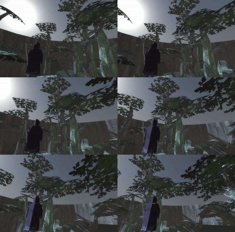
There's an idea blossoming here (forgive the pun). I wish you had more time to really make it all come together. Like many others here I fell off the map and had a really hard time navigating with the controls. The speed was just too fast. When talking to the flower I get a dialogue box but no text appeared and it wouldn't leave my screen. Slicing produced a slash that billboarded the entire length of the map! Pretty crazy attack!
Overall a very ambitious attempt for being a first game. Going straight to 3D billboards is wild! Nice attempt.
The sound design was sooo good. Our composer did a wonderful job and we are super proud of how it turned out. The very firs thing we thought of when we chose a jump king style game was "How do we make this not super frustrating for players?" So we knew from very early on we were breaking the rage game rules with this one. :) Thanks for taking the time to try it out!
Thank you for playing and the feedback! A little minimap or progress indicator would definitely help. The only indication of progress we were able to get in was a little sign that is about 3/4 of the way up the drain that says "Almost There". I wish we would have had time for more features though because that would have been a cool addition.


