
Indie game storeFree gamesFun gamesHorror games
Game developmentAssetsComics
SalesBundles
Jobs
TagsGame Engines

Allegorius

4
Posts
A member registered 50 days ago · View creator page →

Creator of

Recent community posts

Viability: mostly its there, there are a few sort of broken bits? if you fight the bandits and then turn around it just auto cuts to you having given the griffin water and making it your friend which doesn't make sense? maybe this is because of the variables not resetting when you go back to the start?

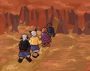
Presentation: It's chill, I'm not sure your current page is communicating much about the story or setting. I'm also cautious of your lack of capital letters. Without them it becomes more difficult for the player to follow your writing and I don't really see a narrative or aesthetic reason to not use them. It may just make the game harder to read.

Theme: I like the vibe! It could be nice to have a route where you don't save the Griffin to emphasis more that your kindness does matter? up to you!

Engagement: It's highly engaging! I like that my choices matter :) it makes me care about my player and also the griffin!

-Cassius

really fun! 

your format is very close to being viable, and the branches are super fun to play with.

you could definitely push engagement since you don't give the player many decisions and you utilize a lot of filler heavy dialogue (shit that is not progressing the "plot",) however I think the dialogue is very good and provides important characterization so I wouldn't change that. I would just watch how long the space between intractable moments is and try to keep that sort of consistent, especially for the party story line. but like, I also think the drawings will majorly help and provide the player a reading break, so *shrug*.

I think your characterization is super strong and the theme is becoming apparent through that, I don't necessarily think your current presentation is aiding your theme but you can just keep tweaking that til your ui feels cohesive with your art and the narritve, and yadda yadda, you know how to do this.

very funny overall tho and I'm really excited to see more of them!! (i didn't know his writing was this fire??? (jk, im always saying this))

-Cas

(UUGHGHH I NEED TO FINISH ONESHOT)

this is really fun. It's very close to being totally viable. I'm excited to see what raina's route is like.

presentation wise I really like your aesthetics, its immersive and evocative. I do struggle with your font a bit. I think the problem I am having is with this font in combination with grammar decisions. You have very long pages of text and distinguishing the punctuation marks in this font is difficult. Because you are *also* using atypical grammar choices this starts to get just incredibly difficult to parse. One suggestion I will make is that maybe since your not using capitals to instead add an additional space between sentences so its a little easier to visually distinguish commas from periods.

"that, was weird. how should i proceed?"

vs

"that, was weird.  how should i proceed?"

or something.

theme is evoked well within the presentation, I think some of your language choices could be fined tuned to make your theme even stronger.

I think the engagement is mechanically minimal but that's fine because the writing is interesting and unpredictable enough that I stayed engaged.

very cool and fun and awesome and i love being chronically ill and chronically online nothing bad happens ever :)

You've got a smooth theme, I think your layout and branching will work well! I liked the aspects of agency and that my choices actually impacted the story line. All of that was engaging, I felt connected to the character I was "building."

Presentation needs more time to cook, you have a *lot* of typos, you also just have a lot of confusing sentence structure? If it's supposed to be "olde timey" you may want to stick to a more specific grammar pattern to execute that because as is it's a little hard to follow. Additionally, I'm not sure your body font is the ideal choice? idk, it's just a bit taxing to read and having that as your body font and then having something sans serif for your links I think is a little like, disengaging? It makes me feel like my decisions exist outside of the aesthetic you are establishing.

I would advise maybe swapping your fonts, or finding an easier to read serif font for your body and perhaps picking an esoteric harder to read olde font for your buttons? Or maybe having specific lines or headers that use a font that establishes the vibe but keeping your body something more legible.


obv you're still missing an ending so it's not fully viable, yadda yadda.


Also on your first page it shows up weirdly low on the page, that is probably because the game is processing you startUp page text as being "before" your game. if you put "~" on either side of your startUp page text it should fix that! (issue I also got)

very excited to see the rest!!!

-Cassius