I assume it just simulates pull-sokoban from a random starting state where the crates are on their targets. that would explain why the player is typically trapped at the start. is my guess correct?
I personally think the images work well enough for the media. the only indication of them being AI is that some of them are obviously not hand-drawn. it may also be that I am unfamiliar with the art style of this particular AI which people may be recognizing.
"adversary's deck changes" is intentional. you are playing against a different person each round.
in regards to luck: just do an insect-based build and save your tokens
"pick from ocean" not prompted when running out of cards due to using a special card. because I am unable to prematurely end my turn, this is a softlock.
update: you are unable to select special cards from the pond, this may have been the cause of my pervious error. additionally the game does not properly end when the pond is all special cards.
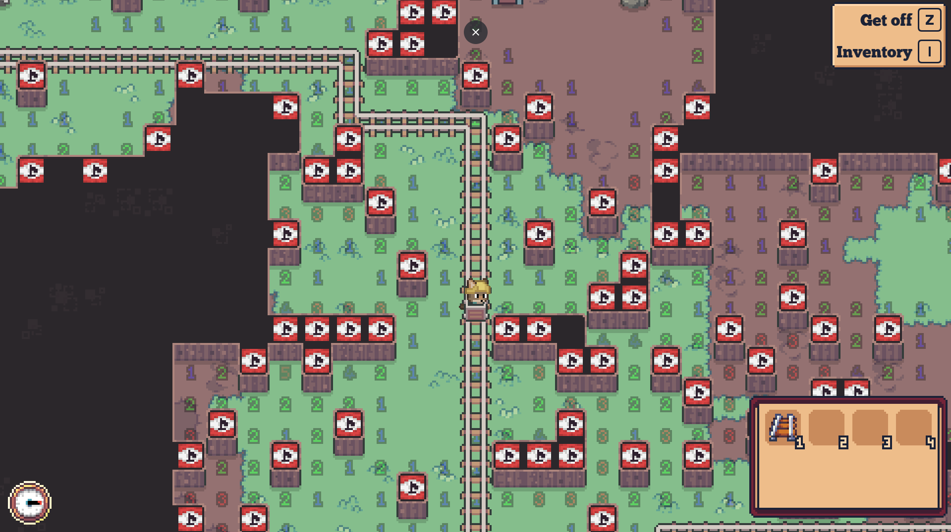
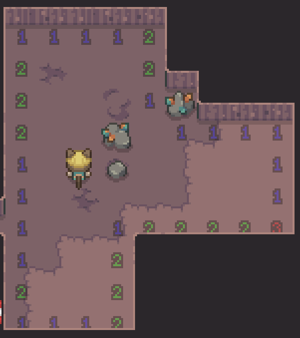
on further inspection, I think this is a decent game, although I will say the enemies are a bit excessively hostile, and it is significantly safer to explore in local view
also, I noticed enemies will not move pass the edges of the "macro tiles," and can then be escaped and killed at the edges of these tiles, although loot dropped at the edge of tiles like this cannot be picked up as it will disappear when within pickup range. perhaps this it related to how loot will reappear on the same space of every macro tile if not picked up?
overall, decent game, I always like to see the effort for random generation games like (though typically more on the puzzle side of things, but any strategy game can become a puzzle).
a suggestion for the rail system: you could pre-calculate the positions at each "physics frame" beforehand, up to intersections or path ends, then speed up or slow down the rate you play them based on the speed and direction the rail is being traveled. something like this would prevent instances where you get stuck halfway off a rail on corners.
other than that, I very much enjoy the gameplay of the rail system and the path optimizations involved, both for direction and length, and would be fine with keeping it the way it is.
at least give some guidance on where direct your attention, or why you should explore. exploring is much more dangerous than staying put at this stage. all games should be motivated either by discovery or by maximization (preferably both to varying, probably unequal degrees).