
Indie game storeFree gamesFun gamesHorror games
Game developmentAssetsComics
SalesBundles
Jobs
TagsGame Engines

5chub1

2
Posts
A member registered Apr 02, 2023 · View creator page →

Creator of

Recent community posts

Andres Review: 

Lucas' game featuring a duck is designed with a clean and minimalistic UI, orange buttons and when clicked, they change their background colour to white, which creates a visually appealing and easy-to-use interface. The simple shapes and colour schemes used in the project help users focus on the content and interactions, following the principle of simplicity in UX design.

The game starts with an Intro scene that immediately shows a "Play" button to start the game, providing a clear call-to-action for users. Upon clicking the "Play" button, users are taken to the menu where they can choose the duck scene among the scenes from the other students that or not implemented at this stage. It indicates a simple and straightforward navigation flow, following the UX principle of ease of use.

In the duck scene, users are presented with a 3D model of the duck in the middle of the screen, which serves as the focal point of the interaction. The ambient background features a small lake, grassland and some basic shaped trees, which adds to his scene's overall look and feel and improves the immersion by mimicking real nature components. The option to move the duck left, right, grow, and rotate is provided on the left of the screen, allowing users to easily manipulate the duck's movements, following the UX principle of user control.

The project also features a "Back to Menu" button, which provides users with a convenient way to return to the menu and choose a different scene if desired, contributing to good navigation and user flow. All buttons are easily accessible, although I would have put them to the right of the screen as most game controls are situated there. Especially if you consider playing it on mobile devices where most users are right-handed and therefore use their right thumb to reach those buttons.

The use of psychology in UX design is evident in the game, with visual feedback and interactions such as the movement engaging the user's senses and creating a sense of satisfaction and enjoyment. This helps create an immersive user experience, following the UX principle of user engagement.

The project follows the design thinking process involving empathy, ideation, prototyping, and testing, demonstrating a user-centered approach to design. The needs and expectations of the users have been considered, resulting in an intuitive and easy-to-use prototype.

The project is designed specifically for the web, with large buttons and simple shapes to ensure accessibility for a wide range of users, including those with disabilities. This demonstrates consideration for inclusive design, following the UX principle of accessibility.

Overall, Lucas' duck game prototype exhibits positive UX aspects such as clean and minimalistic UI design, simple navigation, user control, engaging interactions, user-centered design thinking process, and accessibility considerations. Addressing any potential areas for improvement, such as providing additional feedback or moving the buttons to the more convenient right side of the screen, can further enhance the overall user experience of the game.

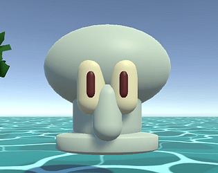
PS: Nice work on modelling the duck. Impressive!

(1 edit)

Andres analysis of Marlyz's Unity 3D Prototype Game „Panda”:

Marlyz's game features three scenes and starts with an Intro scene that displays a "Play" button to begin the game. Upon clicking the "Play" button, users are taken to a menu where they can choose Marlyz’s panda scene among the scenes of the other students that are not included at this stage. In the panda scene, users can interact with a 3D model of a panda using directional buttons to move it, a button to rotate it, and a grow button to upscale it. There is also a reset button to revert changes and a back-to-menu button. In the following, I highlight some pros and minor nitpicks I noticed while playing. 

Pros:

  1. Button click indication: The game provides visual feedback through colour changes when buttons are clicked, indicating that the user's action has been registered. This follows the UX principle of affordance, making it clear to users how they can interact with the buttons.
  2. Instant movement feedback: The panda control buttons provide instant feedback by immediately moving the panda when clicked. This follows the UX principle of responsiveness, ensuring that the system responds quickly to user input, enhancing the overall user experience.
  3. Labels on buttons: The buttons are labelled with text describing the action they perform, such as "Left," "Rotate," and "Grow." This is a good practice for learnability, as it provides a clear description of the buttons' functionalities, making it easier for users to understand and use the game mechanics.
  4. Reset button: The presence of a reset button allows users to revert all changes made to the panda and start over. This follows the UX principle of error prevention, providing a safety net for users to undo changes or recover from unintended actions, enhancing the overall usability of the game.
  5. Consistent design: The game demonstrates a consistent design, including the main menu scene, buttons and the background that features a greenish Asian-themed ambient with bamboo and grass. Consistency in design helps users build a mental model of how the interface works, making navigating and understanding the game's functionalities easier.
  6. Background ambience: The game's background ambience, featuring bamboo and grass, creates a fitting and immersive atmosphere that complements the panda scene and adds to the overall aesthetic appeal of the game.
  7. Use of main menu scene: Marlyz's game utilises a main menu scene, which is a good example of reusing existing components, saving development time and effort. This follows the UX principle of efficiency, maximising usability by leveraging familiar elements across different game parts.

Nitpicks:

  1. Small control buttons: All buttons in the game are noted to be small, which may make it hard for users to see and click on them (especially on mobile devices). This could potentially affect the game's usability and accessibility, as users may struggle to interact with the buttons effectively. This could be improved by increasing the size and spacing of the buttons, ensuring they are easily clickable and usable, in line with the UX principle of accessibility.
  2. Lack of visual cues for button purpose: While the buttons are labelled with text, they could also benefit from visual cues, such as icons or symbols, to further clarify their purpose. This would help users quickly understand the functionalities of the buttons, especially for users who may not read or understand the text labels, following the UX principle of clarity.

In conclusion, Marlyz's Unity 3D prototype game demonstrates good examples of following UX principles such as affordance, responsiveness, clarity, error prevention, consistency, and efficiency. She understands how to create a simple 3D game prototype and applies the core principles of UX Design, making the game more immersive and enjoyable. The game provides feedback, uses labels for buttons, includes a reset button, maintains consistency in design, and reuses components like buttons. However, there is a potential issue with small control buttons that may affect usability and accessibility. Overall, Marlyz's game shows promising aspects of UX design, with opportunities for improvement in terms of button size and spacing.

Well done, I love it!

PS: Great work on the Panda; very impressive and cute! :)