
Oh yeah that's a great way to do it, my two options were mostly for DMG-only. Flipping the UI palette is a lot easier/quicker.
A member registered Mar 13, 2023 · View creator page →
Creator of
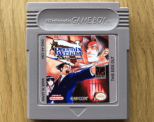
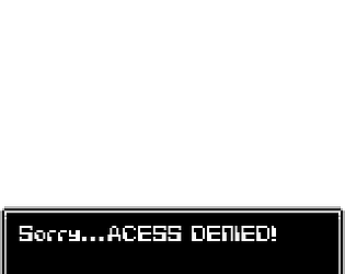
Phoenix Wright Case 1 for Game Boy!
Adventure
Play in browser
44 Game Boy fonts for GB Studio and Retro game dev!

Discovering AMVs (Circa Mid 2000's)
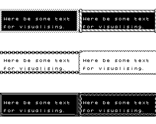
130+ dialogue frames to spice up text boxes!
200 detailed backgrounds for GB Studio and Gameboy dev use!