The first one on this page is the BGM of our game. It is free to download and use but remember to give credit to it. All the other sound effects are also found here.
Right, my game lacks some more instructions for sure and I really appreciate your feedback. I can tell you some of the codings for clipping multiple if you still wanna try. There is a sphere detecting area surrounding the paper clip. So, if the hitbox of the paper is colliding with it, holding the left click will create a joint between the paper and the paperclip. The same for multiple papers. Basically, you might wanna let all the papers you want to clip have part of the area intersect with the detect sphere area, and then hold the left click should work to clip them all.
Thx! Also, I still wanna know how the clipping mechanic troubles you so I can make improvements? It supposes be you approach the paper and hold the left/right mouse button.
Compared with the Necrocid, Necrocid Dread is a great improvement. The pose change when the player grabs the wall and slowly goes down looks cool. I would suggest improving the UI, including keys size, assets style, and stretching issues.
It is a great innovation and challenge to combine artwork with a game as you need to balance the visual effect of the artwork with the difficulty of the game. I am really glad to see that you guys make use of the portal mechanics in the color region which is a great idea when the player's control is limited by the rules themselves. One suggestion would be when I watched the demo, I am quite confused as some portals cannot enter again after left, and how I, as a player, are enabled to know that? Or, how can I determine which one of the portals, or which side of one portal, can be entered? I believe more instruction or guidelines can be made so it can be more player-friendly.
It is rare to see this game type, and I believe it is a great challenge and innovation. I am surprised that I used to think your game is merely choosing selection and having different endings just like a gamebook, but the interesting interaction and puzzle game embedded truly make it stand out. Also, All the different pixel art absorb me into this interesting adventure. A suggestion would be replacing the default unity UI, like the button, which might make your game looks more consistent. And if possible, I think if there is an automatic reading function for this game would be really helpful for people like me who don't like to read.
I am really amazed by all the artwork of this game especially the animation which I previously thought is free assets but you guys made it exactly by yourselves! Though I cannot play your game this time as I don't have an ios phone, the gameplay looks pleasant from your demo in class. A suggestion would be fixing the player's shooting direction issue. You can either make the shoot button another virtual stick like The binding of Isaac and Brawlstar do or navigate the bullet automatically to the enemy like Soul knight. I cannot come up with a better idea as the control for mobile games is limited, you either make it simple or make it smooth. Overall, great game, and I like it.
The use of color is really brilliant as different colors truly bring people different atmospheres and moods while combining with other specific environments. The storytelling seems really complete within only 3 weeks of game development. Besides that, I would suggest adding a model and animation for the player.
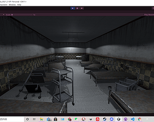
The puzzles are really interesting, and the low poly assets look really matching with each other. For my gameplay experience, I am quite confused about what is the goal of the game at the beginning, and then I gradually realized I was doing what the title said with more and more clues shown after each puzzle was solved. It is really amazing since this kind of setting and storytelling makes me experience like I am actually in the game itself, and creates a mind flow that keeps me playing it and thinking about what might be revealed or happens next.
A little suggestion would be to make some route tracing, for example, the glowing effect that led you to the next room, or just make the content in the room some sort of random(any first room that I enter would be the first puzzle). The reason I suggest this is because, I waste about 5 mins to find the room that I can enter since certain doors are just locked at first and cannot enter, and the moving speed for the player is a little bit slow.
Overall the game is truly satisfying, and I really like it!
I do think you guys have an interesting idea for the game and it makes me memorize that there is a game on PSP about three kingdoms, and inside the game, there is a minigame that you need to compete with NPC to see who eats faster. The idea of let NPC block your way from eating the food is creative, and I would suggest you improve the customers so there can be more interaction and interference. Overall, I like the game, and I am willing to see more progress.
The characters and their animation are pretty cute, and the music is really chilling. Playing this game makes me feel relaxed, and the color doesn't make my eye feel tired. Also, I like the torch is ignited after you walk across it. My suggestion would be I do think that the camera still needs some adjustment since it affects the player's control and matters for the gameplay. I feel like sometimes the camera rotates too hard since the path is narrow, which means there is a chance that the player needs to click at some point that is really near the character. If so, the camera rotates at a huge angle even if you only move your mouse a little bit. Another thing is that, from my gameplay, I found sometimes when you click frequently, the navigation works weird(it leads me to the wall but not the place I click). I am not sure why it is happening (maybe caused by the terrain?), but I do think fixing that can make the game weigh better. Overall the game looks nice.
From my first impression, this game looks so mature and like can be published already. The model and the UI, especially the NPC's dialogue window, fit so well and really absorb me inside the game. I think the skybox is actually a punchline that not only fills in the gaps in the background but also emphasizes the magical and mysterious element. Besides, I'm impressed that the monsters' steps fit so well as their speed which makes their movement real and lets the player feel intense. My suggestion would be, to add more stages, fill the storyline, and this game can be a masterpiece.
First of all, I really like the artwork you guys made for the title page, which clearly points out the topic of your game and gives players the tension for the unknown battle and enemies. For the game content, I like how you increase the game difficulty with the moving platform the climbable wall. The boss fight idea is unique, and I really appreciate that.
I really like the artwork for this game. The spirits for whatever item, background, or character fit very well, not only in the background story aspect but also it seems like the pixel size is united well so it looks comfortable for me. Also, I like the collecting system, and I believe there can be further functions developed based on that. The player control is smooth, and I enjoy the game very much.
The background story of this game is attractive, and the game setting(the sprite, music, etc.) is highly related to it. Also, I like how the game difficulty curves from starting with the basic control to more elements being introduced. A little suggestion is that the cinemachine can be zoomed out a little bit at the last level so the player can see the path they need to go. Overall, the game looks great!
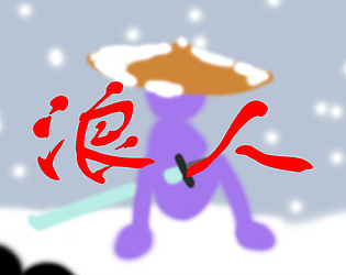
I've walked through this game myself. Honestly, I really like the idea that letting the ninja fight the robot, and there are many aspects that are deserved to learn.
Firstly, the art is really good. All sprites, UI icons, BGM, and sound effects match so well that gives me a strong feeling of being involved inside real ninja combat(I like the sound of the door opening and how it moves upwards). For the sprite, I like how the platform is not directly rectangle but with a sandstone outline underneath it, and the pixel unites well which makes me feel great.
Also, I like the mechanic of having both melee attacks and shooting, which fits the ninja setting a lot. Combined with the smooth player movement and fitted hitbox, the gameplay is fair and interesting.
The difficulty curves smoothly. I deal with a lot of level design from the previous assignment and exercise, and I found the more you test your own game the harder you can tell the level difficulties. But through my playing of your game, your difficulty for each level is designed very well and increases reasonably.
I think there are two obvious but super little imperfections that can be fixed further on like: 1. the sound of waving katana does not match with the animation but depends on how fast you click the mouse. It does not affect gameplay too much but might look and sound weird. 2. Glitch when the player goes through the platform. I think this should be a super common issue that also happens in our game project.
To sum up, it's a really nice game, and I really like it.