Indie game storeFree gamesFun gamesHorror games
Game developmentAssetsComics
SalesBundles
Jobs
Tags
(1 edit)

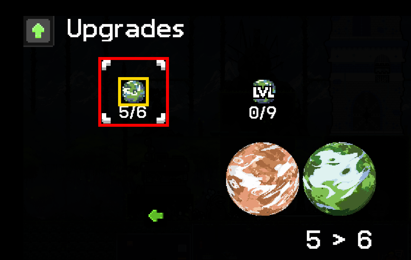
"hit test in upgrades screens are smaller than selection boxes, e.g. you need to click the planet icon to select it, not the area that is then selected" 

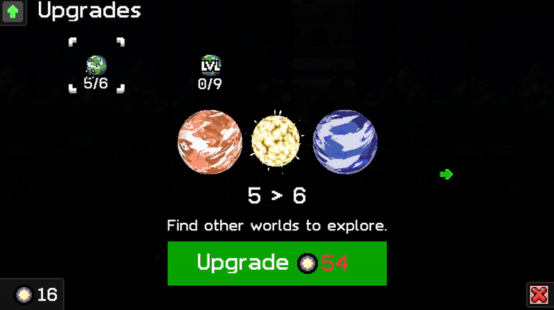
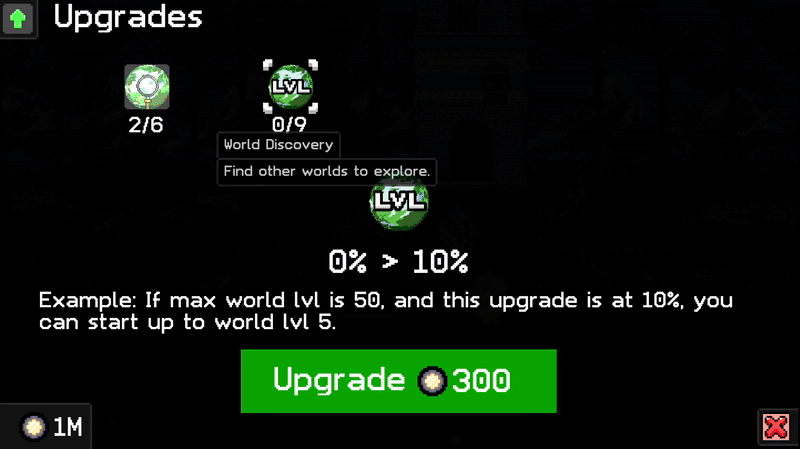
 To get a better understanding of this issue, I’ve included a gif, as I'm not quite sure what you're referring to:


(+1)

It's probably just me, but it would be more convenient to be able to click anywhere in the red rectangle. I'm the king of misclicks, so anything that helps counts :)


0.85.16:

- Added higher res icons for most upgrade icons.
- Made the selection box around the icons more representative of the touch area.
- Made the base builder interface darker too.


Thanks for the feedback!