Indie game storeFree gamesFun gamesHorror games
Game developmentAssetsComics
SalesBundles
Jobs
TagsGame Engines
(+2)

I just received the email with the update and rushed here.

I'm amazed 🎈🥳

The program is much better than I could have imagined.

The option to “hide” the text is great for someone, like me, who lives with roommates.

My suggestion is to make a post in the itch.io community and also in reedit and, of course, on Twitter. Your program has also just become a great space for outline and a lot of people need it.

I recommended it to some friends, but it's not something massive. I want to see everyone using and supporting this software.

You deserve much success after this impeccable work.

(+1)

Thanks for the kind words and suggestions! I was actually thinking of posting some things about WriteRush on reddit and other websites, and I'll definitely do that now. Also, thanks so much for recommending it to your friends! It's amazing to see such support from you!

Also, I really loved your idea for showing the data (like word count, words left to goal, etc) near the progress bars. If you have any more, tell me and I'll implement them!

Again, thanks!

(3 edits) (+2)

I have three suggestions:

1 - Increase the distance between lines. Before, as the CSS was visible and editable, I had made a small modification:

#typeArea {

     max-width: var(--typeAreaWidth);

     text-align: justify;

     line-height: 2em;

}

It's much better to write and read!

2 - This suggestion is more for the general improvement of other people. I suggest fonts for people with dyslexia. And also fonts that are better to read, such as “Merriweathe”, which was made for this!

3 - My last suggestion is that the timer's “progress bar” be a circle in the corner of the screen. I love doing sprints, but I'm not always in the mood, so not having a second “bar” would be really nice.

Example:


I just wanted to show the concept of being round that “fills”. A common little circle would be great and discreet. If you didn't want to use a timer, it would be something that doesn't “disrupt” your vision.

These are my suggestions! Thanks again for the incredible program, I spent the rest of the night writing yesterday!

(+2)

Hey! Super sorry for the late response!

1) This is a brilliant suggestion. It's also easy to implement. I'll add it to the next update!

2) More great suggestions! I'll add the option for dyslexia fonts and Merriweather. 

3) I could add this one as well. But I'll have to think of how to make it intuitive. It'll be difficult to have the circle fit with the other elements and look good (e.g. chapter, note, and main text section), unless I want to have it directly on top of another. Most likely, I'll include a feature to disable the timer bar.

Thanks for the amazing suggestions! They help make WriteRush better for everyone!

(+2)

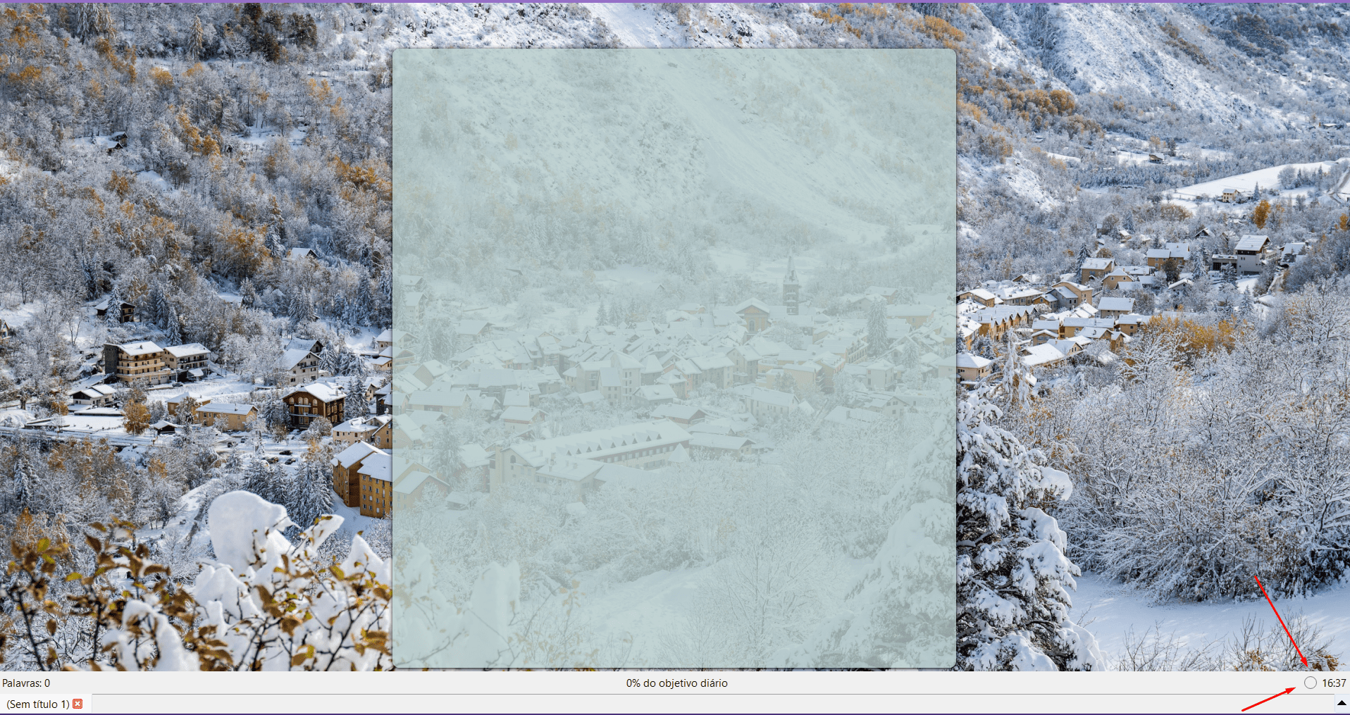
Sorry to invade the conversation, but do you know Focus Writer? It's an open source program that I like, but I don't use it because it doesn't have auto-save. I've already lost 1K words when the power went out.

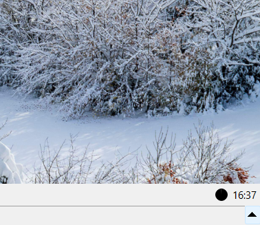
It has the “Timer” in the corner of the screen and when activated, it turns black and loses color like clockwork. When I read @still_life suggestion I immediately thought about this program.

Exemple: 

(+2)

Thanks for the example! And no problem with joining in on the conversation, your feedback is great!

I actually used FocusWriter for a while — it used to be my main writing software. But I use WriteRush now, of course. It was the source of much inspiration. My end goal for WriteRush is to have it be a seamless mix between StimuWrite (because of the writing effects), FocusWriter (because of how immersive and beautiful the UI is), and Scrivener (because of how useful the program is). And maybe something like Atticus far in the future (Book formatting) — but that's unlikely.

Also, thanks for adding the arrows! I find it funny that you added those. But very helpful.

Regarding the circle progress bar. I can probably add that in a future update. I'll make it an option to choose between line and circle progress bars — probably in the lower navbar like FocusWriter.

And on another note, I've been thinking of adding a hide-away interface like FocusWriter (where you put your mouse near the top or bottom to open up the menus). I'll probably add that to the next update!

Keep up the amazing suggestions!

Thanks!

(+2)

I wanted to say that your “mix” is working! WriteRush has become my favorite writing program, every day I just open it and write ♥

(+2)

Thanks so much! And I'm going to keep making it even better!