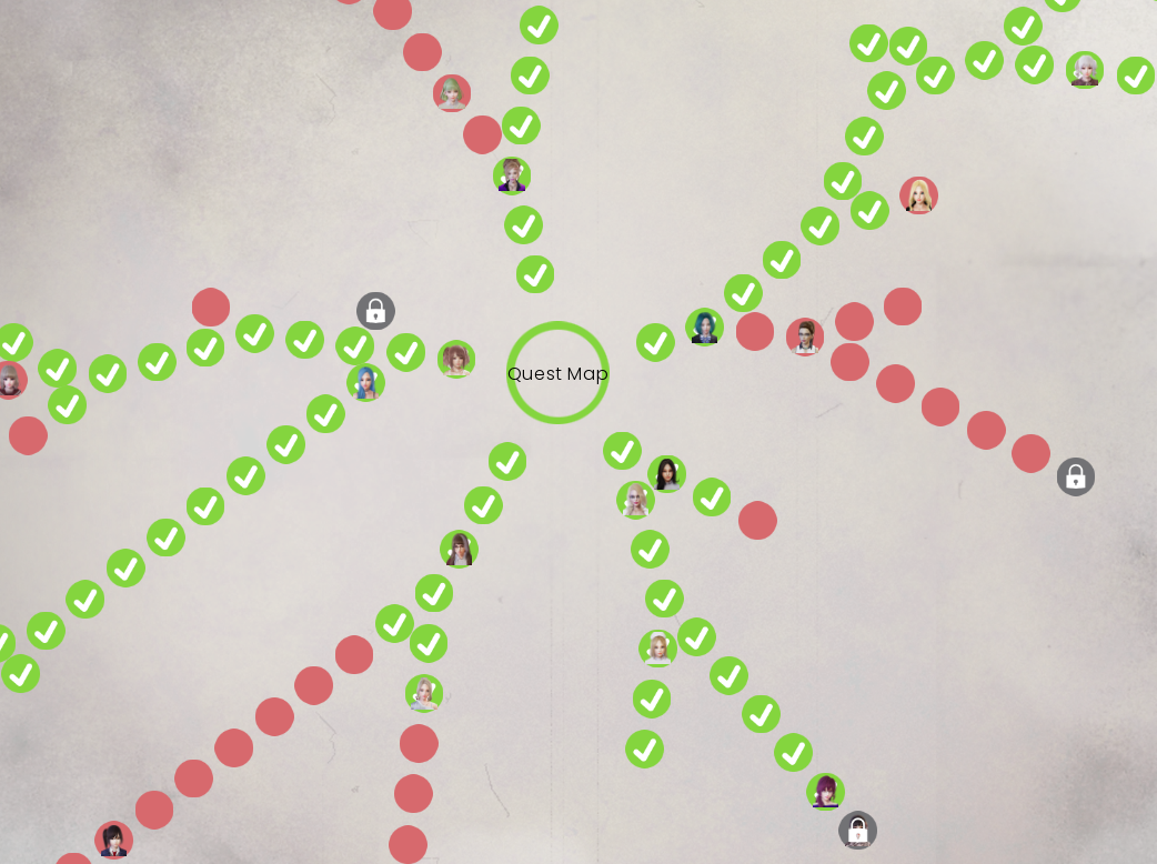
The quest web seems really weird (atleast for android).
if I try to use the tip of my finger for a precise click, it does not work (the squares won't open). It was only by chance while fucking around with it that i found out I could actually open those squares at all. It seems to only work when I use the flat of my finger and have the entire square covered. Although both of these are seeming to be inconsistent as i try more and more and the whole page is super laggy when I do.
I think it might be a good idea to focus one of the next few updates on just revamping this system to something more akin to other games. Make a page with a series of pictures of each character. When you click on them it shows a new page with a tip on how to proceed or whether you've reached the end of their content. Trying to figure this out with the current system is painful. Especially for characters where they intertwine like sapphire and sakura.
***
Also, I cant for the life of me figure out what the tiny squares are for in this menu. Green nor red nor black seem to expand when i click on them.


