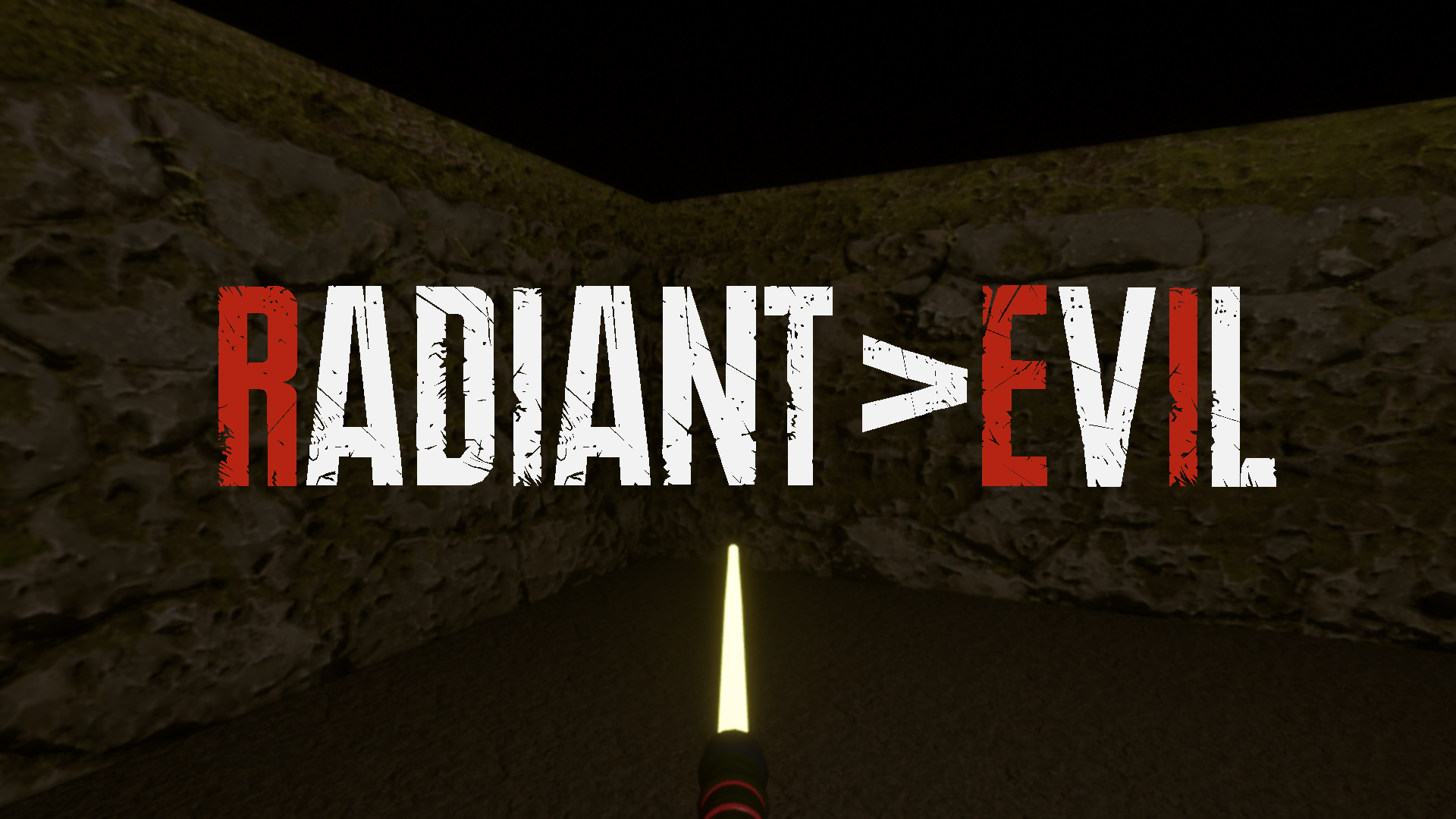
Day 10 - I got the splash screen image created now. I used the same gothic font from Resident Evil 2 and 7. Here is what it looks like. BioShock was always clever and added the version number to the logo too, so I did the same thing. The light saber represents version 1.

Level 1 is finished. I have started on the second level now. I will post some pictures once I get it somewhat looking polished. I still have a few game mechanics to finish, and will try to do that in between level building. I had said I would do 20 levels, some with different game mechanics. I am not sure how many I will be able to finish on time. If I get 5 or more, I will be happy with the game.