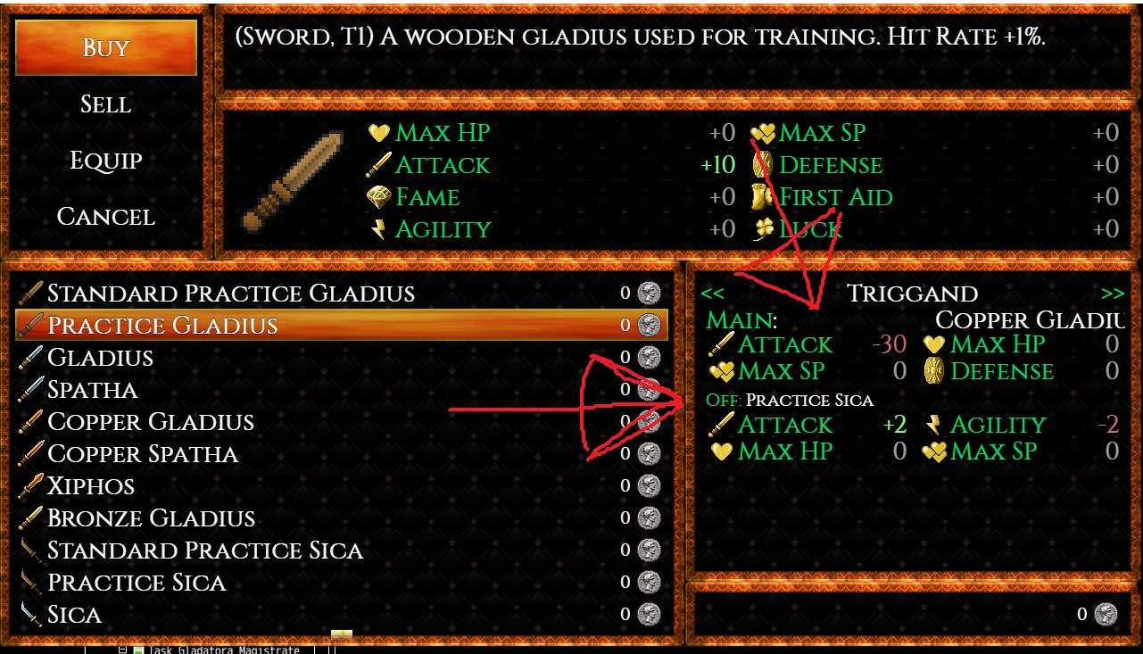
Hey there Ramza, I had a little issue I was hoping you could help with. So I use this plugin, your menu extension plugin and yanflys shop core with MV. I'm not sure if it's your plugin or yanflys that's doing this, apologies if it's yanflys issue. =)
 In the image I posted you can see the shop menu. It shows the main hand and off hand weapon being used by the actor looking at the weapons for comparison. As you can see the offhand weapon text is small but shows the whole weapon name but the main hand weapon is larger and there's a large space between the main hand text and the Weapon name text. Which makes the weapons name be cut off.
What I was wondering is if you know anyway to fix the issue with the main hand text. I use the latest releases of your plugins and am on MV 1.6.2. Thanks for your time Ramza. =)

