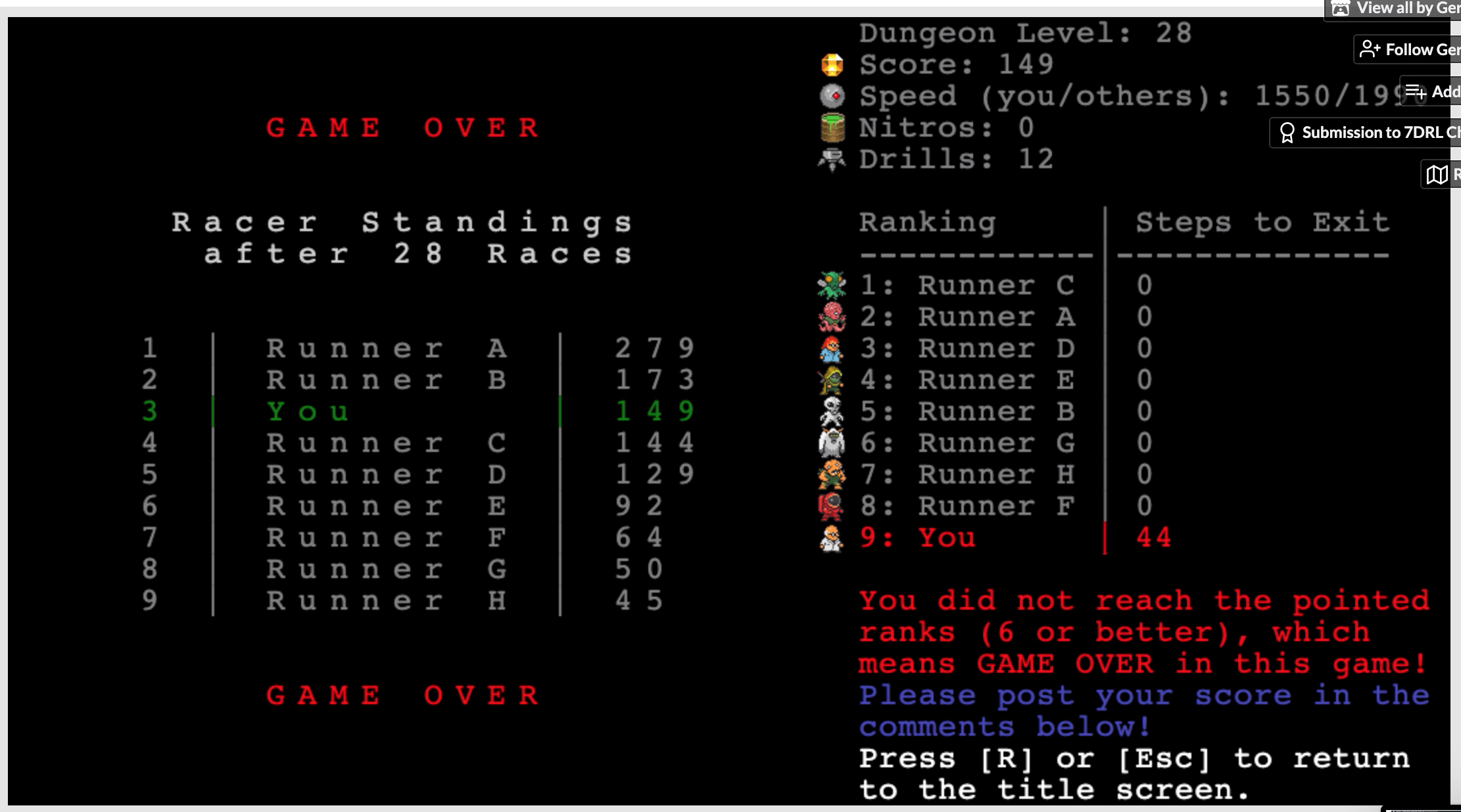
Completely get it! Like I said, great game regardless.
RunToTheStairs now uses a graphical tileset and looks much better. The only problem is that it requires WebGL 2.0 which is not supported by all browsers yet. I would be pleased if you could test if it runs on your system. Please name your operating system and browser. Thank you! :-)
If it does not run at your system you can still play the ASCII-only-version of RunToTheStairs.
I'll try and get all the videos I have uploaded tonight! Will probably be another 6+hrs until then just a heads up
And a few things about the minor indicator glitch (I don't know what else to call it) that I pointed out:
1. It doesn't just show items, it also indicates the other players
2. They're hard to see, a little easier to see when zooming in on the screen. And easiest to see on the right side because they show up as white block-length sliver and the right border of play is the only dark border that they contrast well against.
3. When I highlight the play field (just highlighting the whole page works) the play area is then surrounded by a red highlight and **interestingly** these indicator glitches also show up as highlighted. So they then become small red slivers instead of white and are slightly easier to see.
I'm not a programmer but I think #3 points to two possibilities. Either these slivers are 'holes' in the interface allowing you to see through the game to the highlighted page behind, or if they're indeed highlighted themselves then they are some kind of text element.
Thank you for your report about what you found out about the glitches. The fact that the glitches can be also highlighted is a really interesting behavior. Unfortunately I cannot reproduce it on my system (Windows 10). I tried it with the browsers Chrome, Firefox and Opera (not with Edge since it does not support WebGL 2.0). I think I have to get a mac somehow.
Nevertheless I wanna thank you for your effort to upload the videos. As a dev it is always a rich (and sometimes painfully) experience to watch others playing your own creation. Especially if they play it more skilled than yourself.
Still addicted to the complexity of this game. To be honest, for the first couple minutes I hated the graphical update. However, I got used to it pretty quickly once I had a feel for the commotion on the screen. When scanning the map diagonally at speed it's a bit tougher to tell the items from the extra graphics on the playing field, but I suppose that just adds to the difficulty.
One thing I noticed, the white upcoming-item indicators on all edges of the playing interface, most noticeable on the right side as displayed below. Not sure if it's intentional or not but I could see why it would be. Don't really have a preference, I definitely haven't been using them enough, they are very useful. My newest thing is trying to get as far as possible rather than high score. Here's my latest. It's on video but I'm slacking on uploading it cause it's 37min.
I know it's a lot of work on your end, unless you're able to automate the score system somehow, but it would be awesome to either have different scoreboards or be able to sort the scoreboard by highest level, speed, and maybe even items at death in addition to the normal high-scores.
Please note that you can still switch to ASCII-mode by pressing [g] if you do not like the graphical tiles. It also looks very funny to see how different the same areas are displayed in both modes.
I consider to allow the player to disable the extra graphics in the sidebar in case he gets distracted from it.
The white lines at the edges are not intentional and do not appear on my computer. Would be nice if you could test it with another browser or on another machine.
I went about your wish of a second high-score by awarding the medals 🥇, 🥈 and 🥉 to the players with the best dungeon-level-results.
I consider to implement your other ideas regarding leaderboards as soon as I have implemented the backend.
Hello RantotheStairs,
there is a new version of RunToTheStairs:
- The game now has a server-sided backend wich is hosted at GreenGeeks.
- This allows to generate automatic high-score-tables which are accessible from within the game.
- Players can register accounts in order to keep their progress.
- High-Score-Tables can be sorted by different criteria. (e.g. "Score per Hour" which should be interesting for speedrunners)
- You can also sort by speed, level and the number of nitros or drills as you suggested in your post 3 years ago! :-)
- Balancing changes towards shorter games.
- Less unfair: The players position is newly calculated if the distance to catch up would be to large.
- More versatile pathfinding-algorithm with better performance.
Please consider to play again!
Gerhard

