Indie game storeFree gamesFun gamesHorror games
Game developmentAssetsComics
SalesBundles
Jobs
Tags
A jam submission

Dalla SteppaView project page

A literary solitaire wargame inspired by the likes of Friedrich and Regicide
Submitted by JohnnyRep — 23 days, 19 hours before the deadline
Add to collection

Play game

Dalla Steppa's itch.io page

Results

CriteriaRankScore*Raw Score
Theme#74.7504.750
Playability - Mechanics#153.7503.750

Ranked from 4 ratings. Score is adjusted from raw score by the median number of ratings per game in the jam.

Leave a comment

Log in with itch.io to leave a comment.

Comments

Submitted (1 edit)

Nice work on this game! I've played a few times now and it was enjoyable each time. The first time I played I found it very easy, but that was due to me misunderstanding the rules about troops that you did defeat on the way to the fortress being added to to the forces to beat. My next few play-throughs were much more challenging :-D

I concur with what Vijil wrote about the atmosphere and being drawn into the game. Personally I didn't mind the random travel amounts. It helped the story I was telling in my head about struggles of moving an army through the mountains, plus it changes the landscape a bit with each play through. The drawback though is that sometimes it can be really easy and sometimes it can be really hard.

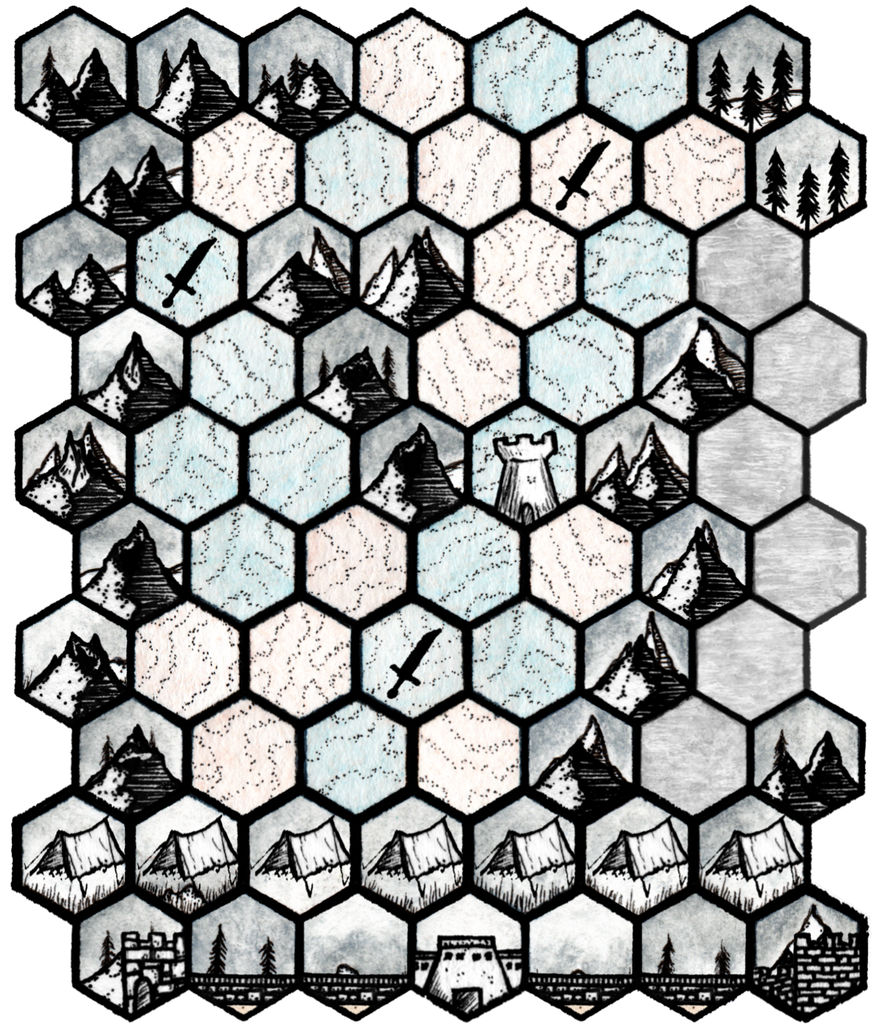
I really enjoyed the card mechanic as a way to manage resources and movement. I've been drawn to games that use a standard playing card deck lately. Even though it's random, it gives you a nice decision space to work with and definitely experienced that with your game.

I liked the idea of the spaces with suits powering up your cards. I wonder what the experience would be like if they were more of risk to get to. They are super helpful when you're on them, what if it took more time or resources to reach those spaces?

Submitted(+1)

I really like this one. The player decisions are whether to draw red or black, when to call it quits for the day, and which way to go - everything else is randomized. But that's what works so well. The red cards could be considered food and time, the black cards can be thought of as ammunition, time, and morale. Balancing these resources is the key. Then there's the aspect of the suit, which represents choosing the battlefield that best suits your force from limited options.

Loads of fun. My one gripe is perhaps a silly one - the terrain values for travel are almost too random. I think I'd prefer that many hexes were just a plain number, especially in flat easy areas. Add dice for uncertain footing or hilly stuff. The combat works well though.

The best thing is the sense of atmosphere. I really felt the drawn out, difficult trek with enemies who were in some cases easier to deal with than the terrain! The first time I tried going through the fog and ignoring everyone... welp, but what got me was all the enemies coming from behind when attacking the fortress. I think I needed to make 68 to beat it, and couldn't do it. The second time I went the battling way through the tower which was much easier! This time I managed to win, just. Nicely weighted.

Developer(+1)

thanks so much for your feedback! Your analysis is spot on I think - I struggled to work out what would be good value for the travel/supply hexes. I was worried having a flat number would have made it too easy to be sure of the best route but also agree values I have some of the hexes is a bit random 😅

Submitted(+1)

The mechanics of move and combat feel distinct from other submissions in this jam.  I like very much the variable strength of the final fortress.

What I find difficult for myself is legibility of movement costs on the hexes. I have a laser printer but its' overall quality is far from commercial. Spade and clubs symbols also required a double take to make sure that I am reading them right.

Those, however, are visuals - I like the game and how it 'moves' :)

Developer

Thanks a lot! Agree with your point about the visuals and difficulty in reading the symbols. I would like it to be easier to read them. I am not very experienced with software and graphics but will see if I can make it easier! 

Submitted(+1)

You have used white background and red (or black) font. Would it be possible to increase the size of the font, by 1 or 0.5? Alternatively, a different font that has different typeset (uppercase/"capitals"). Similarly with the spades/clubs symbols. 

They read fine on a screen but on postcard sized paper, particularly with artificial light (late in the evening), I had some problems 'reading quickly'. Red helped, yet black font was the main troublemaker :)

Developer

Hiya! Have increased font size and made the black text italic! Hopefully more printer friendly now!

HostSubmitted(+1)

Thank you for your submission. =)