Indie game storeFree gamesFun gamesHorror games
Game developmentAssetsComics
SalesBundles
Jobs
Tags
(+1)

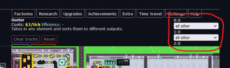
I found a bug in the UI. When trying to configure a sorter, the dropdown menus for only 2 of the 3 exits are shown instead of all three. The Play/Pause and Fast Forward buttons also get covered up rather than getting pushed to the right where there's much, MUCH more unused space the UI could use.


Entering fullscreen has no effect, in fact it only exagurated things.


Excuse my sloppy, mouse-drawn annotations, but why not rearrange the UI to make use of a larger screen? Make sure nothing overlaps. And instead of padding the screen with blank space, why not upscale? Zoom the area in so it actually fills the screen! Immagine if someone was playing on a 1440p or 2160p monitor? The game would be even tinier! A zoom feature would be much useful here.

I find it interesting that you have no indication of the third setting for the Sorter, while I have a small indication that is fully functional:

This suggests that there's some setting (on our computers, browsers, etc.) that changes how things appear, but I have no idea what it is.

Currently the lack of full-screen means I don't have access to all of my upgrades any more. The page ends at Steel seller and I can't find a way to scroll it any lower. The only way to see the remaining upgrades is to move the game 1) to a different browser (Chrome, I normally use Firefox), 2) on a bigger monitor, and 3) full screen. If I only do two of these things, it doesn't work.

(-1)

the empty space is for ads