Thanks for playing through this version. I'm glad nothing broke down, since people usualy report atleast one crash or fatal bug I missed.
When selecting New Game, 'Press [Esc] to continue' is a bit awkward
I will look into it. I don't want it to be a enter/space button because it would be quite easy to skip over that screen by accident. However, ESC is not the only button that works.
When you turn on the game for the first time, you get a control overview screen showing you all of the common buttons. It doesn't appear afterwards, but it is also in the "Controls.png" in the root game folder.
"ESC" and "num0" and "X" have the same function, so you can press any of these and they will work. I'm afraid I can't really comunicate that to the player that well though. If I say "press the B button", it will mean nothing to them unless they go to the options menu first. I will try to think of something.
Potential confusion for new players when picking class.
That is something on my to-do list. I plan to remove the screen and replace it with ordinary point perk buy system like in cataclysm, zomboid or pretty much any modern survival game. And even later, I will add a short linear intro section where you make multiple decisions, which will give you perks and bonuses depending on them. Subsequent playthroughs will allow you choose perks freely.
The "NPC Walking away" animation is really long and gets old quick.
I could fix that. It works like it does now because it doesn't cause any problems and is easier to do, but allowing the player to move while they walk away can be done too.
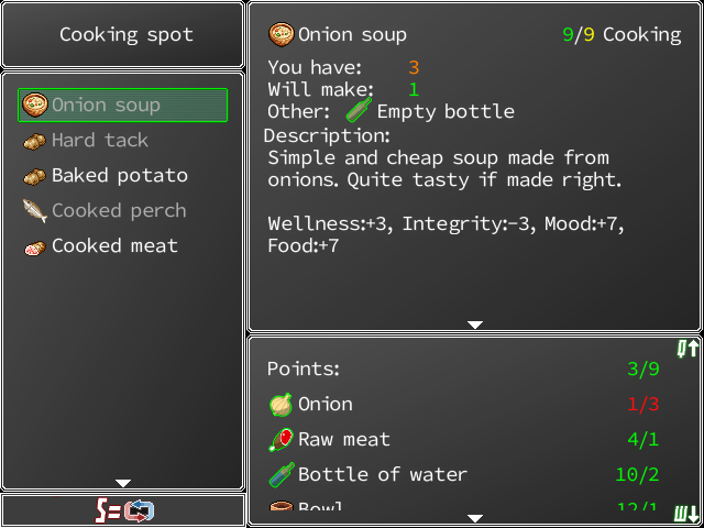
I like the new descriptions and inventory visuals. I have a suggestion for things like food
I actualy had the window look like that in the early version, however that didn't work properly in the crafting window.

As you can see, puting those stats under each other would make them not fit in there. I would have to resize other windows and make them smaller. I will definitely do something about it, since I'm not really happy with it either. Probably asign different text color to each stat or replace the text with icons.
I think it's a good idea to start highly polishing the early game section and idiot-proofing things.
Thats pretty much a constant battle for me. While most of the things you said are valid and I will adress them (Billy telling you about installing crafting stations is a good idea), I also don't want to make the game explain things "too much" and I want players to figure certain things on their own naturaly. There is a questlog in the menu that shows you the quests you get from John, so players can read again what they have to do and if they go through the tutorial, they will learn how crafting stations and skill learning works so they wouldn't be confused by empty crafting recipes. I will be improving this part of the game for sure, but I also have to stop somewhere, since I could easily just place tips everywhere, place quest reminders and popups all over the screen and some people would still get confused.
Another example of idiot proofing would be the Billy potato quest
That's definitely something I will adress. I will simply rename the "Quest" option into "Get quests" or something similiar. I can also make the quest tab glow a little if you have a quest ready to be turned in or something.
In the screen with the elevator machine and the mine
Found the problem and fixed it.
I think this is a bit cruel since it's difficult to gauge the relative strength of enemies
That's something I also strugle with. I think the biggest problem are the graphics. Kobolds and the scavengers look too big. They are suposed to be smaller than the player, but I don't have the graphics for them. The bear doesn't look that much bigger than them, so it is hard to take seriously.
As for its location, I actualy want it to be like that. I want the world to be designed in a same way the gothic games are. You have weak enemies mixed with strong enemies in pretty much every location. Strong enemies are easy to avoid, or they guard some kind of treasure you are meant to get later. I really like this, because it doesn't make earlier locations completely obsolete once you get too strong. Getting killed by a strong enemy early also makes killing it later much more satisfying than just going through a map with linear difficulty progression.
Anyway, thanks again for playing through this version. I will adress your points and release small version in a couple of days.

