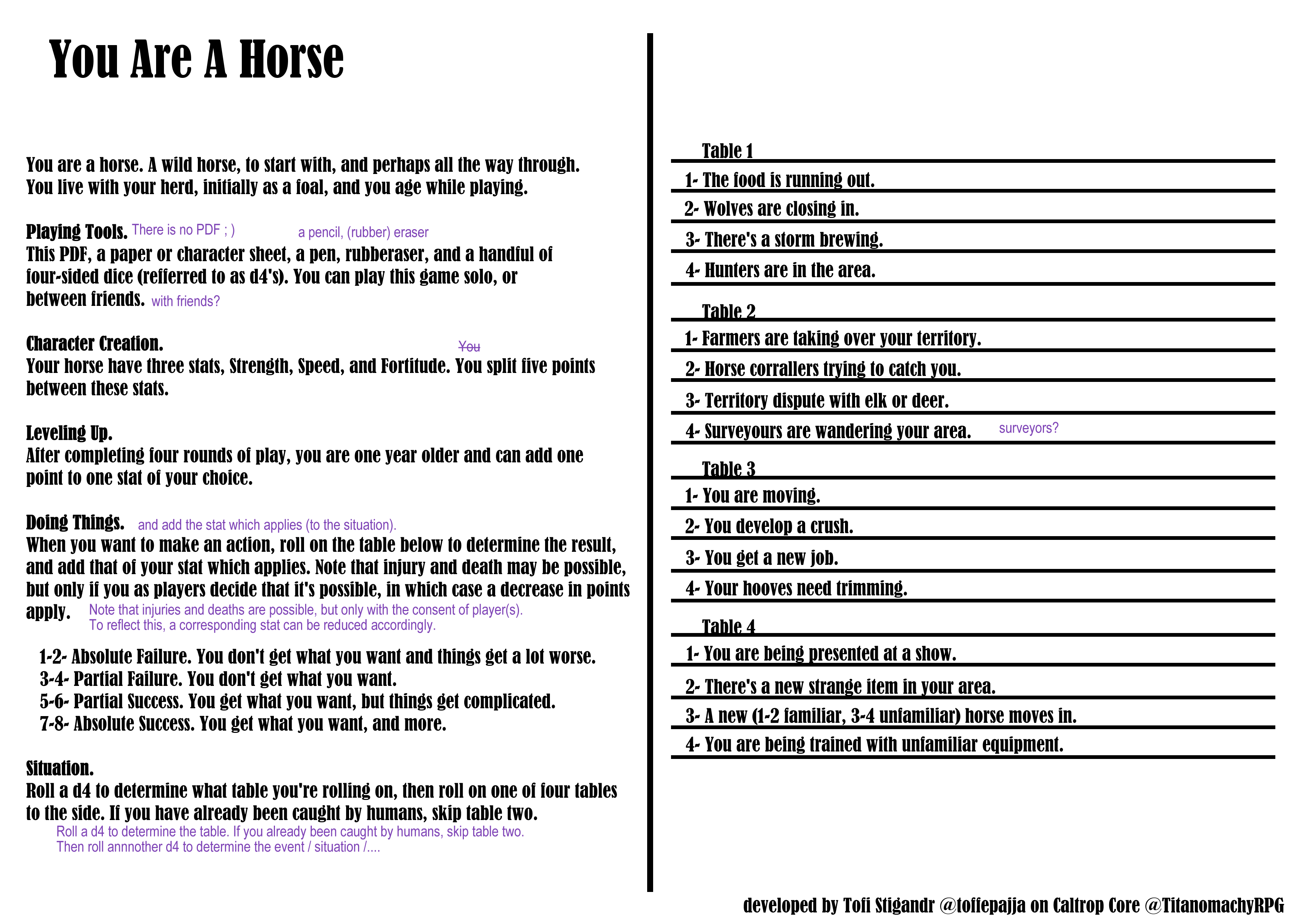
About me: I have almost no idea about horses and prefer games that have a goal. So that you can put the criticism into perspective.
In general it is a good one page RPG. You know what to do and you get a good idea of the gameplay.
As a dyslexic, I had a bit of trouble reading it. The font is a bit difficult, especially the distinction between f, t, i and l.
I also noticed a few phrases that didn't sound right to me. But since I have English as a second language, I could be completely wrong. Therefore, please ignore all my suggestions. Oh, and the file names should ideally also be in English. I didn't know what "liggande" was. :)
Bottom line: It makes you want to try it out, I like the character sheet and especially as a debut work I find it quite good.